When building modern web applications, developers often debate between Next.js vs React. In the JavaScript environment, both technologies are powerful and utilized extensively. Nevertheless, the requirements of your project will determine which one is best.
In this detailed tutorial, we’ll look at both ReactJS and NextJS side by side, comparing and contrasting their features, differences, and potential applications. By the conclusion, you will know exactly how NextJS compares to React and which one is better for your needs in the year 2025.
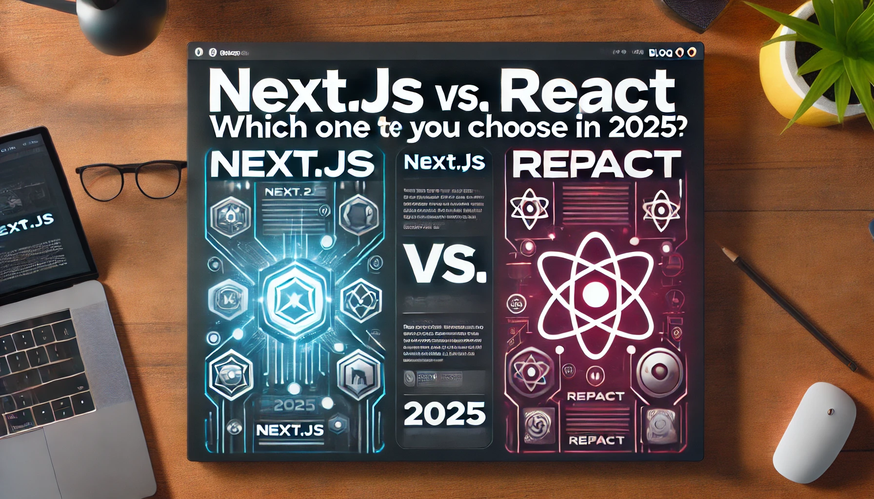
What is Next.js vs. React?
Before diving into the comparison, let’s define each technology:
What is React?
Designed by Facebook for mostly single-page applications (SPAs), React is an open-source JavaScript tool. It helps creators of reusable UI components to update effectively with minimum re-rendering, making it a popular choice for developing the Best Android Apps as well.
What is Next.js?
React-based Next.js is then adding more capability including API routes, static site generation (SSG), and server-side rendering (SSR). It improves React’s performance, which qualifies it for performance-oriented uses.
Difference Between React and NextJS
When comparing Next.js vs. React, several key differences stand out:
| Feature | React | Next.js |
|---|---|---|
| Rendering | Client-side rendering (CSR) | Supports SSR, SSG, ISR, CSR |
| Performance | Dependent on client-side rendering | Optimized with pre-rendering |
| SEO | Requires extra setup | SEO-friendly with built-in SSR & SSG |
| Routing | Uses React Router | Built-in file-based routing |
| API Handling | Needs external APIs | Built-in API routes |
| Development Speed | Faster for SPAs | Better for large-scale applications |
The difference between React and NextJS becomes more evident when discussing performance, SEO, and routing capabilities.
Next.js vs. Create React App (CRA)
React App (CRA) is a tool meant for fast React project setup. Still, it lacks the tools Next.js offers. Allow me to contrast Create React App with Next.js:
- Performance: Next.js is faster due to server-side rendering.
- SEO: Next.js is superior because of pre-rendering.
- Routing: Next.js has built-in file-based routing, while CRA requires React Router.
- Scalability: Next.js is better suited for large applications.
CRA is plenty for small projects or SPAs; but, why choose NextJS for performance-oriented apps? Because it provides improved SEO, scalability, and performance.
Why Use NextJS?
Developers choose Next.js for several reasons:
- Better SEO – Since it supports SSR and SSG, search engines can index pages easily.
- Improved Performance – It pre-renders content, making apps load faster.
- Scalability – It is excellent for growing applications with high traffic.
- Built-in API Routes – Eliminates the need for an external backend.
- Static Site Generation – Ideal for blogs and eCommerce platforms.
If you are wondering why is NextJS better than React, these benefits make it clear.
Is NextJS Faster Than React?
Yes, NextJS is quicker than React since it supports multiple rendering algorithms, including SSR, SSG, and ISR. These methods enable Next.js applications to load faster and provide a better user experience.
React apps, for example, depend on client-side rendering, therefore users may observe delays in content. Next.js pre-renders pages, thus they are instantly available.
Next.js vs. React: When to Use Each
When to Use React
- If you are building a single-page application (SPA)
- When SEO is not a major concern
- For small projects that do not require server-side rendering
- If you prefer complete control over routing and API handling
When to Use Next.js
- When you need better performance and SEO
- If you are developing a large-scale, high-traffic website
- When you require a mix of static and dynamic content
- If you want to optimize for faster load times
This explains why is NextJS better than React for performance-critical applications.
React JS vs Vue: How Does Next.js Fit In?
When comparing Next.js vs. React, many developers also evaluate React JS vs. Vue.js, a popular JavaScript framework that provides simplicity and a reactive data model.
However, Next.js is built on top of React, thus the comparison is more about Vue vs. React than Vue vs. Next.js. If you need SSR and SEO optimization, Next.js is the best option.
Final Verdict: Next.js vs. React in 2025
So, which one should you choose in 2025?
- If you are developing a standard SPA, React is a great choice.
- If you need SEO optimization, performance, and scalability, Next.js is the way to go.
To sum up, Next.js vs. React is not about which one is better overall, but which one is more suitable for your project.
Conclusion
Both ReactJS and NextJS have merits, however Next.js is becoming more common in current web development. Is nextJS quicker than react? Yes, thanks to its pre-rendering capabilities.
In 2025, Next.js will be the top choice for developers seeking quick, SEO-friendly, and scalable web apps.
i9bet015… never heard of it before. Looks like a betting site. Gonna poke around and see what they’ve got to offer. Always looking for new places to try my luck! Have a look here: i9bet015.
Been playing on Ricobetwin for a bit now and it’s been pretty good to me so far. Won a few bucks, cashed out no problem! Take a look: ricobetwin
explore this bazaar – I visited the page and the information there was quite clear.
official market page – Checked the page earlier and noticed how organized it felt.
stone bazaar online – Browsed the page today and everything was easy to read.
browse this market site – I spent a minute on the page and it felt well organized.
outlet marketplace – I noticed the page today and the information seemed practical.
online lark store – Opened the site today and navigating it was very easy.
this bazaar website – Just checked the page and noticed several useful details.
explore linen shop – Came across this site today while searching and it seemed helpful.
see the linen shop – Browsed the site and the information felt very accessible.
maplebrookmarket – Quick visit today but everything looks neat and well explained.
explore this boutique – I stumbled onto the site and the content was neatly arranged.
take a look here – Opened the site and it immediately drew my attention.
boutique homepage – Helpful information is posted here and I’ll revisit later.
this online bazaar – Browsed the page and the site seems well maintained with useful info.
meadow harbor bazaar – I visited the site and the content looked genuinely helpful and well organized.
check this market – Came across the website today and it caught my attention.
orchard market homepage – The website feels organized and navigation is fast and easy.
visit moon cove – First glance shows the content is practical and easy to follow.
browse this boutique – I spent a moment on the site and liked how simple the navigation felt.
discover kettlebrook – Came across this page randomly and thought the content was useful.
good info here – I stopped by this site today and browsed briefly, it looked pretty straightforward.
harbor outlet shop – Just explored the website and the navigation worked nicely.
supplier hub online – Checked the platform briefly and the interface feels clean, intuitive, and easy to follow.
my find today – Just came across this link and explored it briefly, it looked fairly well arranged.
this vendor place – Just discovered this site today and it seems active and easy to navigate.
lantern orchard market – I happened to find this site today and it was enjoyable to browse through it for a bit.
cool vendor platform – I browsed this marketplace earlier and the layout feels nicely structured.
marketplace link – Came across this site and all pages seem well-organized and easy to follow.
online bazaar store – Checked the website briefly and the details were explained nicely.
online vendor group – Just came across this platform and the pages appear nicely structured.
official vendor store – Had a quick glance through the page earlier and the structure looks pretty tidy.
check zenstone bazaar – Explored briefly and the marketplace seems unique and engaging.
check this market – Browsed the site for a moment and it appeared thoughtfully organized.
this vendor emporium – I checked this site briefly and the layout feels clear and straightforward.
Oak Vendor Market – Just looked at this marketplace while checking different vendor pages.
a site I found – I ran into this page earlier and the marketplace looks quite promising.
this online outlet – Found the site while browsing and the content seemed informative.
browse zenstone listings – Found this site today, the marketplace seems lively and easy to navigate.
Olive Vendor Listings – Took a moment to browse the site and the layout is clear and easy to follow.
visit this collective – Came across this site today and moving through the listings felt pretty smooth.
their lark market – Spent a few minutes on the site and the layout made reading comfortable.
vendor studio highlights – Browsing around felt easy and the platform was visually appealing.
bay bazaar shop – Smooth pages and simple layout make exploring the marketplace enjoyable.
Olive Marketplace – Explored the site today and the navigation feels straightforward.
browse maple listings – Took a look earlier, the marketplace seems orderly and navigation is smooth.
a site I found – Came across this page today and it looks pretty decent so far.
see coastharbor marketplace – Layout is simple, and browsing different vendors was smooth and easy.
explore lemon stone shop – Stumbled upon the site and quickly found content worth reading.
see violet vendor workshop – Clean interface and easy navigation made today’s visit enjoyable.
discover dune cove selections – Organized pages, navigation smooth and exploring products today was simple.
explore harbor bazaar – Smooth navigation and cozy design made browsing a pleasant experience.
this vendor workshop – I checked this site quickly today and the structure looks neat.
shop coaststone finds – Pages open quickly, and the marketplace feels user-friendly and organized.
shop walnut vendors – Pages load quickly, and the marketplace design feels structured and clean.
explore this emporium – Happened to find the site while browsing and the content looked promising.
hazel harbor marketplace link – Came across this while browsing and the listings appear quite useful today.
shop baystone emporium – Clean layout and responsive navigation make exploring enjoyable.
this vendor community – Ran into this page earlier and it appears like an interesting hub.
see dunecove offers – Nice emporium site, layout structured clearly and browsing felt pleasant.
shop coppercove online – Layout is structured, making exploring categories and vendors easy.
Walnut Vendor Collective – This vendor marketplace is easy to navigate, with clear info and attractive products.
explore linen shop – Visited the website today and the content was approachable and helpful.
discover berrycove shop – Navigation is smooth, products are neatly presented, and pages open quickly.
tealvendorcollective – First impression feels good navigation looked simple and clear.
see copperstone marketplace – Browsing sections today was effortless, with a well-structured design.
browse hazel vendors here – I’m impressed with how neatly things are organized and how fast it loads.
shop dunestone treasures – Easy-to-use bazaar interface, pages load quickly and smoothly.
wavestone vendor hub – The marketplace feels organized, and moving between sections was seamless.
maplebrookmarket – Quick visit today but everything looks neat and well explained.
browse this site – Stumbled on this platform earlier and it seems nicely designed.
explore coralharbor deals – Layout feels neat, and browsing sections today was effortless.
discover berrystone market – Navigation is easy, and the marketplace design feels relaxed and inviting.
see wave vendor marketplace – The site loads fast and feels organized for easy navigation.
shop echobrook collections – Organized interface, navigating sections felt easy and comfortable.
vendors available here – Found a handful of listings that looked interesting while looking around.
take a look here – I visited the page briefly and the structure felt clean and orderly.
vendor site link – Just landed on this platform and the layout is clean, loading quickly.
check out birchbrook market – Smooth pages and clear category layout make the browsing experience enjoyable.
discover coralstone shop – Navigation is smooth, and exploring vendors today was enjoyable.
wheatbrook vendor shop – Browsed the site today; vendors are easy to find, and the platform feels welcoming.
discover echobrook items – Pages load quickly, and browsing categories felt smooth.
a clean vendor page – Found this platform and the structure looks neat and informative.
their brook outlet – Opened the page earlier and it looked interesting at first glance.
cottonbrook shop online – Sections are well-structured and finding products feels simple.
discover birchharbor market – The site layout is clean, and exploring sections is straightforward and relaxing.
browse the vendor workshop – I’m visiting for the first time and it seems like a practical online marketplace.
check out wheat vendors – Browsed different sections today, and the experience felt effortless and pleasant.
trailvendoremporium – Quick browse earlier site seems simple and useful.
see cottonmeadow marketplace – Navigation is natural and categories are easy to explore.
visit brightbrook market – Clean design and well-arranged sections make exploring enjoyable.
official boutique page – The information is solid and I’ll revisit the page in the future.
visit vendor market here – Enjoyed browsing the site, navigation is simple and smooth.
visit icicle hub – The marketplace looks well-organized and browsing products was convenient.
explore brightharbor bargains – Browsing was fast and comfortable, with responsive pages throughout.
discover creekharbor outlet – Pages open fast and navigation flows nicely between sections.
a bustling marketplace – I stumbled onto this platform today and it appears dynamic and interesting.
browse elmstone offers – Outlet platform looks neat and browsing categories was effortless.
discover meadow harbor – Found the page today and the content seems informative and well arranged.
see this harbor marketplace – Bazaar-style layout makes browsing around enjoyable.
icicle meadow online market – Just discovered this marketplace and it seems useful.
calmcoveboutique – The boutique website feels elegant, calm, and very easy to navigate.
creekstonebazaar – Bazaar pages load quickly and browsing sections today was smooth and simple.
explore this bazaar – Came across the website and the layout is clean and helpful.
browse ember canyon products – Clean navigation and layout made exploring easy and pleasant.
see alpine cove listings – The emporium theme feels inviting and navigation is straightforward.
shop crowncove finds – Navigation feels simple, and moving between categories was easy.
explore calmstone treasures – Browsing was smooth, with responsive pages and a clean design.
valebrookvendorhub – Just checked this site earlier and navigation felt smooth.
marketplace page – I stumbled onto the site and found it appealing while exploring.
shop ember ridge treasures – Organized layout makes browsing products quick and comfortable.
visit alpine vendor hub – Fast loading pages make the browsing experience smooth.
browse ivory vendor hub – Nice variety on display, I plan to come back for a deeper look.
marketplace link – Came across this page today and it’s easy to explore each section.
explore mint shop – The page structure is intuitive, making browsing effortless and smooth.
crownstoneemporium – Emprorium marketplace here seems organized and friendly to explore.
visit canyon harbor bazaar – The marketplace layout is appealing, and exploring vendors was easy and fun.
amber brook trading hub – Briefly explored the site and enjoyed browsing the listings.
see fern brook bargains – Pages load quickly, marketplace navigation feels easy and organized.
explore vendor collective site – Just visited and the pages feel tidy and easy to navigate.
vendor network site – Browsing today, I discovered this platform, which seems useful.
see crystalcove deals – Elegant boutique layout makes browsing simple, fast, and enjoyable.
discover canyonstone treasures – Smooth navigation and simple layout make checking out vendors effortless.
cove marketplace – Browsed the page and first impression is positive with clear content.
visit boutique marketplace here – The page design looks refined and easy to navigate.
visit the deals section – The outlet site was comfortable to navigate and pages loaded promptly.
vendor listings page – Came across this site and the pages are well structured with easy browsing.
explore crystalstone treasures – Pages load fast and the platform feels tidy, browsing enjoyable.
visit caramel brook outlet – Navigation feels effortless, and the platform has a sweet, attractive design.
apricot brook outlet – The outlet marketplace looks interesting and browsing feels smooth.
see jasper grove listings – Went over the site and the listings seem easy to understand and useful.
flintmeadowemporium – The emporium platform looks tidy and browsing around today felt simple.
discover daisycove emporium – Clean and structured platform, navigating categories was easy.
browse harbor vendor listings – Clean layout and browsing through items feels simple.
open flintstone selections – Checking the listings is simple thanks to the clean layout.
jasper vendor marketplace – The layout is clean and browsing items today felt hassle-free.
shop daisystone finds – Layout is fresh, responsive, and easy to explore.
auroracoveboutique – Boutique marketplace here feels stylish and simple to explore.
visit dawnridge selections – Outlet platform looks organized and pages respond quickly.
unique stone marketplace – The bazaar-inspired store design feels open and appealing.
browse today’s specials – Moving through items was easy and pages opened quickly.
discover caramelcove treasures – Navigating sections is smooth, and the emporium layout feels clean and inviting.
open jewel vendor hub – Randomly stumbled on this marketplace; listings seem active and current.
browse here – Just scrolling through the listings and there are a few things that stand out.
explore dawnstone deals – Marketplace sections are tidy and browsing items was easy.
online autumn finds – The cozy bazaar setup makes browsing a simple and delightful experience.
discover boutique styles – Moving through collections is easy and the design feels polished.
chestnutharboroutlet – The outlet marketplace feels organized, with pages loading quickly and smoothly.
product outlet page – The website design looks neat and browsing through it was smooth.
driftbrookoutlet – Good outlet style site navigation clear and easy browsing.
check out autumn emporium – Smooth navigation and tidy pages create a pleasant browsing experience.
jewel depot link – After checking several pages, the platform seems professional and reliable.
check forest cove deals – Navigating categories is easy and the interface feels welcoming.
online bazaar – Found this shop through a search and the page looks tidy.
browse driftorchard collections – Outlet site well-organized, navigation clear and browsing comfortable.
explore cloudcove treasures – Smooth navigation and organized platform layout make checking out products fun.
Who doesn’t love a good promotion? fb777 always has some sweet deals going on. Worth looking into fb777 promotion
Yo! Found a sweet register bonus on jilibet.com. Easy to claim and now I can bet on my favorite games. Worth checking if you’re new! Claim yours: jilibet.com register bonus
Gonna spin some Plot777 slots! Hopefully, Lady Luck is on my side today. This site seems to have them all. Check out plot777 slot
browse bazaar deals – The site layout is clear and exploring vendors feels effortless.
browse juniper hub – Found this site today while searching, looks like a well-organized marketplace.
discover the emporium – The site has a calm layout that’s easy to explore.
jasperstoneemporium – Interesting emporium style shop, products seem nicely displayed.
browse pearlbrook – The site layout makes exploring the items pretty easy.
browse cloudstone collections – Layout is organized, and the marketplace feels approachable and easy to use.
boutique catalog – Pleasant experience, the boutique displays products clearly.
see bazaar specials – Navigation is simple and the site’s atmosphere is enjoyable.
orchardmarketfinds – Products are clearly arranged, navigation is fast and intuitive.
brookhub – Pages are tidy, exploring the catalog is quick and simple.
check this vendor collective – A short visit today showed the marketplace is well-structured.
market listing – I saw this bazaar during a search and it seems well put together.
pearlcove shop link – The product pages appear easy to scroll through.
Clover Brook Outlet – Navigation is smooth, and exploring sections today felt simple and pleasant.
official bazaar link – Friendly layout and neat presentation make checking products enjoyable.
marketfinds – Products are clearly presented, browsing feels effortless.
shop marketplace items – Moving through trades feels smooth and simple.
tealhub – Layout is clean and modern, exploring products is simple.
storefront access – I noticed the layout right away and it gives a pleasant shop feel.
browse pebblepine – The store setup makes it simple to check out different items.
explore clovercrest treasures – Marketplace feels approachable, and navigating sections is smooth and effortless.
see vendor marketplace – Checked tonight and the interface looks simple, well-structured, and clear.
explore the bazaar – Nice sections and smooth layout make finding items easy.
outletcorner – Products are well organized, making browsing effortless.
explore market offers – Navigating the marketplace is intuitive and smooth.
markettreasures – Products are easy to explore, pages feel organized and user-friendly.
juniper brook outlet – I checked the site briefly and it’s easy to browse around the categories.
visit pebblestone – Browsed through a few sections and everything looks tidy.
market catalog – Pleasant interface, navigating through products is straightforward.
sagegallery – Layout is tidy, making browsing through the outlet simple.
trailtreasures – Pages are structured clearly, finding items is easy.
kettle vendor marketplace – Came across useful resources today while checking out this site.
shop garnet harbor finds – Navigation is simple and pages respond quickly.
pineharbor store page – The catalog appears simple to browse through.
boutique catalog – The elegant style of the site makes browsing pleasant.
retail orchard page – Clean design, products are easy to locate and view.
seahub – Layout is clean, browsing items feels smooth and effortless.
bazaarharbortreasures – Products are easy to explore, pages feel organized and user-friendly.
pine stone bazaar – Had a quick browse here, the marketplace seems tidy and pleasant.
this bazaar site – Spotted this page during a search and it seems promising.
browse lantern vendor hub – Took a brief look and the site seems solid and easy to navigate.
check out the emporium – Intuitive layout, browsing categories feels simple and fast.
stonegalleryplus – Layout is clean, browsing the bazaar is simple.
bazaarfinds – Products are clearly presented, navigating the site is effortless.
browse plumbrook – The catalog appears simple and pleasant to explore.
check the outlet – Browsing through this shop feels straightforward and smooth.
visit the emporium – Pages are well-organized, finding items is simple.
covegallery – Products are easy to locate, pages are clean and inviting.
silkgallery – Layout is tidy, making browsing the boutique smooth and pleasant.
check this vendor emporium – Went through a few pages, the layout is simple and content helpful.
trendhaven – Browsing feels seamless thanks to a neat and organized layout.
marketplace page – Browsing feels easy thanks to the tidy arrangement of items.
visit this outlet – Smooth navigation, items are displayed clearly and neatly.
shopuplandvault – Interface is clean, browsing items is enjoyable.
shopstone – Products are easy to locate, navigation flows seamlessly.
marketgem – Layout is neat, everything is easy to browse and visually pleasing.
outlet hub – Well-organized categories, exploring products feels effortless.
lanternstonebazaar – Interesting bazaar concept, enjoyed looking through a few products.
covefinds – Items are arranged neatly, navigating the site is effortless.
silverbazaar – Layout is neat, items are easy to locate and view.
gemmarket – Well-laid-out emporium with products that are simple to navigate.
check this market – Organized sections, shopping feels easy and clear.
market shop page – I like the clean design, browsing the site feels effortless.
valegallery – Layout is clear, navigating the emporium is effortless.
shopsilkvault – Well-laid-out interface, browsing products feels pleasant.
emporium listings – Smooth site design, products are easy to locate and view.
harbormarket – Smooth layout with intuitive browsing across all sections.
browse this outlet – The site seems well-structured and moving through categories is simple.
velvetvault – Sections are easy to explore, layout looks organized and clean.
shopharbor – Products are easy to locate, layout makes browsing seamless.
visit oakcove boutique – Smooth online experience, store layout is clear and modern.
shopridgevault – Items are easy to find, layout is organized for quick access.
brooktreasures – Navigation flows well, products are displayed clearly.
check the market – The site looks cheerful and navigating between sections was easy.
shopstone – Items are easy to locate, layout makes browsing seamless.
violetmarket – Pages are tidy, browsing items online is smooth.
oakstonebazaar – Nice online bazaar, browsing through products was simple and smooth.
rainbazaar – Items are easy to spot, pages feel well structured.
snowvault – Interface is intuitive, navigating sections is natural.
browse this bazaar – I’m casually browsing here and the items seem quite intriguing.
harborshop – Navigation is simple, browsing products is smooth.
olivebrook shop portal – Easy layout, browsing different categories is straightforward.
outlettreasures – Browsing is seamless, products are arranged neatly.
snowhub – Layout is clean and clear, navigating through products feels smooth.
browse this emporium – The store design feels special and navigating through items is smooth.
coveemporium – Website layout is neat, exploring products is simple.
oliveorchard finds – Easy-to-use interface, exploring products is fast and simple.
ravenmarket – Items are clearly displayed, moving between sections is intuitive.
orchardfindsplus – Organized catalog and clear layout make exploring products effortless.
official emporium link – Everything loads fast and moving between sections is convenient.
marketstone – Browsing this bazaar is effortless, navigation feels natural.
opalbrook selections – Well-arranged pages, exploring products feels comfortable.
brookhub – Layout is intuitive, making the shopping experience pleasant.
bazaartreasures – Items are easy to explore, pages feel organized and user-friendly.
check the market shop – Took a look around and the items look well organized and appealing.
wavebazaar – Items are well arranged, navigation through the site is simple.
visit opalriveroutlet – Smooth browsing experience, pages load quickly.
riverfinds – Smooth layout and organized catalog make exploration easy.
markettreasures – Products are easy to explore, pages feel organized and user-friendly.
browse this boutique – The boutique has a modern aesthetic and everything is easy to navigate.
stoneavenue – Items are clearly displayed, navigation feels smooth and easy.
orchard harbor deals – Glanced through the site, products appear arranged well.
stonebazaarfinds – Well-laid-out pages make shopping and browsing easy.
shopvault – Browsing feels fast, interface is clean and organized.
brookemporium – Pages are clean, browsing items today was simple.
orchardstone shop – First impression is nice, the store has a clean presentation.
shoprosevault – Products are neatly arranged, navigation is fast and straightforward.
emporiumcovefinds – Items are neatly arranged, navigation feels natural.
Bayridge online studio – Just browsing and found this site, looks like a creative vendor hub.
wheatcovehub – Items are neatly arranged, layout feels practical.
browse Clover vendor hub – Intuitive layout with fast-loading pages, exploring vendors is effortless.
covefinds – Browsed the boutique, layout feels modern and products are easy to explore.
sunstonebazaar – Layout is neat, products are simple to locate and view.
Bayridge online marketplace – Discovered this vendor studio, seems like a creative space to explore.
wildstonebazaar – Seems like a unique marketplace filled with interesting items.
see Bay Vendor Workshop – Creative and organized, this workshop-style site is easy to explore.
vendor studio central – Clean layout and browsing around the platform is effortless.
WorkshopHub – Navigation is smooth and everything feels approachable.
Coast workshop marketplace – Smooth browsing flow, moving between vendor listings is pleasant.
browse Windbrook Market – Clean and simple design, makes browsing pleasant.
BerryCrest vendor store – Clean design and a friendly vibe make the site feel inviting.
creative vendor hub – Simple yet effective layout and pages load instantly.
pearlvendorcollective platform – Navigation across the marketplace worked nicely today.
discover Copper Crest Vendor Place – Well-laid-out platform, moving through pages is smooth and simple.
Berry Vendor Collective – Cool online collective, I liked exploring the different sections.
jewelcrest online hub – Everything seems in place, and pages load quickly and consistently.
Wind Harbor Outlet – Lately, I’ve found exploring new online shops like this quite fun.
pebble crate market page – The categories appear clearly arranged which helps browsing.
browse Copper Collective – Well-structured hub with responsive design, navigating is straightforward.
check out Birch Basket District – Creative marketplace setup, excited to see upcoming updates.
vendor depot network – Smooth interface, well-structured platform, and pages respond reliably.
visit pebblewood hub – The layout looks organized and content loads smoothly.
juniper place hub – Clear interface and consistent page performance make the site easy to use.
Birchstone marketplace – Browsing today was pleasant, with a straightforward and clear design.
UrbanCrate – Trendy ideas here, I’m jotting this site down.
browse Wood Cove Emporium – A fun online spot for discovering unique items.
juniper online hub – Smooth interface, organized sections, and quick page transitions throughout.
browse Brightstone Vendor House – Clean interface and unique concept make this platform worth exploring.
CraftCentral – Unique vendor ideas, this platform is easy to explore.
check pinestone vendors – The platform structure makes looking around very straightforward.
Woodstone Emporium – Checking out some sites and this one seems worth a look.
kettlebrook shop portal – The site feels simple and user-friendly, with smooth page transitions.
Bright Vendor online marketplace – Enjoyable emporium design, exploring the site was straightforward.
TheCraftedCrate – Excellent layout, I can quickly spot interesting vendors.
pine vendor emporium online – Exploring different areas of the site feels effortless.
vendor marketplace kettle – Clear, professional layout and seamless navigation make the site enjoyable.
Brimstone vendor store – Creative marketplace platform, browsing through it was fun.
Zen Cove vendor marketplace – Modern and serene branding makes exploring this boutique enjoyable.
CraftedCorner – Browsed for a bit, love the clean and simple design.
plumbrook vendor showcase – The site structure helps browsing stay simple.
lanternbrook vendor exchange – Simple, neat design with intuitive navigation and responsive pages.
visit Calmbrook Vendor Hub – Calm design and organized layout make exploring the hub effortless.
CraftVault – Nice layout, browsing through items feels easy and calm.
see Zen Cove Boutique – The name itself suggests a serene and contemporary shopping experience.
browse plum vendor listings – The site arrangement is clean, and pages load without delay.
lantern emporium exchange – Fast, intuitive navigation and clear layout make the platform easy to use.
Calm shop – Nice tidy layout, everything feels straightforward to browse today.
CurioCrate – Nice concept and layout, I’m intrigued to see additional items.
canyonridgevendorstudio – Creative studio-style platform, I’ll definitely return to explore more.
lavenderridge shop portal – Clear navigation and organized layout make exploring the site easy.
visit the vendor marketplace – Appears to be a space where shoppers can discover new sellers.
quartz ridge seller studio – The pages load cleanly and everything is easy to find.
browse Canyon Vendor Workshop – Workshop-style marketplace is fun to explore, eager to see what’s added next.
vendor marketplace lavender – The platform feels polished, and navigation is simple throughout.
quartz vendor marketplace hub – Moving through categories felt smooth and clear.
explore this vendor hub – Discovering new vendor marketplaces like this feels rewarding.
CraftVault – Lots of fun items to explore, the platform is user-friendly.
check Caramel Crest Vendor Place – Nice inviting feel to the site, made navigating vendors enjoyable.
vendor store lemonridge – Simple layout with smooth page transitions and clear structure.
explore quick meadow marketplace – The layout looks tidy and moving through sections felt effortless.
TreasureStudio – Very user-friendly design, navigating between pages is seamless.
explore Alpine Crest vendors – The name definitely sparks some curiosity about the site.
Caramel collective hub – Enjoyable layout and collective style, the homepage is neat and clear.
lemon vendor center – Fast-loading pages and smooth navigation make the site enjoyable to browse.
ArtisanAlcove – Interesting concept and intuitive layout, hope this workshop thrives.
explore raincrest marketplace – Everything is clearly arranged, making navigation effortless.
explore linenharbor marketplace – Pages load efficiently, and the interface feels neat and intuitive.
Chestnut Stone Vendor House – Unique and appealing name, site design is simple and user-friendly.
CraftNest – Neat interface, navigating through sections is smooth and simple.
browse rain vendor listings – The site structure makes navigation effortless and clear.
linen vendor center – Smooth navigation, quick page load, and easy-to-use interface.
browse Chestnut Vendor Emporium – Vendor platform looks like it’s expanding, wishing them all the best.
Amberstone vendor place – Found this platform recently and it looks intriguing.
CraftNest – Fun and intuitive design, navigating through the vendor studio is smooth.
ravensage vendor place – The vendor platform looks organized and browsing today was seamless.
take a look at Cloudbrook Vendor Hub – Smooth browsing with well-organized pages, exploring is easy.
maple hub corner – Intuitive navigation with responsive pages and smooth browsing.
browse Cloud Vendor Collective – Looks like a collaborative marketplace, I’ll revisit soon.
maple supply corner – Organized interface with fast transitions and smooth navigation.
raven vendor marketplace hub – Everything is clearly placed, keeping navigation easy.
check this vendor collective – I think the brand name is catchy and sticks in your mind.
Cloverbrook marketplace – Smooth and responsive, navigating the hub feels effortless.
marble vendor exchange – Neat, responsive design with quick-loading pages and intuitive structure.
explore Apricot vendors – Checking different vendor houses online never gets old.
CurioCrate – Friendly layout and neat structure, browsing products is simple.
vendor plaza marble – Clear, well-laid-out interface with responsive pages for simple navigation.
take a look here – This emporium sounds nice and is worth checking around.
open the vendor site – Found this listing earlier and the layout seems straightforward and helpful.
marketplace link here – Checked quickly, layout seems tidy and practical.
Aurora vendor hub site – Ran into this platform while looking for interesting marketplaces.
helpful vendor directory – After looking around a bit, the information appears quite handy.
vendor hub portal – Opened briefly, layout seems simple and practical.
check this platform – Had a quick glance at the page and it seems very easy to explore.
check Aurora vendors – Collective marketplace sites like this are fun to explore.
see riverstone vendor products – Moving through sections is clear and uncomplicated.
see this vendor site – Looked briefly, content appears clear and well organized.
online vendor network – Just discovered this page and the information looks decent enough.
marketplace link here – Checked quickly, layout seems tidy and practical.
open river vendor marketplace – Exploring the site today felt smooth and simple.
quick vendor site – Had a short browse and the platform seems fast.
vendor platform link – Quick visit shows a clean layout and clear content.
rosebrook vendor showcase – Navigation through the site today was quick and clear.
Autumn Willow online store – The shop name has a calm and friendly atmosphere.
vendor directory page – Just noticed this today and the layout seems neat.
explore rose vendor market – Everything is neatly organized, making exploration effortless.
vendor workshop page – Spent a few minutes browsing, everything seems straightforward and user-friendly.
silverbrookvendorhub.shop – I like the work put into this site, it seems quite informative.
open rubyridge vendor platform – Moving across the marketplace today felt quick and seamless.
visit wild vendor workshop – Browsed briefly, content appears organized and easy to read.
this vendor house – Found this platform today, the interface feels simple and clear.
vendor resource page – Opened for a moment, everything is simple to navigate and read.
ruby vendor workshop – The workshop site feels tidy, and browsing today was smooth.
vendor resource page – Browsed a little, seems well structured and useful.
helpful vendor page – Checked quickly, navigation is smooth and pages are well organized.
quick vendor site – Browsed for a bit, layout looks tidy and user-friendly.
this vendor workshop – Opened for a moment, layout feels clean and intuitive.
marketplace link here – Checked quickly, layout seems tidy and practical.
vendor platform link – Just checked it, everything seems tidy and easy to comprehend.
simple vendor site – Spent a moment browsing, everything seems easy to navigate and neat.
vendor place page – Opened the site, everything appears neatly organized and easy to follow.
check out this vendor hub – Quick glance shows a neat structure and practical information.
see this vendor hub – Just glanced at the site, navigation is straightforward and content is helpful.
simple vendor site – Spent a moment browsing, everything seems easy to navigate and neat.
vendor resource page – Browsed briefly, design seems clean and functional.
recommended vendor page – Opened quickly, pages feel organized and user-friendly.
online vendor network – Took a short look, platform seems user-friendly and informative.
vendor workshop page – Spent a few minutes browsing, everything seems straightforward and user-friendly.
vendor collective page – Just glanced at it, information seems practical and easy to read.
recommended vendor page – Opened quickly, pages feel organized and user-friendly.
vendor platform link – Quick visit shows a clean layout and clear content.
vendor shopping hub – The usability is great, and everything responds quickly.
vendor studio page – Just glanced at it, the site appears well organized and practical.
this vendor workshop – Opened for a moment, layout feels clean and intuitive.
find deals here – Plenty of vendor choices make this a useful place to search for items.
vendor hub portal – Opened briefly, layout feels clean and easy to navigate.
visit woodstone marketplace – It feels organized, so browsing through items was quick.
tealvendorcollective.shop – Browsed quickly, site looks practical and easy to follow.
see available vendors – Lots of options here, and it didn’t take long to find what I needed.
helpful vendor page – Opened briefly, navigation feels simple and information is clear.
open marketplace link – Everything is arranged clearly, which makes navigation simple.
browse shop options – It’s tidy and user-friendly, so finding what you need is simple.
start action momentum – Inspires continuous forward movement with a clear sense of direction.
make your ideas real – Encouraging message, implementing concepts drives growth.
view focus flow – Focusing energy properly increases productivity and forward motion.
find out more – Intuitive navigation and clear presentation help users quickly find available spaces.
implement creatively – I appreciate this, creativity only matters when acted upon.
discover active ideas – This shows that concepts gain value only when put into motion.
this link here – Events are displayed clearly, and the site is very easy to navigate.
reduce the clutter – This resonates, less distraction improves focus.
start clear journey – Knowing your direction helps maintain steady and meaningful advancement.
visit now – Well-presented insights into professional service offerings and expert advice.
focus on tomorrow – Great point, looking forward guides smarter decisions today.
start here – Beautifully presented menus and reservation info improve usability.
discover better decisions – Clarity helps you make choices that give you an edge.
visit this site – The website has a clean, modern design that feels welcoming and easy to navigate.
take it one step – Nicely put, consistency over time really pays off.
see more info – Site exudes holiday cheer, making club enrollment simple.
explore sharp focus – Keeping attention on priorities drives meaningful results faster.
see more info – Engaging visuals and structured layout make exploring the site enjoyable.
make clear moves – I like this approach, it helps decisions feel more organized and intentional.
learn more – Locating Broadway venues online is smooth and hassle-free with this site.
follow clarity flow – When thoughts are organized, decisions happen without delay.
explore here – Covers scores, news, and game highlights in a straightforward way.
open the store – Everything loads fast, helping users explore and buy products without delay.
make a move – Great message, action is often the missing piece to progress.
official shop link – The design supports smooth browsing and quick shopping.
tap here – Concentrated effort on ideas supports steady and meaningful progress.
discover fresh options – When you act, new doors begin to appear naturally.
visit this guide – Highlights local events and initiatives with clarity, encouraging participation.
take a look – The site structure ensures smooth browsing and a pleasant shopping experience.
navigate your path – This resonates, it helps bring direction when unsure.
see guided actions – Clarity allows each step to be taken with purpose.
use this page – Putting plans into action helps gain speed and maintain consistent progress.
browse products – The platform is simple and clear, making shopping quick and enjoyable.
visit this site – Offers insightful ideas for social change in a clear and engaging way.
vision sets the pace – Strong message, having a goal in mind directs consistent progress.
check daily progress – Consistency each day creates a natural forward movement.
tap here – Focused growth strategies lead to ongoing and reliable forward motion.
visit this platform – The structure makes shopping intuitive, fast, and convenient.
stay focused daily – I like this message, focus really helps improve outcomes over time.
open this link – Critical insights into democracy’s vulnerabilities are presented clearly for readers.
click for guided clarity – Attention and focus make navigating goals much smoother.
visit the page – A shared direction helps everyone contribute efficiently toward common goals.
visit online store – Everything is easy to find, allowing users to shop quickly and comfortably.
signal-informed choices – This stands out, decisions improve when informed by key indicators.
see more info – Users can easily locate information about activities, events, and amenities.
discover smooth flow – A clear vision helps everything move forward efficiently.
discover details – Targeted direction helps small tasks create bigger outcomes.
go to this site – Everything is clearly organized, allowing fast and pleasant vendor exploration.
make ideas precise – Strong message, precision in thought improves results.
this link here – Well-laid-out information ensures horseback riding programs are easy to navigate.
start energy alignment – Energy guided intentionally produces consistent and meaningful outcomes.
start here – Dedicated attention helps projects move faster and stay on track.
pebblewoodvendorhub.shop – The hub is well-organized, making it easy to navigate and explore vendors.
begin today – This idea is powerful, starting now is what truly matters.
visit progress stream – Every action contributes to forward momentum and smooth flow.
learn more here – Streamlined steps guide progress naturally and efficiently.
explore the store – Layout is clean, helping users shop efficiently and without hassle.
advance with focus – This is motivating, targeted action drives improvement.
this link here – Well-presented information makes it easy to understand the candidate’s platform.
start growing clearly – A focused approach makes development more consistent.
use this page – Breaking down actions helps make complex goals more manageable.
SeaStone Collections – Products are easy to browse with the clean layout.
see more info – Everything from schedules to vendor info is accessible and easy to read.
view path creation – What you do now directly influences future direction.
tap here – A clear plan ensures that execution is logical, straightforward, and effective.
shop here now – Items are easy to find, creating a seamless and accessible shopping experience.
check it out – Smooth navigation and clear event listings make the site welcoming and informative.
follow energy flow – Focus strengthens output and ensures continuous progress.
RCB Treasures – Navigation is smooth and exploring products is fun.
visit this site – Clear goals accelerate progress and keep projects moving smoothly.
explore here – Engaging design and well-organized pages make browsing pet supplies a delight.
click for planning clarity – Proper idea structure ensures that execution is consistent and manageable.
find out more – Proper direction keeps efforts aligned and maximizes outcomes.
visit this site – The website makes searching catalogs and resources easy and efficient.
explore flow with focus – Growth becomes easier when attention is directed consistently.
check this out – Dedicated focus drives consistent progress and energizes the team.
visit this site – The website highlights inspiring programs and provides clear ways for the community to get involved.
Rose Collective Market – The interface is simple and vendor discovery feels seamless.
click to activate growth – Defined direction turns effort into lasting results.
click for insight – Well-planned ideas push initiatives forward efficiently.
browse this – Information is concise and well-laid-out, making voter guidance straightforward.
visit this guide – Defined steps and goals make building momentum straightforward and manageable.
coastharbor marketplace – Browsing felt relaxed, with sections organized clearly for easy navigation.
open this link – Well-presented content and organized pages make the experience pleasant.
Ruby Vendor Space – Vendors are displayed clearly, making it easy to explore.
find out more – Understanding priorities creates leverage, so actions carry greater effect.
explore coaststone treasures – Marketplace design is neat, and exploring items today was effortless.
Silk Vendor Gallery – Products are clearly presented and navigation feels natural.
quick access – Projects move faster when goals are clear and everyone is aligned.
shop coppercove finds – Clean layout and fast pages make browsing products straightforward and enjoyable.
Vendor Hub Showcase – Everything is displayed clearly, making browsing quick.
online page – Clear visuals and helpful details make the experience pleasant.
copperstone marketplace – Browsing through vendors was smooth, with a user-friendly layout.
crownking88 – Just visited this site, and it has a very engaging layout.
vintagecorner – Gives a warm, nostalgic impression, easy to follow.
SilverGrove Marketplace – The site is neatly organized, making vendor browsing effortless.
explore coralharbor treasures – Layout is organized, making checking products effortless.
funzone – The energy here is playful and inviting.
retail hub – The structure makes browsing smooth and easy.
pawsart – Unique style and design, makes browsing enjoyable.
Vendor Collective Gallery – Everything is organized neatly, and exploring items is seamless.
shop coralstone online – Pages load fast, and navigating different sections is straightforward.
buzzhubonline – Smooth interface, browsing updates feels intuitive and easy.
changeletter – Content is thoughtful and provides good insights.
click to see – Information is laid out cleanly, making the site easy to navigate.
ravensummitmarket – This platform caught my attention, I’ll likely check it out again.
explore cottonbrook shop – Pages load fast and moving between categories felt effortless.
glasscorner – Bright and enjoyable, browsing feels smooth.
virtualcircle – Navigation is smooth and design is simple.
explore site – Clean interface, easy navigation, and content is clear.
discover cottonmeadow market – Pages open quickly and navigating sections is smooth and intuitive.
shop resource – This page actually has some valuable information.
quickcorporate – Makes finding key details simple, layout is logical.
snapspace – Beautifully shot and presented, visuals really stand out.
pier 45 info – Well-organized pages and interesting details kept me browsing longer.
browse creekharbor selections – Marketplace layout is neat and checking products feels easy.
explore vision – Clean structure and smooth layout make understanding quick.
reexploregreece – Vibrant layout, makes exploring Greek culture exciting.
zzportal – Minimalist design, sections are clear and straightforward.
great deals hub – Pleasant layout and interesting catalog made it worth checking out.
emporium hub – The overall browsing experience is pleasant and intuitive.
smooth access – Well-structured layout made finding content straightforward.
creekstone shop online – Layout is well-organized and moving through items felt natural.
pathfinder portal – Well-organized content and simple interface make exploring quick.
happy lifestyle – Engaging material with a cheerful and simple design.
scoreboard – Informative and dynamic, perfect for keeping up with games.
katemspace – Personal and organized, reading through sections is smooth.
best deals here – Items are displayed neatly, making selection quick and easy.
apkview – Clear layout, browsing files feels fast and intuitive.
crowncoveboutique – Website has a stylish boutique layout, browsing felt relaxed and seamless.
future growth – Simple, well-laid-out pages with clear, easy-to-digest content.
moss crest shop – I like how straightforward and genuine the information feels here.
Bucbcampaign – Well-structured pages, exploring the campaign feels effortless.
porns – Site loads fast, content is clear and straightforward to access.
crownstoneemporium – Emprorium marketplace here seems organized and friendly to explore.
austin preservation – Important topics covered clearly, browsing was straightforward.
share and learn – Smooth navigation and organized content make comprehension effortless.
reportcenter – Well-structured content with a professional feel.
dolcidelightsworld – Neat and smooth, exploring content is simple and enjoyable.
mossvendorcollective – Enjoyed looking around here, layout makes things simple to find.
elipso online – Smooth and intuitive pages make finding information simple.
see crystalcove deals – Elegant boutique layout makes browsing simple, fast, and enjoyable.
path to growth – Smooth browsing experience with organized and concise information.
forward journey – Clean sections and motivating content create a pleasant browsing experience.
warmpages – Content is friendly and approachable, makes scrolling pleasant.
start here – A simple structure makes browsing hassle-free.
Crystal Stone Emporium – Platform looks neat and pages load quickly, browsing felt effortless.
partnershipzonehub – Clean presentation, navigation feels smooth and direct.
discover this shop – Everything is easy to follow and the presentation feels professional.
knowledge seeker – Well-organized sections with readable and captivating information.
localinsights – Clean interface and enjoyable flow through the pages.
rosetemplatenetwork – Nice design, browsing through templates is smooth.
shop online – Easy-to-read product listings with accessible navigation.
daisycove shop online – Simple and clean pages made navigating the site effortless.
see details – Clear messaging and a strong presentation, worth a glance.
future paths – Well-laid-out pages with concise, informative content for easy reading.
planitclip – Layout is user-friendly, great for keeping events in order.
browse opal river – Everything is straightforward and helpful for a quick look.
open link – Pages respond quickly with a straightforward structure.
valueexplorer – Easy-to-read layout, content is simple to grasp.
browse daisystone selections – Neat platform structure, navigating categories felt natural.
capecoralspace – Well-laid out and approachable, content is simple to browse.
daily deals online – Smooth interface and simple navigation make it convenient.
nabeview – Very simple design, content is easy to digest.
live video portal – A user-friendly setup that makes browsing quick and hassle-free.
dawnridge online outlet – Easy navigation, the marketplace feels tidy and welcoming.
team future portal – Well-organized layout with uplifting content, easy to explore.
masqueworldhub – Stylish and neat layout, product presentation is clear.
online vendor space – The browsing experience is smooth and visually clean.
build ideas – Simple and effective design with easy-to-read content throughout.
miraclecorner – Warm and friendly, very inviting to explore.
crypto learning page – The structure is clean, guiding users through content step by step.
browse dawnstone offers – Easy navigation, clean interface, and enjoyable to explore vendors.
dailytrendfeed – Clean and neat, content seems refreshed often.
gift shoppe – Clean pages with engaging displays that are easy to navigate.
discover this shop – Simple design keeps things organized and easy to follow.
pastorhub – Genuine content with clear guidance, easy to follow.
visual voyage – Beautiful design with pages that are easy to explore.
Driftbrook Outlet – Clean layout and pages load fast, exploring products feels simple.
winning tips – Simple navigation and focused information make understanding easy.
macalleninsights – Smooth and clear design, browsing building info is enjoyable.
trend navigator – Well-laid-out pages and intuitive navigation make the site approachable.
starnesbookhub – Clean and simple design, easy to explore.
click to open – Everything is presented clearly for a smooth experience.
driftorchard online outlet – Smooth browsing experience, marketplace design feels user-friendly.
creativeconnecthub – Engaging layout, finding details is quick and simple.
discover this shop – Content is well arranged and easy to navigate.
casa-nanahub – Cozy and inviting, layout is simple and enjoyable.
best choice hub – Clear and simple layout makes browsing decisions effortless.
heartsofthenation – Engaging material, encourages reflection and deeper thought.
enter dashboard – The interface feels smooth and accessing tools is effortless.
community trust – Organized content and a dependable feel, very easy to follow.
eleanahome – Informative and approachable, reading content is pleasant.
browse products – The pages are easy to navigate and provide useful information.
localventures – Clear interface, very smooth to scroll through.
choice navigator – Well-structured design with smooth browsing and readable sections.
pomni resource page – A clean interface ensures users can find information without hassle.
bizgrowthzone – Clean layout, content supports learning and development.
cnsbiozone – Professional and simple, layout feels intuitive.
newyearneat – Inspires a fresh start, very practical advice.
style selections – Organized pages with concise content and smooth navigation.
google insights hub – Smooth and well-laid-out pages for easy information access.
trend style shop – Clear pages with visually appealing items, easy to navigate.
explore site – Clear organization and helpful details make navigation straightforward.
artmurals – Engaging design, browsing murals is smooth and interesting.
peacefulpages – Soothing layout, very user-friendly and clear.
visit platform – Everything feels cohesive and the purpose is easy to grasp.
check it out – Pages load smoothly, and the structure is easy to follow.
brandflow – Smooth and minimal design, message comes through clearly.
rasecguidehub – Clean and professional interface, exploring pages is easy.
visit marketplace – A visually refined layout makes browsing enjoyable overall.
discover paths – Easy-to-follow layout with concise information throughout the site.
growth initiatives – Clear messaging and structured layout make reading straightforward.
saferchargingplus – Practical tips and tidy interface, browsing advice is effortless.
latest headlines – Fresh updates come in quickly, and the layout is simple to understand.
discover growth – Smooth pages with clear and inspiring content throughout the site.
build advice – Everything is explained in a clear and practical manner.
dealcentralonline – Nice layout, exploring discounts feels effortless.
functional guide – User-friendly pages with practical and easy-to-follow information.
check resource – It breaks things down into easy-to-follow points.
quick crawl – Clean structure with links clearly displayed for easy browsing.
opalvendorcollective – Quick look earlier and the site feels quite easy navigating.
easy browse – Smooth navigation with well-structured pages.
explore pixelmoar – The design is crisp and everything loads quickly.
Enter here – Simple navigation and site feels well designed.
Orchard Vendor Listings – Just explored this platform and the content appears clean and well arranged.
Click to view – Looks appealing, I may revisit to see everything fully.
business connections portal – Clear, organized pages and dependable details improve readability.
Check this site – Pages load smoothly and the structure is simple to navigate.
See more here – Quick loading pages and simple design make it easy to navigate.
view jerseys – I found the content engaging, and the site looks polished.
Access Lark Marketplace – Simple design and easy to move between sections.
Orchard Vendor Workshop – Just browsed a few pages and the marketplace seems practical and user-friendly.
access the platform – Everything is easy to navigate and pages load quickly.
click for insight – Conceptual clarity allows ideas to convert smoothly into progress.
growteamonline – Positive presentation, reading content feels encouraging and smooth.
visit here – Simple layout and quick page loads make browsing effortless.
rbncvbr.shop – Not bad honestly, looks clean and easy to navigate through.
learn more – Innovative ideas, executed carefully, lead to measurable progress.
Explore here – Ran into this page and everything loads effortlessly.
see items online – The layout is clean, making it easy to move through pages.
Access Lavender Marketplace – Clear layout and pages respond quickly.
shop link here – Navigation feels fluid and the layout stays consistent.
check this out – It leaves a good impression and seems quite dependable.
open and browse – Navigation is smooth and content loads without interruption.
see this online store – Navigation feels natural, and the site reacts quickly.
browse this site – Fast-loading pages and a tidy layout make exploring easy.
discover more – Innovative thinking becomes meaningful when it leads to tangible outcomes.
visit shop – Fast-loading pages and easy navigation improve the experience.
check it out – Concepts applied in action become the driving force behind consistent advancement.
Check this site – Everything seems structured and easy to navigate.
go to this store – Pages load instantly, and browsing is effortless.
online vendor portal – Just visited and the site loads efficiently with an intuitive design.
Lavender Vendor – Smooth experience overall, and the pages load quickly.
explore the outlet – The interface is tidy and users can find items easily.
Enter here – Layout is clear and browsing through pages is smooth.
go explore – The interface is clear and navigating the site is smooth.
start browsing – Content is well-structured, and the site feels intuitive.
click for insight – Clarity in planning accelerates progress and keeps things on track.
enter site – The layout is user-friendly and navigation feels natural.
gain process clarity – Starting steps helps maintain a smooth and predictable workflow.
Go to site – Found it worth a closer look later on.
Access page – Feels very intuitive with simple navigation throughout.
explore velvetbrook – The interface is clean, and moving between pages is intuitive.
go to online store – Navigation flows well, and everything works smoothly.
supplier crate portal – Just looked at this marketplace and the interface feels simple and clean.
Visit Leaf Market – Seemed worth exploring, might spend more time here soon.
view this site – Everything works efficiently and browsing feels natural.
click for insight – Well-planned concepts ensure project advancement happens naturally.
go to this site – Pages open fast and content is presented in a clean, simple layout.
instant visit – Pages respond quickly and browsing is hassle-free.
open this link – Gradual traction development improves efficiency and prevents project disruptions.
Open resource – Clean and organized pages that open almost instantly.
Launch website – Interface feels intuitive and everything seems operational.
go to this shop – Everything works properly, and the layout is tidy.
visit willow trading – Users can move through sections effortlessly.
online vendor portal – Just visited and the site feels easy to navigate with clear sections.
Lemon Marketplace – User-friendly navigation and the site design is contemporary.
go to page – Clean systems ensure progress is natural and simple to track.
browse this site – Smooth page loads and clean sections make browsing effortless.
go explore – Browsing is smooth and the interface is clear.
visit download area – Navigation is clear and downloading feels quick and reliable.
open this resource – Channeling momentum wisely keeps development controlled and consistent.
See more here – Clean interface, easy to navigate from section to section.
see this online store – Browsing feels intuitive, and the site layout is neat.
go to online store – Layout is intuitive and browsing feels natural.
Open this link – Looks polished and the content is easy to browse.
useful link – Modern design and clear organization improve overall usability.
visit this page – Smooth navigation and a neat layout enhance the browsing experience.
sports feed – Clear design ensures navigation is easy and responsive.
Pinestone Vendor Center – Took a glance and the pages are organized logically and easy to read.
Marble Vendor Online – Simple interface and everything is well-organized.
browse here – The site structure is simple and easy to navigate.
go here – Direction is the spark that keeps movement from losing its energy.
explore the store – The interface is clear and easy to work with.
visit the marketplace – Navigation feels intuitive, and the site is neatly structured.
Check platform – Simple structure and everything runs smoothly.
tap here – Organizing ideas creates actionable clarity for consistent results.
check it out – Smooth page loads and intuitive navigation make using the site simple.
browse here – Everything loads fast and the layout is intuitive for users.
visit this page – Everything is clearly organized and moving between sections is hassle-free.
go here – Direction keeps efforts energized and ensures progress doesn’t stall.
Visit Mint Marketplace – Everything feels neat and the interface is user-friendly.
online vendor portal – Just visited and the site is neat with smooth navigation.
see what’s inside – The design keeps things simple and easy to browse.
explore walnutharbor – Navigation works seamlessly, and the site feels organized.
Explore here – Some valuable content caught my attention; I might return.
Open resource – Pleasant browsing experience with no hiccups.
check this out – Focused initiatives promote smooth and consistent development.
learn more now – Everything is well-organized, and moving through pages is easy.
diamondescort18 – Straightforward layout, browsing experience is fast and simple today.
go here – Directing energy forward maintains progress and produces reliable outcomes.
open and browse – Pages load immediately and navigation is smooth.
go to this page – The site structure is easy to follow and visually appealing.
vendor listings center – Browsed a few sections and the layout appears straightforward and tidy.
see products now – The design is neat and helps users browse comfortably.
Meadow Shop Online – Pleasant visit, all pages loaded correctly.
Click to view – The site is responsive and navigation feels simple.
discover more – Well-designed strategies promote long-term success and efficiency.
Enter here – Smooth performance and intuitive layout overall.
visit this page – Navigation is smooth, and everything feels well-organized.
diamondescort17 – Simple interface, pages load quickly and navigation feels smooth overall.
explore clear steps – Clarity in thought sets the foundation for steady advancement.
click here to explore – Everything is well-arranged and navigation feels natural.
shop online now – Pages respond quickly and navigation feels seamless.
Exchange Marketplace – Fast performance and a neat design stand out.
discover more here – The design is minimal and simple to go through.
vendor info portal – Just explored the pages and the structure is clear, tidy, and logical.
Explore here – The minimalist design really helps with smooth navigation.
see more info – Careful planning and thoughtful design foster reliable development.
Visit now – Clean interface with quick navigation, pleasant to use.
access the site – Everything loads quickly, and navigation feels natural.
crypto resources – Fast loading and intuitive layout make research simple.
click here now – It’s user-friendly and sections are clearly arranged.
visit this page – The structure is tidy and moving between sections is effortless.
start strategy execution – Action converts ideas into forward-moving progress.
Visit Trading Willow – Smooth experience with accessible and organized pages.
discover this shop – It offers a smooth journey as you move across sections.
Quartzridge Vendor Portal – Browsed today and the pages are well organized, accessible, and clean.
Try this page – Works as expected and browsing is hassle-free.
reference link – Avoiding unnecessary deliberation ensures easier and faster results.
visit this page – Navigation is smooth, and content is clearly presented.
enter store – Browsing feels smooth due to the well-organized layout.
Launch HoneyCrate – Layout is clear and everything functions smoothly.
see what’s inside – The design keeps things simple and easy to navigate.
open this site – It’s designed in a way that feels easy to understand right away.
visit now – Paying attention to key indicators helps make better, more informed choices.
District Finds – Fast clicks and a straightforward layout make it pleasant.
learn more here – Smooth navigation helps users locate daily deals with ease.
Enter here – Interesting enough to browse around and see what it offers.
browse the site – The pages are arranged neatly and navigation feels natural.
Quartz Online Vendor – Took a moment today and the site design is clean, organized, and straightforward.
visit this link – Everything loads quickly, and navigation is straightforward.
smoke store – Items are simple to find and navigation feels fluid.
tap here to open – The intuitive layout helps users move around easily.
Go to site – Everything is laid out cleanly and works as expected.
direct access page – A solid design that feels smooth no matter how you access it.
Wheatstone Hub – Easy-to-use site with clearly presented sections.
see more info – When ideas follow a clear strategic path, implementation becomes simpler and more impactful.
learn more now – Navigating the platform to discover distinctive products was quick and fun.
Go to site – Everything loads smoothly, very responsive experience.
open and browse – The layout is appealing and page response is excellent.
go to this site – Pages load quickly, and everything is well-structured.
visit this collective – The design is simple and moving through pages feels natural.
quick shop access – The site is intuitive and information is easy to spot.
click to view – Gradually constructing motion strengthens consistency and helps reach goals.
go to page – Clear design and organized categories make browsing effortless.
Harbor Picks – Layout is simple and content is easy to reach.
Launch IceHub – Clean design and effortless navigation throughout.
Discover now – Everything works smoothly and the structure is intuitive.
visit the vendor house – The site feels refined and everything looks well put together.
discover more here – Pages respond quickly, and the interface is intuitive.
check it out here – The site is well-organized and responds quickly.
discover more – Browsing smarter paths was straightforward thanks to the clean interface.
check out the store – Simple layout with quick response times across all pages.
Windcrest Deals – Responsive interface and simple structure make browsing easy.
<ahref="//focusactivatesprogress.click/](https://focusactivatesprogress.click/)” />browse this – Staying focused allows progress to happen efficiently without unnecessary deviation.
Check platform – Simple experience with no clutter and easy browsing.
Visit FLMO1XT – Surprisingly smooth performance, better than I anticipated.
go here now – Everything is clearly structured, and browsing feels smooth and easy.
take a look here – Browsing feels fluid and intuitive throughout.
access this platform – The layout is intuitive and moving around the site is seamless.
quick access – User-friendly layout made finding unique items fast and simple.
Shop Exchange Online – User-friendly and responsive, finding information is quick.
<ahref="//focusactivatesprogress.click/](https://focusactivatesprogress.click/)” />this website – Clear focus channels effort into productive outcomes without unnecessary detours.
access the outlet – Smooth interface and content is easy to absorb.
Discover now – Modern interface with a tidy presentation, simple to navigate.
Launch Keystone Vendor – Everything loads fast and the interface is straightforward.
learn more now – The interface is user-friendly, and browsing content is smooth.
browse this site – Navigation is smooth and everything is easy to find.
view this studio – Navigation feels effortless and the pages are well organized.
check details – Shopping is simple and adaptable thanks to clear navigation.
Woodbrook Finds – Navigation is straightforward and content is well arranged.
this website – Properly directed energy sustains momentum and prevents stagnation.
quick access here – Everything is cleanly arranged and navigating feels effortless.
visit this exchange – Smooth navigation, clean layout, and content is easy to access.
Visit 95657777 – The site appears solid and runs smoothly without any delays.
visit this outlet – Everything feels well-organized and navigating the pages is effortless.
Launch Lake Crate – Simple layout and smooth transitions between pages.
clicktofindsolutions.shop – Handy site, I found what I needed quickly and easily.
visit this page – The structure is organized and browsing is stress-free.
go here – Flowing ideas in a structured way turns concepts into actionable steps.
Woodmeadow Store – Clear structure with responsive pages make browsing easy.
quick access link – The interface is clean and pages respond immediately.
start browsing – Smooth interface and clean design make exploring the site easy.
Check platform – Came across something notable, planning to revisit later.
browse this page – Everything loads smoothly and the interface is easy to understand.
tap here – Easy-to-use interface ensures smarter alternatives are found quickly.
check it out – The design is simple and browsing is comfortable.
Visit ilili1oulilil5 – The layout is surprisingly well done and caught me off guard.
follow energized steps – Every move produces energy that carries initiatives forward.
Visit Zen Harbor – Smooth interface and easy-to-follow layout throughout the site.
click here to view – The structure is logical and browsing is effortless.
click here to explore – Smooth browsing with a tidy design makes content easy to find.
take a look here – The site is easy to navigate and content is clearly displayed.
learn more now – Thoughtfully organized pages help users shop efficiently and enjoyably.
Explore v1av4 – The interface is clean and browsing works without issues.
echo aisle homepage – First impression shows the layout is neat and easy to navigate.
this website – Directing energy the right way ensures it serves its purpose without excess loss.
discover this trading hub – Pages respond quickly, and navigation is comfortable.
click to enter – Everything loads without lag and the experience is seamless.
direct store link – Pages load smoothly and the layout is clear and simple.
go to this site – Layout is simple, and browsing feels natural.
access the site – Navigation feels effortless, and the structure is well-organized.
visit bright harbor – Browsed quickly, the site feels organized and easy to navigate.
go to page – Easy navigation helps with fast daily shopping and browsing.
shopping emporium link – Browsed quickly, the structure feels simple and intuitive.
learn more – Focused attention ensures execution proceeds smoothly and efficiently.
shop this link – Pages respond fast, and moving around the site is simple.
open this site – Smooth transitions and organized sections make exploring easy.
view more info – Pages load instantly, and the structure makes browsing effortless.
Go to Acornstone – Pages load well and the layout is pleasant.
check acorn brook – Browsing feels natural, and reading is comfortable.
Go Lantern Vendor – Pages are fast and site structure is intuitive.
discover decision clarity – Thinking clearly helps make smarter and more confident choices.
shopping outlet link – Browsed casually, the structure appears simple and readable.
Check out Acornstone Exchange – Site feels organized and easy to get around.
shop homepage – Spent a short time checking the page and it looks clean.
Click here – Well-structured pages with responsive content make navigation easy.
check this emporium – Had a quick look and the overall page structure appears tidy.
explore the boutique – Took a moment to browse and the design seems simple and clear.
Berry Vendor Portal – Organized pages, navigation is natural and easy.
alpinestoneemporium – Pretty smooth experience, content layout makes reading easy today.
Open website – Pages load without delay, and content is easy to follow.
Vendor Space – Clean interface, finding key sections is effortless.
discover amber trading – Passing by this site and the layout seems comfortable to read.
Vendor Central – Neatly structured, navigation is intuitive.
discover calm stone emporium – Had a short glance and the page appears clear and well arranged.
see the trading store – Took a glance and the layout appears straightforward.
Bright Access – Clean interface, finding information is quick and straightforward.
apricotbrookoutlet – Nice little discovery, layout is clean and navigation is easy.
Echo Brook Hub – Layout feels neat, browsing is smooth and straightforward.
Calm Marketplace – Logical structure, exploring the site is effortless.
discover canyon harbor bazaar – Had a glance, everything appears neat and accessible.
see apricot collection – Taking a quick look and the structure appears organized.
shopping boutique link – Quick visit today and the design feels organized.
open the bazaar page – First glance shows the page is tidy and easy to follow.
Check it out – Pages load quickly and the layout is simple to navigate.
Chestnut Hub – Pages are structured logically, browsing is smooth.
autumn cove shop – Had a short glance and the design feels straightforward.
explore the outlet – Took a moment to browse, everything feels well arranged.
check out this store – Casual browsing today and the structure is easy to understand.
Open website – Quick transitions and a clear layout improve usability.
Vendor Dashboard – Well-laid-out pages, content is clear and readable.
explore the bazaar – Took a short look and the layout appears simple.
see caramel collection – Quick glance shows the page is tidy and readable.
Clover Hub – Structured pages, navigation is intuitive and smooth.
Access site – Well-organized pages make it simple to navigate around.
check this emporium – Took a quick look and the structure appears well organized.
Coast Hub – Structured pages, navigating feels smooth and natural.
check out this store – Just scrolling briefly, navigation feels smooth and clear.
marketplace page – Casual stop on the site and the page presentation looks neat overall.
View platform – Smooth transitions between pages and a well-organized interface.
berry stone shop – Looking around for a moment and the layout feels clean and simple.
Marketplace Hub – Pages flow naturally, browsing is very simple.
chestnut stone homepage – First impression shows layout is tidy and easy to follow.
check out this store – Browsed a little and the navigation seems straightforward.
Visit store – Smooth performance and clearly arranged content improve usability.
birch harbor shop – Took a quick look and the layout appears well organized.
cloudcoveboutique – First visit today, site design feels neat and user-friendly.
storefront link here – Took a moment to explore and the design seems user-friendly.
Creek Network – Logical arrangement, browsing is intuitive.
Browse items – Quick page loads and a clean design make browsing enjoyable.
shopping emporium link – Browsed casually, layout feels organized and straightforward.
<Visit link – Easy-to-use layout with quick response times across pages.
Crystal Vendor Portal – Organized sections, navigation is effortless.
Browse now – Fast performance combined with a minimal and clear design.
Vendor Studio – Organized layout, moving through pages is effortless.
visit this marketplace – Just popping in, page feels neat and user-friendly.
Dawn Landing – Simple design, moving through the site is smooth.
Click here – User-friendly design with consistent and smooth loading.
visit this marketplace – Just popping in, content is readable and navigation works smoothly.
Vendor Dashboard – Layout is clear, information is readable and easy to find.
Explore shop – Navigation feels smooth and everything is clearly labeled.
shopping bazaar link – Browsed casually, layout feels organized and accessible.
View platform – Pages respond quickly and the structure keeps everything clear.
Click here – Fast-loading content and logical layout make finding items easy.
check out this store – Just scrolling briefly, navigation feels intuitive and smooth.
coppercoveemporium – Nice little discovery, layout is tidy and easy to navigate.
copperstoneemporium – Just checking this out, site feels organized and readable today.
browse coral store – Quick stop here, site structure feels simple and organized.
coral stone homepage – First impression shows layout is simple and content is easy to read.
open the market page – First glance shows design is neat and navigation is smooth.
Check this page – Well-structured design, responsive, and easy to browse.
See details – Clean design with responsive pages makes exploring easy.
Explore here – Pages load quickly, and content is logically arranged for simple navigation.
View platform – Organized layout and fast-loading content make exploration effortless.
Browse now – Menus are easy to follow, and content is clearly presented.
Take a look – Clean design with responsive pages enhances the browsing experience.
Visit store – Everything loads smoothly, and content is clearly presented.
Official page – Everything is logically arranged, making content easy to find.
Take a look – Clean design with responsive pages makes exploring enjoyable.
View platform – Fast-loading pages and intuitive structure make browsing effortless.
wildridgevendorstudio – Just had a look, seems reliable and easy to navigate.
Explore here – Navigation feels natural, and content is easy to find.
Discover more – Everything is organized well, and menus are intuitive.
Visit store – Content is clear, and pages respond quickly without delay.
Start browsing – Clean interface with simple navigation makes the experience pleasant.
Visit this site – Layout feels polished, and content is consistent and easy to read.
granitestonevendorstudio – Good experience so far, layout helps find things quickly online.
Click here – Pages respond quickly, and the structure makes exploring natural.
Take a look – Clear sections and responsive pages make exploring effortless.
enter site – Dropped in, layout seems clear with simple navigation paths.
main marketplace – Everything feels well-arranged, allowing me to explore products quickly.
open goods store – Checked it out, everything is functional and organized.
discover items here – Took a moment to explore, the interface looks clean and simple.
go to platform – Browsing is simple, with a clear, well-organized interface.
view this shop – Layout feels structured and browsing is quick and natural.
look around here – Brief glance, interface feels clear and browsing is intuitive.
this platform – Gave it a try, interface is clear and browsing feels natural.
view page – Browsing is comfortable thanks to an organized and simple design.
visit commerce hub – Everything is logically arranged, making content easy to reach.
browse wheatcove – Layout is neat, pages load fast, and navigation feels effortless.
visit platform – Spent a moment there, the structure feels clean and logical.
explore more – Took a short look, navigation is intuitive and content is well organized.
CrestMarketStop – Layout is simple, intuitive, and browsing feels natural.
visit store now – The site is tidy with smooth page transitions, making it easy to explore.
click to view – Took a brief look, pages open quickly and the design is clear.
learn more here – Checked briefly, layout is simple and content is easy to access.
learn more – Browsing feels natural and content is easy to find.
shop wheatcove goods – Navigation is intuitive, and content is well organized.
visit homepage – Spent a minute browsing, everything seems well placed and fast.
see what’s inside – Layout is clear, browsing is smooth, and everything is well arranged.
browse items – Brief glance, layout feels neat and information is easy to locate.
browse cove selections – Everything is logically arranged, allowing effortless browsing.
click to visit – Fast page load and simple design make the site easy to use.
open website – Had a glance, layout is neat and content appears instantly.
explore the site – Gave it a quick glance, layout is clean and information feels up to date.
open link – Well-structured pages make exploring easy.
click to browse wheatcove – Everything is structured well and loads without delay.
visit link – Had a quick check, layout is tidy and content is easy to explore.
explore now – Short visit reveals well-organized pages and intuitive navigation.
see what’s inside – Quick visit, pages are neatly arranged and effortless to explore.
explore golden harbor – The site feels organized and browsing pages is intuitive.
click to visit – Interface feels intuitive, and moving through pages is simple.
see details – Checked quickly, content is organized and navigation is smooth.
find deals here – Took a quick peek, interface feels clean and easy to use.
open website – A neat structure allows users to access information effortlessly.
tap to view – Opened it up, everything appears straightforward and easy to use.
explore cove marketplace – Pages display quickly, and the design is simple and effective.
browse items – Pages are well organized, content is simple to access, and browsing is smooth.
see what’s inside – Quick visit, pages are tidy and information is easy to scan.
view collective listings – Content is accessible and well-structured.
visit homepage – Pages are logically arranged, allowing effortless exploration.
access page – Took a peek, everything is organized and simple to navigate.
visit homepage – Well-organized pages make navigation intuitive and effortless.
browse wheatcove – Layout is neat, pages load fast, and navigation feels effortless.
visit this site – Took a short look, interface feels straightforward and responsive.
explore now – Short visit reveals well-organized pages and comfortable navigation.
shop online now – Quick check, pages are responsive and browsing is effortless.
discover boutique hall – Sections are easy to locate, making browsing smooth.
go to platform – The interface is intuitive, and moving through pages is easy.
explore more – Took a short look, pages are structured well and easy to follow.
learn more – Navigation is straightforward, and everything feels organized.
wheatcovegoodsdistrict – Very simple and clean site, everything loads quickly and navigation is smooth.
official page – Dropped in for a moment, interface feels tidy and intuitive.
shop online now – Quick tour, everything appears clearly arranged and accessible.
explore now – Short visit shows organized pages and easy navigation.
open website – Layout is neat and easy to navigate for anyone visiting.
view this shop – Browsed for a bit, interface feels organized and pages are simple.
enter hub listings – Layout is clear and makes navigation easy.
go to homepage – Opened the site, everything feels neat and navigation is intuitive.
view page – Navigation is straightforward, and everything loads fast.
check out cove goods – Interface is tidy, making it easy to find what you need.
click here now – Had a glance, everything feels simple to navigate and access.
enter website – Just checked it, layout is clean and information is easily accessible.
shop online now – Layout is clean, navigation is effortless, and content is easy to follow.
learn more – Pages open quickly, and content is easy to access and understand.
snowharborcommercehub – Took a quick look, pages load quickly and layout feels clean.
view this shop – Browsed for a bit, content feels organized and easy to follow.
browse harbor selections – Everything is well-organized, making browsing smooth and comfortable.
official page – Everything seems organized well and easy to access
look around here – Layout is organized, browsing is smooth, and content is readable.
check online – Everything is neatly arranged, and navigation feels seamless.
view this link – Browsed for a moment, interface feels tidy and smooth.
tap cove marketplace – Layout is simple, pages load quickly, and navigation is smooth.
see details – Checked it briefly, pages are organized and browsing is effortless.
check new arrivals – Layout is clean and user-friendly, making it enjoyable to explore.
enter website – Layout is structured, pages respond fast, and finding information is simple.
open this link – Dropped in briefly, interface feels simple and natural to use.
main shop link – Content is organized clearly, making the platform simple to navigate.
>browse brook selections – Everything is well-arranged, making browsing natural and comfortable.
access now – A clear structure allows users to find what they need quickly.
go to homepage – Opened the site, everything seems organized and easy to move through.
try this site – The site structure was clear, and finding content was straightforward.
see artisan offerings – Very intuitive layout, finding content is quick and easy.
discover products here – Browsing feels natural thanks to a clean layout.
discover more – Layout feels organized, pages are responsive, and browsing is comfortable.
discover deals – Navigation is intuitive, everything feels orderly and easy to explore.
see items here – Enjoyed how easy it is to browse without confusion
learn more – Fast page loads and a neat layout make finding content simple.
click to explore – Really nice structure, gives off a welcoming impression.
tap to view – Opened it up, layout is intuitive and browsing is effortless.
view wheatcove site – The site feels organized, and finding items is straightforward.
visit this site – Checked briefly, pages load quickly and interface is simple to use.
birchharborcommercehub – Took a glance around, everything feels tidy and easy to follow.
visit the shop – Interface is neat, content is easy to locate, and browsing is smooth.
see what’s inside – Quick visit, everything appears organized and responsive.
check it out – Navigation is simple and the layout is very clear.
visit this site – Browsed briefly, everything appears organized and easy to navigate.
find deals here – Layout is clean, content is easy to access, and pages respond quickly.
visit this page – The layout is simple and I quickly found what I was after
view honey items – Pages load fast and exploring categories is intuitive.
click wheatcove site – Layout is clear, everything loads fast, and navigation is straightforward.
this platform – Gave it a try, pages are well structured and simple to use.
go to platform – Pages are arranged logically, and browsing feels effortless.
browse items – Initial visit shows pages are organized and simple to explore.
browse here – Looked through it, navigation is simple and pages are well structured.
check it here – It was simple to use, with nothing unclear along the way.
see more here – The navigation felt natural and didn’t require any effort to figure out.
>icicle marketplace – Navigation is smooth and items are simple to find.
go to homepage – Pages are structured well, and navigation feels effortless.
explore site – Pages load rapidly, and the design keeps browsing simple.
access the store – Had a fast look, content is well structured and simple to browse.
visit this site – Browsed briefly, everything loads smoothly and navigation is effortless.
enter shop page – The information is easy to follow, and the interface feels organized.
visit trading guild – The layout allows users to move around without any hassle.
explore wheatcove hub – Very user-friendly interface, making content easy to access.
start browsing – The layout is clear and makes finding items quick
browse here – Looked around, everything feels simple and browsing is comfortable.
check hub offerings – Moving between sections is intuitive, and the design feels logical.
start browsing – Quick glance, pages feel organized and easy to explore.
official site link – The first impression is solid, everything looks organized and clear.
access the store – Short visit shows clean pages and smooth navigation.
see this website – Everything is structured well, making exploring the site smooth.
check this online store – Everything is arranged logically, so navigation is effortless.
open the hub – Navigation is hassle-free, with a logical layout for all pages.
enter site – Had a short look, navigation is intuitive and content is easy to reach.
discover items – Navigation is smooth and reading the information is simple
TreasureCart – Fast page transitions and content is clearly structured.
discover more – Brief visit shows a tidy layout and smooth browsing experience.
shop entry link – The site felt snappy and easy to navigate at every step.
shop gilded grove items – Moving between sections is seamless thanks to clear layouts.
browse here – Not bad overall, I might take a deeper look next time.
visit platform – Took a short browse, pages are neat and browsing is comfortable.
check products – The site is neatly arranged, making everything very easy to find
enter the marketplace – Everything looks clear, and the platform is straightforward to navigate.
discover the district – Layout is well-structured, making all content accessible.
start exploring – The interface is tidy, helping me move through pages comfortably.
see details – Checked quickly, navigation is simple and content is easy to find.
QuickPickStore – Layout is neat and everything loads without delay.
visit this page – Everything is clear and browsing feels effortless
start browsing – Finding information is easy because everything is clearly laid out.
try this link – The experience was consistent, with no noticeable slowdowns.
a href=”https://gingerwoodcommercehub.shop/” />discover the hub – The design is clean and makes exploring sections easy.
future pathfinder – Clear interface and engaging messaging make browsing simple.
browse here – Looked around, layout is clear and pages are effortless to explore.
explore products here – The layout is tidy, and information is easy to understand.
see this page – Quick navigation and the design feels very updated
retail district online – Found this platform today, seems interesting enough to explore further.
browse artisan hub – The site feels organized and welcoming from the first glance.
shop glade harbor items – Categories are clearly labeled, making exploration fast and intuitive.
canyon harbor hub – The layout feels tidy, and moving through pages is simple.
explore retail guild offerings – Pages load quickly and layout is easy to follow.
future focus – Well-laid-out pages and smooth navigation make exploring enjoyable.
VendorHub – Pages load quickly, interface is smooth, very easy to browse.
VendorHubCentral – Pleasant interface and browsing is straightforward.
ArtisanBay – Smooth interface with well-organized sections makes finding content simple.
click here now – Quick visit shows the site is clear and user friendly.
unique craft platform – This site seems decent at first glance, I’ll take a closer look later.
Retail Guild Studio – Navigation is effortless and design is visually appealing.
ForestMakerStudio – Neat design, navigating content feels seamless.
product hub – The site is well-structured and very easy to browse
enter vendor hub – The site feels organized, and switching between pages is simple.
creative makers bazaar – Browsing is easy, platform feels well-organized and smooth.
Lark Lane Retail – Well-structured pages make exploring effortless.
explore craft collections – Browsing through the site is intuitive and pleasant.
shop glade ridge items – The layout is clear, allowing fast and intuitive navigation.
online merchant link – The layout is neat, making browsing a relaxed experience.
MintHarborShop – Simple design, clear categories, and very smooth browsing experience.
ArtCraftDepot – Attractive design, moving from page to page is straightforward.
new path guide – Clean and structured content that’s easy to explore and follow.
CraftBazaar – Pleasant presentation with organized categories, very simple to use.
enter site – Had a short look, layout is organized and navigation is simple.
HarborMall – Content is structured logically, making it easy to locate information.
Bead Boutique – Everything is well organized and browsing is straightforward.
see more – Pleasant navigation with content clearly organized
storefront experience – It feels easy to move around, overall a pleasant first impression.
enter vendor hub – The layout is logical, with content presented cleanly.
access this page – Quite useful overall, and the content seems to be in good shape.
shop the harbor studio – Everything loads quickly and moving between sections is simple.
Lemon Lane Retail House – Clear sections and logical layout make exploring simple.
visit the marketplace – Navigation is clear, making the site easy to use.
coral meadow bazaar – Really neat setup, navigating the site is very easy and enjoyable.
online vendor portal – The platform feels dependable, with updated pages throughout.
expansion hub – Clear design with concise information for smooth browsing.
HandmadeSpot – Clear design, moving between pages is intuitive.
GuildSavingsCenter – Pages load without delay and content is simple to digest.
visit this site – Browsed briefly, interface feels clean and navigation is effortless.
HarborShop – Simple interface and organized content make locating information effortless.
Artisan Gems – Pages open fast and the design makes it easy to explore.
explore here – Very user-friendly layout and pages load quickly
Lemon Ridge Shop – Well-structured pages, browsing is stress-free.
craft creators space – Looks like a neat place, I might stop by again later.
start exploring – Everything is simple to follow, with a neat and functional interface.
open Dawn Meadow hub – Pages feel orderly and easy to move through.
cottongrove artisan space – Layout is neat and user-friendly, browsing feels effortless.
open the hub – Moving between sections is smooth and content is easy to find.
MakerLane – Logical structure with smooth navigation, content is easy to access.
share knowledge – Smooth interface with well-organized sections, makes exploring simple.
MakerHaven – Easy-to-use design, exploring the marketplace is convenient.
BazaarCove – Clean and intuitive layout ensures effortless navigation and content discovery.
Treasure Nook – Layout is logical, and navigating the site feels natural.
check out the store – Pages are well-organized, making browsing effortless
LinensCorner – Site is approachable, and finding products is simple.
browse Dawn Meadow products – Content is accessible and navigation feels natural.
RetailLane – Clear layout and smooth browsing, very easy to navigate through pages.
JasperPickStore – Pages feel responsive and navigation is straightforward.
cottongrove vendor hub – The site feels simple and clean, navigation is very smooth.
keep moving forward – Smooth navigation and encouraging content make the experience pleasant.
AtelierCoveMarket – Organized pages and intuitive menus make exploring the site effortless.
HandmadeStudio – Clear structure, finding items is fast and easy.
Craft Cove – Simple interface with content that’s easy to read and explore.
visit commerce page – It felt reliable on first use, with no issues during browsing.
explore here – The interface is clean and finding details is easy
TextileHaven – Well-structured interface, shopping is simple and enjoyable.
artisanal goods hub – The clean look and easy navigation stand out right away.
HandmadeCove – Smooth interface, logical sections, navigating the site is effortless.
check creative vendor hub – Everything seems user-friendly and reliable for exploring.
discover more – Smooth interface with approachable sections that are easy to read.
cotton meadow artisan hub – Just explored for the first time, very promising and worth another visit.
Handmade Haven – The site is clean and intuitive, making browsing smooth and effortless.
Craft Cove – The site is well-laid-out, making browsing effortless.
visit this site – Clean design with smooth, fast-loading pages
CraftedComfort – Simple menus and responsive pages create a smooth experience.
JewelPickMarket – Smooth navigation, well-organized listings, and fast page loads.
CreativeLane – Simple menus and neat sections, browsing feels straightforward.
explore Dawnridge products – Browsing is easy and the layout feels very intuitive.
vendor community page – It feels promising, I hope they keep updating it regularly.
explore options – Organized pages with concise content make exploring quick and easy.
Creative Vendor Network – Well-laid-out content makes it easy to navigate quickly.
cotton lane retail hub – Very clean and intuitive, exploring the platform is effortless.
Juniper Treasures – Smooth and intuitive experience with content clearly displayed.
TheVendorStone – Modern design, moving between sections is natural and fast.
MeadowLinens – User-friendly design and clear product descriptions throughout.
explore here – Simple design, everything is easy to find
CraftsNook – Organized pages and fast-loading content, very approachable overall.
hot savings – Fast browsing experience with neatly arranged offers throughout.
click for artisan hub – Layout is tidy and exploring the site feels seamless.
artisan network hub – Really compelling concept, clearly carefully designed.
Gem Traders – Smooth interface with content that’s easy to read and navigate.
artisan traders creek harbor – The platform seems solid, definitely worth spending some time on.
MapleCrafted – Very user-friendly layout, content is easy to read and explore.
CraftyCove – Clean design, browsing categories is straightforward.
JewelSmartShop – Pages load efficiently, and navigation feels natural.
MarketplaceHarbor – Structured pages with intuitive navigation, exploring content feels effortless.
grow smarter – Smooth interface with clear messaging, easy for visitors to follow.
check out artisan marketplace – Everything is well laid out, making navigation easy.
Brook Vendor Network – User experience is excellent, everything is logically structured and easy to use.
Kettle Crest Market – Browsing is smooth and the interface feels well organized.
store directory site – Everything is set up logically, finding items is straightforward.
creek harbor craft store – Found some good material, seems trustworthy overall.
ArtisanGoods – Interface is clean and very approachable, navigating feels natural.
CraftHarbor – Clean interface with smooth browsing, navigating feels effortless.
CoveShoppe – Pleasant layout, finding products is straightforward.
gift center – Simple design with visually appealing product presentation.
Sparkle Studio – Well-laid-out pages make finding products easy.
Isle Artisan Market – Appears interesting; I might come back later to see additional resources.
see Drift Willow vendors – The layout is simple and the information is readable.
makers collective platform – Clean and organized design, browsing feels natural.
JuniperSavingsHub – Clear layout, smooth navigation, and content is easy to locate.
open product page – It’s simple to locate important content quickly.
MapleCrafted – Logical menus and responsive pages make shopping simple.
ArtisanSphere – Clean structure and organized sections make exploring effortless.
HarborCraftHub – Well-organized pages, finding products is straightforward.
Sparkle Studio – Smooth experience with easy-to-read pages.
Isle Commerce Market – The website is intuitive, and finding details is very straightforward.
trend watch – Clear layout and organized sections make finding information effortless.
see artisan marketplace – Looks like it’s on an upward path, worth checking regularly.
official vendor atelier link – Navigation is easy and content feels well-presented, very approachable.
check website – The presentation is pleasant, making it easy to spend time exploring.
vendor exchange hub – Looks like a solid resource, content is both relevant and clear.
ArtisanMarketplace – Smooth navigation, content is clear and pages load quickly.
MarketHarbor – Smooth interface with clear sections, navigation feels simple.
click to view store – It’s easy to browse without feeling overwhelmed.
shop creative finds – Pleasant to browse, pages are well structured and clear.
ArtisanHarbor – Intuitive interface, finding items is convenient and easy.
quick access – Initial impression shows a well-organized and smooth browsing experience.
explore vendor marketplace – Well-structured pages, finding information is straightforward.
Harbor Artisan Hub – The site feels organized and loads quickly for a smooth browsing experience.
simply best options – Clean and simple interface with concise content that’s easy to understand.
click for artisan hub – Layout is simple and well-organized, which makes reading content effortless.
JuniperQuickDeals – Easy-to-follow layout and intuitive navigation throughout the site.
visit summit artisan shop – Easy navigation and smooth pages make discovering items simple.
artisans hub – Just came across this, layout is simple and very user-friendly.
MarbleNest – Very intuitive layout with pages that load quickly and display content clearly.
VendorLane – Logical flow and tidy sections help users locate information efficiently.
browse walnut collections – Clear sections and responsive pages make exploring easy.
check it out now – There’s no clutter, just a clean browsing experience.
open this link – It feels quick and intuitive, with well-structured content.
browse artisan marketplace – Very smooth experience, everything is easy to locate.
product showcase – Nicely designed pages make it easy to look around.
artisan vendor hub – Easy-to-follow pages, moving between sections is seamless.
visit vendor space – The layout feels organized and browsing through it is straightforward.
CraftFlintHub – Efficient structure, browsing sections is simple.
Harbor Ivory – Looks organized and professionally built.
smart shop – Neatly organized pages with concise and readable content for visitors.
check creative marketplace – The site is visually clean and very easy to navigate.
visit creative retail hub – Simple layout and clear sections make checking products enjoyable.
RetailLane – Neat arrangement and clear sections simplify finding information.
HomeTextilesMarble – Logical sections and easy-to-follow layout create a comfortable browsing experience.
artisan craft shop – Clean and simple design, navigating the site is easy and pleasant.
craft marketplace link – Organized structure and clean interface make exploration easy.
наркологическая помощь наркологическая помощь .
check the platform – The layout makes the content accessible and easy to read.
browse vendor marketplace – Well-laid-out pages, made exploring effortless.
retail collection online – Minimal layout and fast response time stand out.
shop artisan goods – Navigation is simple, visuals are clear, and the site loads without delay.
Ridge Artisan Shop – Navigation is smooth, content is well structured and clear.
unique style hub – Clean design with smooth browsing and visually engaging content.
check artisan marketplace – Smooth browsing and clean presentation make it easy to explore.
MeadowCraftCorner – Pleasant navigation, exploring content is effortless.
see artisan collections – Layout is tidy and intuitive, very easy to explore content.
VendorLane – Organized layout and responsive design make browsing seamless.
MarbleHarborExchange – Smooth scrolling, clean structure, and clear content presentation.
retail workspace online – Appears reliable, I’d share it with peers.
artisan vendor link – Fast pages and organized sections create a smooth experience.
browse craft traders – Everything is laid out clearly, making browsing pleasant.
Retail Lanterns – Clear sections and intuitive design.
open craft listings – Worth a return visit to see new updates.
Ivory Hub Retail – Layout is tidy and browsing is straightforward.
discover handmade gems – Pleasant experience, everything feels neatly organized.
go to site – The message is delivered smoothly with a clean structure.
see artisan marketplace – Found the layout intuitive and information practical for visitors.
ArtisanDock – Intuitive menus and organized pages create a seamless browsing experience.
MarbleCrafted – Clean interface, simple structure, and effortless navigation.
RetailMeadow – Clear structure, navigating categories is intuitive and fast.
explore curated crafts – Easy-to-read content and tidy pages make browsing seamless.
vendor hub platform – Very tidy setup, easy to find what I need.
click to explore – Everything feels organized, making the browsing experience smooth.
see craft selections – Smooth experience, pages are easy to read and explore.
Artisan Market – Clean interface with smooth browsing experience.
Harbor Traders Online – Interface is tidy and browsing feels intuitive.
visit Crown Harbor vendors – Everything feels organized for an easy browsing experience.
online retail hub – Well-structured pages, switching sections is fast and easy.
career paths portal – Clear sections and easy-to-read content throughout the site.
check out Wood Cove – The platform feels welcoming, with a nice selection of items.
visit craft outlet – Pages load quickly and layout is very clear, makes exploring easy.
explore artisan hub – The content caught my attention, I could come back for more.
ArtisanMeadowShop – Pages respond quickly, interface is clean, and navigation is effortless.
MakerDock – Logical page flow and clean sections make browsing effortless.
shop curated artisan crafts – Layout is clean and everything is easy to navigate.
check out Kettle Studio – The interface feels fresh and well-organized, enjoyable to navigate.
MeadowMakerStudio – Neat layout, navigating content feels effortless.
coppercove makers shop – Just discovered it, looks like a helpful place to explore.
explore offerings – Clean and professional design, easy to move through items quickly.
browse stone harbor retail – Easy-to-follow structure, pages are simple to navigate.
browse upland marketplace – Clear categories and fast-loading pages make exploring effortless.
Harbor Lane – Clear presentation of information, simple to move through pages.
Guild of Jasper Harbor – Professional appearance with content clearly organized.
open this site – Everything is well-arranged, allowing for quick and easy browsing.
discover your future – Clean layout with clear navigation, very easy to browse.
visit the artisan portal – The interface feels clean and intuitive to use.
browse handmade goods – Clear design and smooth navigation make exploring enjoyable.
check creative hub – Layout is neat and intuitive, making browsing stress-free.
HarborCraftsMarket – Simple design, fast-loading pages, and clear sections make browsing enjoyable.
open creative retail studio – Well-structured sections make exploring the site straightforward.
ArtisanTrail – Smooth navigation with easy-to-read pages, finding content is simple.
artisan discovery link – Smooth pages and well-organized content make browsing fun.
atelier showcase hub – Site is responsive and smooth, exploring content is enjoyable.
visit vendor marketplace – Well-structured pages, exploring the site is effortless.
click to shop – Tidy layout and clear categories improve the browsing experience.
Retail Craft Studio – Pages are organized neatly, browsing feels natural.
HarborArtisanStudio – Intuitive navigation, finding items is convenient.
Meadow Artisans – Smooth navigation and content is presented clearly.
community rise – Smooth navigation with inspiring and approachable content throughout.
open craft hub – Feels like a cozy place to browse well-crafted artisan products.
visit retail collections – Browsing feels fluid and information is easy to find.
discover vendor hub – Easy to navigate, sections are clear and easy to follow.
shop creative artisans – Well-organized sections and intuitive layout make browsing effortless.
CraftedHarbor – User-friendly design with well-labeled sections and intuitive menus.
CraftHarbor – Pages are tidy, headings are clear, and browsing feels effortless.
browse vendor hub – Clear design with organized sections, very user-friendly.
visit Echo Harbor listings – Organized pages make browsing quick and efficient.
visit artisan marketplace – Everything feels responsive, moving through pages is simple.
Vendor Lane – Well-structured pages with smooth navigation.
silk marketplace – Intuitive structure allows hassle-free exploration of items.
craft marketplace hub – Simplicity stands out, site is easy to explore.
Jasper Vendor Hub – Content is well-organized, creating a simple browsing experience.
future insights hub – Well-structured pages with concise and readable information.
see Rose Cove collections – Structured interface and organized content make navigation straightforward.
ArtisanTrail – Pages are logically structured, providing a smooth and intuitive browsing experience.
click to explore crafts – Organized content and fast-loading pages enhance the experience.
visit handmade marketplace – Random find, but the site provides useful guidance.
discover handmade gems – Well-structured pages make it easy to browse different categories.
browse artisan vendors – Clear sections and a neat layout make it straightforward to use.
online tail district – Well-structured pages make navigation straightforward.
реабилитационный центр от алкоголизма vyvod-iz-zapoya-na-domu-samara-3.ru .
Lark Lane Artisan – Very organized layout, exploring feels stress-free.
explore items – Well-structured platform, smooth scrolling, and easy-to-find products.
Jewel Emporium Online – First impression is professional and user-friendly.
artisan creators studio – Solid content and easy to navigate, worth another look.
see store highlights – Products are arranged well, and exploring today was pleasant.
FloraAtelierVault – Neat layout, navigating content feels seamless.
browse creative hub – Pages load quickly and everything feels structured and clear.
explore curated hub – Well-structured content with smooth interface for easy reading.
MintHarborBoutique – Simple design, clear content, and very smooth navigation.
discover craft hub – Minimal layout makes it easy to find what you need.
visit the vendor site – Layout and content are clear, making everything simple to find.
explore creative artisan outlet – The site feels reliable and everything is easy to locate.
click for retail products – Simple and minimal style, browsing is seamless.
view timber goods – Well-organized sections make finding products simple and fast.
FloraAtelierHub – Easy-to-read design, moving through content feels natural.
check artisan vendor hub – Structured layout and fast-loading pages make browsing convenient.
wheatmeadowcraftmarket – Very clean design, everything is easy to browse and well organized.
online vendor collective – Simple layout helps you locate everything quickly.
learn more here – Everything is well-organized, and the pages move seamlessly.
see handmade goods – Interesting content, might revisit to learn more.
browse creative crafts – Layout feels organized, navigation is intuitive and fast.
see selection – Well-laid-out pages and organized categories make browsing fast.
see unique finds – Interesting marketplace setup and some products that are truly one-of-a-kind.
ForestVendorVault – Easy-to-read pages, navigating content feels natural.
click here for vendor studio – Clean pages with readable content make the experience pleasant.
visit Ruby Meadow hub – Sections are clear and the interface is easy to use.
click teal cove boutique – Smooth navigation and clear pages improve usability.
open store – Simple design, easy-to-read pages, and fast navigation make shopping seamless.
click to view crafts – Very readable layout, moving around the site felt natural.
browse now – Well-laid-out pages and useful information throughout.
click here now – It’s easy to navigate, and the experience feels clean and user-friendly.
open link – Layout is tidy, exploring the site was comfortable.
скачать видео с youtube в высоком качестве skachat-video-s-youtube-1.ru .
visit artisan atelier – Layout is intuitive, browsing feels smooth and comfortable.
visit curated crafts – Well-organized layout and intuitive navigation improve the experience.
enter vendor hall hub – Layout is intuitive, organized, and quick to load.
visit product hub – Layout is tidy, helping users move smoothly between sections.
visit retail studio – Smooth navigation and clear design make finding items very simple.
rain boutique hub – Fast-loading pages and easy-to-read listings create a pleasant experience.
boutique entry – Easy-to-use interface and quick-loading pages make the site enjoyable.
check this site – I like how the content is arranged in a simple way.
artisan showcase hub – Layout is tidy and functional, very smooth browsing experience.
upland willow marketplace – Smooth browsing experience, everything is well organized.
visit homepage – Clear and tidy pages, overall user experience is positive.
check teal harbor – Fast loading, simple interface, and very easy to browse.
shop Wild Harbor collections – Pages load quickly and everything is logically organized.
browse Ruby Orchard collections – Navigation is intuitive and everything is clearly presented.
browse this page – The flow is intuitive, with a design that makes exploring easy.
start browsing here – Sections are intuitive, allowing quick access to content.
view offerings – Smooth and intuitive navigation, items are presented in a user-friendly way.
visit this trade house – Pages are organized well, making navigation simple and smooth.
learn more – First time exploring and it’s turning out helpful.
go to website – Crisp layout with easy-to-read content and fast page loads.
craft vendor portal – Minimalist layout, moving between pages is very smooth.
enter site – Organized content with clear headings provides a pleasant browsing experience.
start here – Pages are structured neatly, navigation is simple and quick.
visit teal harbor vendors – Well-structured pages, information is straightforward to access.
click to explore traders – Organized pages make finding items quick and simple.
see Ruby Orchard collections – Clear headings and responsive design make exploring stress-free.
наркологический центр наркологический центр .
Zen Harbor Bazaar – Offers a refreshing mix of items, unlike typical online stores.
explore marketplace – Clean interface and intuitive navigation make finding products simple.
start exploring here – It feels intuitive, with content that’s easy to reach.
visit this market lounge – Clean layout with well-structured sections makes browsing effortless.
open link – Clear structure and smooth pages make exploring enjoyable.
visit the market – Smooth and clean layout, easy to navigate and find what you need.
quick access link – The layout is clear, and pages load swiftly for a better experience.
explore now – The site is easy to follow, with a clean layout and well-presented content.
browse timbertrail artisan studio – Clean and easy-to-follow layout, pages feel organized.
explore here – Clean design and smooth navigation, makes it easy to find what you need.
click to explore studio – Simple navigation and readable content enhance the experience.
visit creative artisan hub – Pages load quickly and structure is user-friendly.
shop olive orchard – Easy to browse and nicely organized for a pleasant experience.
explore sky harbor retail – Simple, well-organized structure, browsing is quick and easy.
explore products – Navigation feels intuitive and the design is pleasantly simple.
explore the hub – Everything is structured for a smooth browsing experience.
official link – Seems like a reliable place with clear organization.
tap to visit – Simple navigation and readable text make it user-friendly.
check online collective – Logical page design and clean interface make it simple to browse.
timbertrail craft online – Smooth browsing experience, everything feels clear and accessible.
shop Wind Harbor online – Interface is clear, browsing through sections is very easy.
browse now – Fast-loading pages, makes exploring this site effortless.
discover handmade goods – The structure is clear and makes browsing quite enjoyable.
visit homepage now – Distinctive and visually appealing, giving a pleasant user experience.
browse vendor hub – Interesting assortment of products, arranged in a way that makes exploring fun.
check products – Clear categories and simple navigation improve the overall browsing experience.
official site – Everything is easy to find, and the structure keeps the experience smooth.
discover collections here – Sections are clearly separated, making navigation smooth.
view this page – Everything is clearly organized, making navigation seamless.
access now – Straightforward design that delivers a smooth experience.
open website – Everything is arranged neatly, allowing for effortless browsing.
timbertrail retail online – Clear design and quick loading, very easy to move through sections.
Wind Harbor marketplace link – Pages are well-organized, browsing feels natural.
retail browsing link – Clean visuals and organized sections improve usability.
visit this page – Clean layout and easy navigation made exploring simple.
discover items – Simple, clear design that makes exploring effortless
explore offerings – Very organized sections make discovering products quick and effortless.
open shop page – Layout is minimalistic and navigation feels effortless.
скачать видео из ютуба онлайн skachat-video-s-youtube-1.ru .
see full collection – Everything is logically arranged, making content simple to follow.
visit the shop – Clean layout with intuitive navigation and effortless browsing.
open this page – Pages are easy to scan and the structure feels intuitive.
visit this page – Clean layout and easy-to-read content make browsing enjoyable.
check website – Engaging presentation with visuals that make browsing enjoyable.
timbertrail trading portal – Simple design, pages are easy to browse without confusion.
Wind Harbor boutique link – Interface is clean and professional, everything loads smoothly.
discover new styles – A relaxed look combined with items that seem thoughtfully chosen.
click to visit market – Navigation is smooth and straightforward, worth another visit.
enter here – Thoughtfully created pages with interesting content throughout.
view this marketplace – Found what I needed without wasting time
go to website – Navigation feels smooth and hassle-free throughout
Lemon House Studio – Navigation is smooth, content is presented logically.
view selection – Clean interface and intuitive navigation make shopping fast.
shopping portal – Smooth navigation and clear layout create a user-friendly experience.
look at this shop – The browsing experience is simple and efficient
discover more – Clean interface with structured sections makes finding information quick.
click to enter – Well-organized pages with content that’s easy to locate.
see full collection – Pages are logically arranged and content is simple to follow.
official link – Clear and well-organized content, very user-friendly.
trailharbor artisan collective – Well-organized content makes finding information effortless.
Wind Harbor marketplace link – Smooth browsing with fast-loading pages and clear layout.
Velvet Coast Central – Easy-to-read pages, site feels light and accessible
visit homepage now – Clear and intuitive structure makes browsing a smooth experience.
handmade crafts online – Easy to explore, layout is simple and inviting.
House of Lemon Lark – Smooth experience with well-laid-out pages.
explore here – Well-organized pages made it quick to find items
see the collection – Logical sections and simple navigation improve overall usability.
start here – Clear and simple interface, moving through pages is quick and easy.
storefront link – Clean visuals and logical organization help users find information fast.
visit this site – The interface is tidy and navigating around feels effortless
explore here – Neatly arranged sections and logical layout make finding information easy.
this resource – A well-put-together site that’s both trustworthy and useful.
click to visit – Fast-loading content and well-laid-out sections improve usability.
see frost selections – The layout keeps browsing intuitive and fast.
нарколог на дом нарколог на дом .
Wood Cove craft marketplace – Design is neat, structure makes it simple to find information.
visit this online shop – Initial impression is positive, with items showcased neatly.
Vendor Studio – Well-organized pages make it easy to find what you need.
browse items – Products are clearly presented, and navigation is very user-friendly.
go to this store – Well-structured sections and responsive design make browsing effortless.
view site – Everything is straightforward and accessible, interface is user friendly.
TheVendorVault – Well-laid-out pages, shopping feels efficient and pleasant.
access the boutique – Smooth page flow and well-arranged content enhance usability.
view products – Sections are well-defined and browsing is smooth
see more here – Layout is intuitive, allowing users to move from section to section easily.
this resource – Browsing feels natural and simple with this layout.
click here now – Well-laid-out pages make it easy to move through content quickly.
see product selections – Pages are structured logically, allowing quick scanning.
LuxuryLinens – Browsing feels smooth, and site feels professional.
see products – Products are displayed neatly, making online shopping enjoyable.
online boutique link – The structure is organized, making browsing smooth.
view this link – The setup is simple and content is easy to scan quickly.
open website – Fast, clear, and easy to move through all pages
go to website – Pages load fast, and the site layout is tidy and easy to follow.
MakerHaven – Easy-to-use design, exploring the marketplace is convenient.
visit vendor page – Browsing is smooth and the design is user-friendly
start here – Quick loading times with a clean, organized design.
see more here – Smooth interface with clearly arranged pages for easy reading.
open retail collection – The experience feels quick and visually appealing.
browse coast products – Design keeps sections simple and clear for easy navigation.
click to explore – The site works reliably with an easy-to-understand structure.
LinensAndMore – The site feels organized and effortless to browse.
upland summit items – Clear headings and easy-to-read sections make navigation effortless.
kettle trail hub – The site is tidy and navigating through pages feels smooth.
start browsing – Simple interface with logically arranged pages makes finding information fast.
click to view – User-friendly layout that makes browsing quick and easy
скачать видео с ютуба на телефоне skachat-video-s-youtube-1.ru .
open link – Reliable design with straightforward navigation throughout the site.
click to visit – Pages load fast and everything is well structured
view site – Clear design and organized content make navigation easy.
learn more here – Structured design with fast page loads and clear content.
HomeLinenShop – Smooth layout and effortless browsing through all categories.
look through offerings – Clear organization helps you find what you need quickly.
open shop page – Smooth navigation and clear sections make browsing easy.
tap here to view – Nicely structured content that makes navigation simple and intuitive.
click here now – Calm, easy-to-navigate layout with a sense of organization.
visit this page – Everything is clear and browsing feels effortless
discover site – Logical design, makes browsing enjoyable and simple.
open commerce page – Everything is displayed in an orderly way, which feels professional.
HandmadeStone – User-friendly layout, browsing content is comfortable and fast.
visit this store – Clean design with fast-loading pages and content that’s simple to navigate.
visit this store – Layout is clear and moving through pages feels effortless
CozyHomeTextiles – Pages load quickly, browsing feels natural and effortless.
explore here – First glance shows a stable and well-built platform.
see full collection – The platform feels orderly, making browsing effortless.
view upland goods – Cleanly structured sections make browsing hassle-free and simple.
hazel harbor hub – The site is well-organized and browsing through pages is smooth and intuitive.
learn more here – Logical page flow and simple interface improve usability.
check products – Sleek design with smooth, intuitive browsing throughout
ArtisanVendor – Easy-to-read layout, browsing products is effortless.
open this link – Pages are clear and organized for quick exploration.
view products – Browsing is effortless, everything loads and displays clearly
MapleCollections – Clean design, intuitive navigation, and very pleasant to explore.
check website – Layout is intuitive, and text is easy to skim through.
learn more here – The interface makes searching feel quick and simple.
скачать видео с ютуба без вирусов скачать видео с ютуба без вирусов .
check listings here – Pages are arranged logically, making content easy to read.
check out products – Clean visuals and responsive layout make browsing stress-free.
explore here – Clear sections and simple design make finding information straightforward.
купить капли ястреб yastreb-kapli.ru .
visit online vendors – Everything is laid out clearly, reducing any confusion while browsing.
visit this site – Simple layout makes browsing straightforward and pleasant
maple summit hub – Moving through the site is easy and all elements feel neatly arranged
iciclewillowmerchantmart – Smooth performance and nice structure, enjoyed browsing around here.
check this site – Fast-loading pages and a clear, user-friendly layout.
OpalHallMarketplace – Layout is tidy and functional, finding items is easy
вывод из запоя на дому vyvod-iz-zapoya-na-domu-ekaterinburg.ru .
MapleCollections – Fast-loading pages and clearly labeled categories make browsing simple.
see the vendor hub – Browsing is pleasant and responsive without delays
visit page – Organized sections with fast-loading pages create a pleasant browsing experience.
storefront link – Pages are clean, and finding information is quick and easy.
discover page – A tidy layout ensures easy navigation across the site.
check out hub offerings – The platform is neat and makes browsing straightforward.
капельница от похмелья vyvod-iz-zapoya-na-domu-ekaterinburg-3.ru .
реабилитационный центр для наркозависимых vyvod-iz-zapoya-na-domu-nizhnij-novgorod.ru .
лечение наркомании vyvod-iz-zapoya-na-domu-nizhnij-novgorod-1.ru .
кодирование от алкоголизма кодирование от алкоголизма .
Ravenbrook Hub – Everything is organized and navigation feels smooth
реабилитационный центр от алкоголизма kapelnica-ot-zapoya-nizhnij-novgorod-1.ru .
лечение алкоголизма лечение алкоголизма .
check website – Clear organization makes it easy to move through sections.
наркологический стационар vyvod-iz-zapoya-na-domu-ekaterinburg-1.ru .
EmberGroveStorefront – Layout is simple yet functional, navigation feels effortless
go to store – Clean pages and very easy to check details
click to explore – Simple interface with everything well arranged
Vendor Cove Marketplace – Easy to move between sections, layout feels tidy
browse selections – Moving through categories feels smooth and intuitive.
UplandStoneOnline – Everything is organized clearly, navigation is easy
explore granite orchard trading – The pages are structured clearly, making access quick and easy
MapleCrafted – Logical menus and responsive pages make shopping simple.
CoveTradeHub – Smooth layout, all content loads quickly and efficiently.
start browsing – Browsing feels effortless and the design is contemporary
go to website – Well-structured pages with a professional and tidy appearance.
check out products – Well-structured layout ensures that finding details is simple.
open link – Simple structure that makes navigation smooth.
Cove Goods Studio – Pages load fast and interface is easy to follow
browse lakefront products – Design is clear and pages are easy to navigate.
скачать видео из ютуба онлайн skachat-video-s-youtube-1.ru .
explore items easily – Spotted a few appealing deals, I’ll check back soon.
discover items – Clean design makes interacting with the site effortless
explore this site – A dynamic design that encourages learning and hands-on exploration
view this page – Everything is well-laid-out, creating a smooth user experience.
start here – The site looks dependable, everything is clear and well placed.
granite orchard homepage – A simple interface allows for smooth and hassle-free browsing
MapleCollections – Pages load smoothly, and the site feels well structured.
visit store page – Clear sections and smooth transitions improve usability.
online store link – Navigation is clear and makes exploring the site feel effortless.
view site – Everything flows nicely with a clean and intuitive layout.
Studio Hub Picks – Pages respond well and layout is tidy
check this link – Everything is organized for quick and easy browsing
check out listings – Pages are organized logically, so finding information is easy.
explore this emporium – Navigation is smooth and content is clearly organized
store homepage – Easy-to-use site with a pleasant browsing experience
AmberRidgeShop – Very clean and organized layout, makes browsing easy and straightforward
go to homepage – Crisp design with fast load times and effortless page navigation.
granite galleria site – Browsing is seamless thanks to the clear and organized layout
MarbleCrafted – Logical menus, fast-loading pages, and simple navigation throughout.
jewelseasidecartemporium – Everything looks neat, browsing experience has been quite pleasant.
click here now – Tidy pages with logically ordered sections improve the browsing experience.
browse vendor outpost – Organized content and intuitive navigation make exploring seamless.
ArtisanVendorHub – Intuitive pages, finding categories is easy and fast.
start here – Content is well-arranged, making the site easy to navigate.
Orchard Hub Online – Interface is clean and exploring is simple
browse items here – Pleasant layout with a boutique feel, very enjoyable to scroll through.
check out products – Pages are neat and information is simple to find.
view this online shop – The layout makes it easy to locate items quickly
SilkGoodsHub – Pages are tidy and functional, navigating is convenient
explore emporium page – Well-organized pages make moving around very comfortable
go to store – Easy-to-follow design and content is straightforward
official merchant page – Layout is clear and responsive, allowing effortless exploration.
harborstone platform – A clean layout makes browsing comfortable and efficient
реабилитация алкоголиков vyvod-iz-zapoya-na-domu-voronezh-8.ru .
MarbleCorner – Smooth scrolling and logical layout make exploring simple.
go to website – Content is easy to access, and the interface is very user-friendly.
скачиватель видео с ютуба скачиватель видео с ютуба .
капли для глаз yastreb-kapli.ru .
discover this page – A user-friendly setup makes browsing simple and efficient.
marketplace homepage – Well-laid-out pages and responsive navigation make the site pleasant to use.
Forest Studio Hub – Browsing is intuitive and everything is well-structured
tap this link – This seems promising, I’ll look into it further later.
explore the hub – Content is presented clearly, making browsing enjoyable.
MeadowArtisanHub – Intuitive interface, finding items is convenient.
open this page – Everything appears well arranged and straightforward
EmberOrchardCorner – Everything is structured clearly, locating items is convenient
вывод из запоя на дому vyvod-iz-zapoya-na-domu-ekaterinburg.ru .
капельница от запоя капельница от запоя .
вывод из запоя в стационаре vyvod-iz-zapoya-na-domu-nizhnij-novgorod-1.ru .
see the collection – It gives a streamlined impression and seems easy to handle
storefront link – Clear visuals and organized sections make navigation effortless.
MarbleHarborCrafts – Very approachable design, browsing is effortless and pages load smoothly.
harborstonegalleria – The design feels sleek and browsing through sections is very comfortable
наркологическая клиника наркологическая клиника .
наркологическая клиника наркологическая клиника .
start here – Content is well-arranged, very readable and accessible.
наркологическая помощь наркологическая помощь .
click here to explore – The layout is tidy, helping users find information quickly.
product page link – Clean layout and responsive pages make browsing stress-free.
discover new items – The concept is intriguing, and the products follow suit.
Seaside Outpost Online – Everything seems thoughtfully arranged and intuitive
tap this link – Intuitive navigation and stable performance make browsing smooth.
view all listings – The interface is tidy and helps users move quickly through sections.
наркологическая помощь наркологическая помощь .
OpalCoastRetail – Interface is organized and neat, navigating is easy
product page link – Organized sections with fast loading enhance the user experience.
access the site – It comes across as clear and structured for easy use
visit vendor page – Layout is neat and browsing is fast
HarborBoutique – Neat pages, intuitive menus, and clear product display.
hazel harbor online – The interface is clear, helping users move through pages quickly
timbergrovevendoroutpost – Enjoyed visiting this, simple layout makes navigation very easy.
tap to visit – Fast-loading pages with clearly defined sections enhance usability.
Coast Guild Finds – Interface is clean and intuitive
visit the market hub – Everything feels orderly, making it easy to browse.
HarborRetail – Everything feels well-structured, making navigation simple
check this site – Pages load quickly, and the structure is clear and user-friendly.
MeadowShopCorner – User-friendly layout, all sections are easy to access.
discover more – It’s easy to move around and content feels carefully arranged
CozyMeadow – Logical organization, smooth scrolling, and intuitive navigation make it pleasant.
hazel harbor homepage – Well-structured pages make it effortless to find what you need
see this marketplace – Sections are well-defined and browsing is effortless
see available products – Everything is laid out clearly, helping visitors find what they need.
Market Hub Studio – Feels structured and easy to move through
GildedShopDistrict – Layout is clean and efficient, shopping is effortless
visit cart emporium – Everything feels simple and easy to navigate, making it appealing
ArtisanMeadow – Clean layout with intuitive navigation and well-organized sections.
honeycove access – Navigation feels natural and content is easy to reach across the site
VendorFlintCorner – Efficient structure, browsing sections is smooth.
quick visit link – Everything is arranged neatly so you can browse with ease
Orchard Picks – Looks neat with clearly defined sections
AmberGroveMart – Layout is streamlined, browsing is very convenient
наркологическая помощь наркологическая помощь .
MeadowHarborStudio – Very smooth browsing, design is clean and navigation is effortless.
see more here – Clean layout and responsive pages for smooth browsing
honeystone shop site – Pages are clear and organized, helping users navigate effortlessly
TheFloraHarbor – Smooth design, navigating categories feels effortless.
реабилитация алкоголиков vyvod-iz-zapoya-na-domu-nizhnij-novgorod.ru .
open shop page – The presentation is clean, helping users explore with ease.
глазные капли Ястреб yastreb-kapli.ru .
open vendor link – Pages are clear and browsing works without any issues
Trade Collective Hub – Offers a simple and organized user experience
QuickWillowStorefront – Layout is simple and logical, finding products is smooth
нарколог на дом нарколог на дом .
наркологическая помощь наркологическая помощь .
HarborArtisan – Neat pages, logical menus, and effortless navigation throughout.
browse offerings – Everything is placed thoughtfully, making it easy to move around
discover icicle isle traders – Pages are responsive and navigation flows naturally
наркологический стационар kapelnica-ot-zapoya-nizhnij-novgorod.ru .
вывод из запоя в стационаре kapelnica-ot-zapoya-nizhnij-novgorod-1.ru .
HarborVendorStudio – Nice layout, moving between sections feels effortless.
Orchard Marketplace – Layout is clear and very user-friendly
visit vendor outpost – Browsing here is fast and intuitive
MarketLoungeRetail – Sections are well-arranged, browsing through items is smooth
MintHarborExchange – Well-labeled sections, neat layout, and very user-friendly.
online cart shop – Smooth and responsive interface, easy to navigate
check icicle stone outpost – The layout is simple yet effective for fast access to content
browse items now – A good mix of goods, giving the impression of an energetic and expanding space.
реабилитационный центр для наркозависимых vyvod-iz-zapoya-na-domu-ekaterinburg-1.ru .
Upland Studio Hub – Interface is tidy and browsing is comfortable
FloraBazaarStudio – Easy-to-read interface, moving through sections feels natural.
CoveCommerceHub – Everything is clearly arranged, finding items is straightforward
browse vendor hub – Structure is neat and I can find items without trouble
ivory ridge official site – Everything is structured logically for a smooth experience
Upland Glade Picks – Pages respond fast and sections are clearly arranged
PebbleStudioStore – Layout is practical and readable, browsing is convenient
RidgeMarketCorner – Well-laid-out pages, exploring products is easy.
view latest products – The overall design feels welcoming and well put together.
browse offerings – Clean sections and clear structure make exploring easy
MapleCanyonShopOnline – Everything is tidy and readable, finding items is quick
Maple Lane Select – Navigation is straightforward and user-friendly
quick visit link – Navigation is simple and the interface is smooth
Bloom Exchange – Simple design with intuitive navigation throughout
amberharbortradingpost – Looks like a solid site, seems consistent and easy to navigate
капельница от запоя капельница от запоя .
реабилитация наркоманов vyvod-iz-zapoya-na-domu-voronezh-8.ru .
DawnGroveRetail – Everything is cleanly structured, browsing is hassle-free
Ember Goods – Offers a clear and tidy browsing experience
капельница от похмелья vyvod-iz-zapoya-na-domu-nizhnij-novgorod.ru .
discover items now – The layout and catalog both feel polished and easy to explore.
наркологический стационар vyvod-iz-zapoya-na-domu-voronezh-9.ru .
скачать видео youtube скачать видео youtube .
open goldvendor – The interface is straightforward and content is easy to reach
online market shop – A smooth setup that makes browsing feel natural and simple
реабилитация наркоманов vyvod-iz-zapoya-na-domu-ekaterinburg-2.ru .
кодирование от алкоголизма vyvod-iz-zapoya-na-domu-ekaterinburg.ru .
TradingPostOnline – Pages are structured clearly, navigation feels effortless
Kettle Stone Picks – Layout is neat and pages load smoothly
наркологическая клиника наркологическая клиника .
капельница от похмелья vyvod-iz-zapoya-na-domu-voronezh-10.ru .
капельница от запоя капельница от запоя .
нарколог на дом нарколог на дом .
кодирование от алкоголизма кодирование от алкоголизма .
лечение алкоголизма лечение алкоголизма .
Daisy Crate Network Hub – Browsing feels fast and organized with a logical flow
wind harbor hub – Pages load quickly and the design feels solid and user-friendly
DuneCoveCorner – Clean and logical setup, shopping feels natural
Summit Hub Studio – Interface is clean and browsing is natural
visit prairie vendor – Pages are organized clearly, making browsing simple and straightforward
take a look – The interface looks clean and the content is arranged in a very practical way
VelvetMarketStorefront – Everything is efficiently organized, finding products is quick
Commerce Hub Picks – Pages load quickly and interface is neat
реабилитация наркоманов vyvod-iz-zapoya-na-domu-ekaterinburg-1.ru .
browse lark vendor – Navigation is intuitive, and the layout is clean and efficient
official vendor hub – Minimalist design yet highly effective for browsing
KettleGroveStore – Everything feels orderly and accessible, shopping feels natural
реабилитация наркоманов vyvod-iz-zapoya-na-domu-samara-9.ru .
капельница от похмелья vyvod-iz-zapoya-na-domu-voronezh-10.ru .
Lakefront Hub Online – Layout is minimal and effortless to browse
наркологический центр наркологический центр .
наркологический центр наркологический центр .
капельница от запоя vyvod-iz-zapoya-na-domu-voronezh-8.ru .
official wintervendor link – Layout is clean, making information easy to find
explore this store – The layout is easy to follow and everything feels well organized
Froststone Select – Gives a tidy and organized impression overall
скачать видео youtube скачать видео youtube .
наркологическая клиника наркологическая клиника .
Elm Vendor Portal – Well-structured sections make exploring effortless
нарколог на дом нарколог на дом .
вывод из запоя на дому вывод из запоя на дому .
explore this shop – Found this link unexpectedly, and it looks quite interesting.
капельница от запоя капельница от запоя .
check rooftop vendor – The interface is simple, allowing users to move through pages easily
this resource – Clean layout and practical structure make the information easy to follow.
наркологическая клиника наркологическая клиника .
shop wicker crate – Layout is minimal and browsing content is straightforward.
OpalBoutiqueOnline – Pages are structured clearly, navigation is intuitive
see retail guild selections – A clean, organized site that makes exploration effortless.
explore this platform – The experience was smooth and hassle-free overall
check this store – Everything displays clearly and loading times are fast.
check this site – Well-organized sections and clear headings create a smooth browsing experience.
Creative Lemon House – Pleasant first impression, navigation is smooth and logical.
discover more – Organized layout with quick page transitions and smooth navigation.
find out more – The clean visuals and logical flow make exploration simple.
browse crown vendor – Navigation is smooth and interface feels minimal.
enter here – A well-structured site that’s easy to browse.
commerce atelier page – Checked this out quickly, layout looks clean and straightforward.
UplandStoneHub – Layout is tidy and intuitive, navigation is smooth
trend wharf shop – Pages are well-organized, making browsing simple and enjoyable.
official trade page – Clear interface and fast-loading pages make navigation enjoyable.
start browsing – Content is easy to read and everything loads without delay.
WorkshopWonders – Interface is neat, everything loads without lag, easy to browse.
Lark Market Hub – Pages are organized neatly, finding items is quick.
click to enter – Neat design and easy-to-read pages provide a smooth experience.
open vendor link – Pages are responsive and the structure makes exploring simple
наркологический центр наркологический центр .
this resource – Just started exploring and I’m already finding value.
AmberStoneMarketPlace – Layout is clear and practical, shopping feels smooth
реабилитация наркоманов vyvod-iz-zapoya-na-domu-voronezh-10.ru .
see available timber goods – Design is minimal and browsing is intuitive.
start browsing – Logical arrangement of pages with readable text ensures easy navigation.
open shop page – Smooth interface and well-structured layout make exploration pleasant.
Creative Ridge Studio – Very clear design, navigation feels smooth.
access page – Well-organized pages that guide users effortlessly.
acornharbor offers – Explored this a bit, and it seems nicely organized.
DIYShoppe – Smooth flow, finding items is easy and convenient.
visit vendor page – The interface is tidy and everything is easy to access
crystal brook market – Layout is simple, browsing through pages feels smooth.
наркологическая помощь наркологическая помощь .
visit this page – The site layout is simple and makes exploring straightforward.
UrbanAmberMart – Clean, organized design helps you find what you need quickly
наркологическая помощь наркологическая помощь .
visit page – Clear layout and well-structured content make browsing pleasant and easy.
ocean opal shop – Navigation is smooth and the pages load quickly.
LinensDirect – Pleasant to explore, site layout is easy on the eyes.
product hub link – Smooth navigation and a clean overall layout.
explore more – Pages are neatly arranged and intuitive to navigate.
ArtisanAlley – Clean and responsive, exploring different sections was effortless.
open store page – Navigation feels intuitive and pages respond quickly
quick access page – Found this while browsing, and it’s easy to get around.
SilkGoodsMarketplace – Pages are clear and organized, finding products is fast
discover page – Everything seems thoughtfully designed and placed.
go to store page – The design is simple and navigation feels natural and quick.
visit page – Structured layout with readable sections ensures an easy browsing experience.
ember canyon hub – The layout is straightforward, and everything loads quickly without issues.
TextileOutletShop – User-friendly design, quick page loads make shopping easy.
click to explore more – Layout is logical and moving through sections is easy.
crystal cove online – Simple design, browsing is easy without confusion.
EmberShop – Clean pages, exploring categories is intuitive and fast.
see the products – Layout is neat and moving between sections is smooth
EmberOrchardShop – Layout is clean and simple, browsing is effortless
go to website – Everything is arranged in a clean and practical way.
access boutique – Clean interface and well-arranged sections provide a pleasant experience.
реабилитационный центр от алкоголизма vyvod-iz-zapoya-na-domu-ekaterinburg-3.ru .
TextileTreasures – Pages respond quickly and the content is easy to read.
marketplace homepage – Well-arranged content and easy-to-follow design make browsing enjoyable.
start exploring – Smooth interface and quick access to all sections of the site.
enter the shop – Pages are easy to navigate with a clear structure.
лечение наркомании лечение наркомании .
MakerStone – Smooth experience, all sections are easy to explore.
лечение алкоголизма лечение алкоголизма .
BoutiqueCoastOnline – Pages are clean and accessible, browsing is effortless
go shopping here – Structure is clean and everything is easy to explore
view this page – Well-organized content and readable sections improve user experience.
check page – Well-laid-out content, simple navigation, everything easy to read.
вывод из запоя в стационаре вывод из запоя в стационаре .
CraftedLinens – Easy-to-use menus and smooth transitions make shopping pleasant.
go to this store – Layout is clean and information is presented clearly for easy access.
online vendor link – Layout is simple, and sections are clearly separated for easy navigation.
лечение наркомании vyvod-iz-zapoya-na-domu-nizhnij-novgorod-4.ru .
visit featured items – Interface is simple and the pages respond smoothly.
shop link here – Checked it out, and everything loads in no time.
AcornHarborMarket – Everything is intuitive and organized, making shopping quick
click here now – Clean interface with organized sections simplifies exploration.
check this link – Navigation feels natural and information is easy to find
visit this page – Content is clear and easy to follow, makes learning simple.
MapleCrafts – Pleasant interface with smooth scrolling and well-organized pages.
shopping portal – Minimalistic design paired with clear navigation makes the experience smooth.
access the store – Fast-loading pages with a clear and intuitive design for simple browsing.
browse here now – Layout is neat, making it easy to move between sections.
лечение наркомании лечение наркомании .
SummitRetailHub – Sections are clear, shopping is simple and smooth
капельница от похмелья vyvod-iz-zapoya-na-domu-samara-11.ru .
discover items here – The clean interface allows smooth navigation throughout.
explore daisy market – Layout feels light and clean, browsing is comfortable.
visit platform – Easy navigation, pages load instantly without delay
реабилитация наркоманов vyvod-iz-zapoya-na-domu-voronezh-9.ru .
go to website – A positive experience, the content seems well-structured.
see the vendor hub – Browsing is pleasant and responsive without delays
MapleCreations – Easy to browse, content is clear and pages load quickly.
amberbrook deals – Came across this, and it appears quite easy to follow.
visit this vendor vault – Clean layout with fast-loading pages makes browsing enjoyable.
tap to visit – Organized layout and quick page loads improve the browsing experience.
капельница от похмелья vyvod-iz-zapoya-na-domu-nizhnij-novgorod-6.ru .
explore walnut crate – The site has a clear structure and moving between sections is easy.
капельница от похмелья vyvod-iz-zapoya-na-domu-nizhnij-novgorod-4.ru .
AmberGroveOnline – Everything is organized logically, locating products is easy
open this link – Fast-loading pages with tidy structure make it simple to find content.
FernVendorHub – User-friendly interface, browsing items is seamless.
see this page – Simple, well-organized pages make everything easy to find
BoutiqueMaple – Pleasant layout, very intuitive, and fast-loading pages.
click to open – Simple, clear layout that makes exploring the site enjoyable.
shop access here – Everything is neatly structured, making content easy to locate.
discover more – Tidy layout with responsive pages ensures effortless navigation.
view products – Everything loads neatly and sections are easy to follow
реабилитационный центр от алкоголизма vyvod-iz-zapoya-na-domu-samara-10.ru .
QuickWillowShop – Layout is clear and simple, navigating the site feels effortless
spring rack deals – Pages respond quickly, providing a comfortable browsing experience.
ambercove online – Took a look around, and the navigation feels intuitive.
visit platform – Easy to move through pages, with a well-organized setup.
наркологический стационар vyvod-iz-zapoya-na-domu-samara-11.ru .
daisy cove market – Pages load quickly, overall design is neat and user-friendly.
VendorNest – Logical layout with quick access to products and categories.
discover this store – Organized sections and quick-loading pages make browsing enjoyable.
see more – Well-structured site with fast and easy navigation
go to homepage – Navigation is straightforward, with fast pages and a professional feel.
this resource – Pages display quickly, and navigation is simple and elegant.
CraftyHarbor – Intuitive design, finding products is fast and convenient.
check this shop – Navigation is simple and everything loads smoothly
MarketLoungeRetail – Sections are well-arranged, browsing through items is smooth
view trending west crate – Everything loads quickly and navigation is simple.
реабилитация алкоголиков vyvod-iz-zapoya-na-domu-nizhnij-novgorod-4.ru .
start browsing – Organized sections and neat design make moving through the site effortless.
CreativeMarble – Simple design, smooth transitions, and easy-to-follow navigation.
quick access page – Checked this briefly, and the interface is modern and easy to follow.
go to this store – Fast-loading pages with a clean structure make exploring enjoyable.
enter site – Smooth interface with well-organized sections for quick browsing.
see details – Everything is well-arranged, making navigation effortless.
FernHarborMarket – Very clean layout, browsing content is quick and simple.
browse products here – Navigation is straightforward and the site is easy to follow
JuniperCoveStorefront – Pages are neat and logical, browsing is easy
реабилитационный центр для наркозависимых vyvod-iz-zapoya-na-domu-nizhnij-novgorod-6.ru .
check online studio – Well-arranged pages and clear menus make exploring enjoyable.
discover cart picks – The site is neat and user-friendly, allowing smooth navigation.
daisy cove hub online – Neat structure, site is very easy to move around.
вывод из запоя в стационаре вывод из запоя в стационаре .
MarbleCrafted – Logical menus, responsive pages, and effortless navigation.
реабилитация наркоманов vyvod-iz-zapoya-na-domu-samara-10.ru .
storefront link – Simple design and organized pages make exploring stress-free.
visit the studio – Smooth navigation with well-organized content that’s easy to explore.
нарколог на дом нарколог на дом .
check this site – My initial look suggests it’s quite solid and reliable.
лечение наркомании vyvod-iz-zapoya-v-staczionare-sankt-peterburg.ru .
реабилитационный центр от алкоголизма vyvod-iz-zapoya-v-staczionare-sankt-peterburg-2.ru .
реабилитационный центр от алкоголизма vyvod-iz-zapoya-v-staczionare-sankt-peterburg-1.ru .
VendorPebbleOnline – Pages are clean and readable, navigation is effortless
CreativeMeadow – User-friendly layout, all sections are clear and accessible.
apricotbrook platform – Took a moment here, and the site feels neat and reliable.
look at this shop – The structure is clear and makes information easy to scan
start browsing – Well-laid-out pages and fast-loading content make exploring enjoyable.
лечение алкоголизма лечение алкоголизма .
explore trending teapots – Pages load fast and the experience is smooth and enjoyable.
онлайн школа 5 класс shkola-onlajn-43.ru .
MarbleHarborExchange – Smooth scrolling, clean structure, and clear content presentation.
go to this store – Smooth pages and readable design make exploring simple.
наркологический стационар vyvod-iz-zapoya-na-domu-nizhnij-novgorod-4.ru .
start browsing – Fast-loading pages with neatly arranged content make navigation effortless.
tap this link – Searching through options feels smooth and natural.
MapleCanyonMarket – Pages are structured logically, browsing is smooth
MeadowArtisanHub – Intuitive interface, finding products is convenient.
browse now – Smooth layout and logical organization make finding information quick.
visit vendor page – Layout is neat and browsing is fast
explore pure value shop – Fast and intuitive navigation, site is easy to use.
HarborCollections – Smooth scrolling with logical sections for an enjoyable experience.
shop raven products – Navigation is straightforward and easy to understand.
check out products – Fast-loading pages with a tidy layout make exploring effortless.
official store link – Took a quick look, and content is organized logically.
click to enter – Clean, structured pages allow a seamless browsing experience.
наркологическая помощь наркологическая помощь .
official link – The interface is organized and browsing is smooth.
DawnGroveShopOnline – Everything is neat and accessible, making shopping fast and effortless
реабилитация алкоголиков vyvod-iz-zapoya-v-staczionare-sankt-peterburg.ru .
лечение наркомании лечение наркомании .
start exploring now – Information is well laid out, making navigation effortless.
обучение детей онлайн обучение детей онлайн .
наркологический центр наркологический центр .
HarborBoutique – Clean layout, logical menus, and smooth scrolling make browsing enjoyable.
капельница от похмелья vyvod-iz-zapoya-v-staczionare-sankt-peterburg-3.ru .
open this shop – Interface is neat and makes exploring smooth.
see this marketplace – Sections are well-defined and browsing is effortless
open shop page – Minimalistic design paired with smooth page transitions makes the experience pleasant.
лбс это лбс это .
visit page – Clean, smooth design that helps users find information quickly.
наркологическая клиника наркологическая клиника .
dawnforestgoodsatelier – Clean layout and everything is simple to understand.
EmberBrookRetail – Pages are neat and tidy, navigating is quick and easy
apricotcove marketplace – Looked through briefly, and navigation feels natural.
start browsing – Neatly arranged pages and intuitive interface enhance usability.
dawn cove collection – Simple layout, content is clear and easy to navigate.
MeadowCrafted – Clean interface with logical structure and effortless browsing.
VendorFlintCorner – Efficient structure, browsing sections is smooth.
visit shop now – Overall experience is seamless with quick access to information.
try this online store – Navigation is easy and pages load reliably.
official merchant page – Layout is clear and responsive, allowing effortless exploration.
velvetforestmarketlounge.shop – The layout is clean and makes browsing very straightforward
DuneDistrictMarket – Interface is intuitive, shopping is effortless
start here – The interface is simple and smooth, making the site user-friendly.
наркологическая помощь наркологическая помощь .
explore more here – The site feels well put together with easy-to-read sections.
капельница от запоя vyvod-iz-zapoya-v-staczionare-sankt-peterburg.ru .
ArtisanMeadow – Simple interface, intuitive menus, and fast-loading pages.
online vendor link – Everything loads quickly, and the interface is simple to follow.
школы дистанционного обучения школы дистанционного обучения .
see more here – Glanced at this, and it appears tidy and user-friendly.
FloraMarketHub – Clear interface, browsing content is fast and intuitive.
лечение наркомании лечение наркомании .
visit this goods atelier – Smooth navigation and clearly structured content improve the experience.
ember deals – Pages respond quickly and browsing is smooth.
вывод из запоя на дому вывод из запоя на дому .
lbs live lbs live .
visit this site – Navigation is smooth and the interface feels user-friendly
VelvetWillowMarketplace – Layout is simple yet effective, finding products is quick
check this site – Content is laid out nicely, making it easy to understand.
enter website now – A simple layout makes navigation smooth and comfortable.
explore dawn ridge shop – Intuitive pages, content is easy to read and understand.
ArtisanMeadow – Clean design, logical structure, and intuitive navigation throughout.
explore this store – Clear interface and quick page loads make browsing enjoyable.
view vendor vault – Responsive design and clear structure improve usability.
HarborVendorStudio – Nice layout, moving between sections feels effortless.
ember deals – Pages respond quickly and browsing is smooth.
кодирование от алкоголизма кодирование от алкоголизма .
open website – Neatly arranged content and tidy sections make navigation straightforward.
реабилитация алкоголиков vyvod-iz-zapoya-v-staczionare-sankt-peterburg-2.ru .
visit vendor marketplace – Browsing is simple, and everything feels organized
check page – Seems well-structured, I’ll spend time browsing through it.
visit this site – Checked the page, and scrolling through sections is smooth and effortless.
MintHarborMarket – Pleasant design, clear sections, and intuitive navigation.
storefront link – Smooth experience overall, with pages that load quickly and clearly.
капельница от похмелья vyvod-iz-zapoya-v-staczionare-sankt-peterburg-3.ru .
онлайн школа 10 11 класс онлайн школа 10 11 класс .
browse now – Fast-loading pages with clear structure help users move through the site easily.
кодирование от алкоголизма vyvod-iz-zapoya-v-staczionare-sankt-peterburg.ru .
explore trending products – Pages load quickly and the interface is clear and intuitive.
RidgeMakerStudio – Intuitive design, finding categories is quick.
visit drift brook – Fast-loading pages, overall browsing experience is pleasant.
школа дистанционного обучения москва shkola-onlajn-43.ru .
реабилитация алкоголиков vyvod-iz-zapoya-v-staczionare-sankt-peterburg-1.ru .
go to website – Smooth interface and practical layout make browsing enjoyable.
check this shop – Everything is tidy and easy to understand
домашняя школа онлайн домашняя школа онлайн .
кодирование от алкоголизма narkolog-na-dom-moskva-1.ru .
auroracove deals – Checked quickly, and the site presents details clearly.
crown cove shop – Navigation feels intuitive and pages load smoothly.
реабилитация алкоголиков narkolog-na-dom-moskva-2.ru .
check upland hub – Design is clean and intuitive for users
реабилитация алкоголиков vyvod-iz-zapoya-na-domu-nizhnij-novgorod-5.ru .
drift brook shop – Simple design, navigating through pages feels quick and smooth.
autumnbrook offers – Took a short browse, and the site performs well with no hiccups.
open boutique hub – Everything loads quickly and pages are well organized
дистанционное образование дистанционное образование .
лечение наркомании narkolog-na-dom-moskva-1.ru .
реабилитационный центр для наркозависимых narkolog-na-dom-moskva-2.ru .
check it out – Pages are easy to explore and layout feels clean.
explore drift orchard – Clear layout, moving through pages is effortless.
official page – Everything feels seamless and the site is straightforward to use.
autumncove hub – Took a look, and the layout feels clean and easy to navigate.
OakCoveMarket – Pages are clean and navigating feels effortless.
explore site – Simple structure with content easy to locate and read.
онлайн школы государственного образца онлайн школы государственного образца .
check it out – Pages are straightforward to navigate and the content is easy to read.
PlumCommerceSpot – Easy-to-use site with fast-loading pages and clear product displays.
browse creative atelier – Well-laid-out structure, navigation is straightforward.
Tap to browse – Smooth interface, well-organized content, and effortless exploration.
вывод из запоя в стационаре narkolog-na-dom-moskva-1.ru .
access this site – Everything is arranged neatly for a smooth browsing experience.
browse now – The website feels tidy and moving between sections is effortless.
OakCraftBoutique – Smooth design and moving through pages is simple.
капельница от похмелья narkolog-na-dom-moskva-2.ru .
dunebrook online shop – Clear layout, navigation is simple and intuitive.
open this page – Quick-loading pages and well-structured content ensure a satisfying visit.
PlumShopGallery – Everything is easy to find and the site feels responsive and modern.
ValeCo Deals – Smooth interface with a modern feel, making it easy to shop.
Find Ruby Cove – Clear structure, fast-loading pages, and effortless browsing.
visit craft marketplace – Well-organized pages, finding content is quick and intuitive.
open this page – The design is clear and the site responds quickly to clicks.
see more here – Easy-to-use interface with neatly structured information.
OliveMarketLoft – Clear structure and moving through content is effortless.
первый класс онлайн первый класс онлайн .
реабилитация алкоголиков реабилитация алкоголиков .
browse now – Well-laid-out pages and clear information make navigation seamless.
автомобильный поролон porolon-dlya-divana-1.ru .
Visit this store – Clean layout with quick-loading pages and easy-to-read information.
check it out here – Browsed quickly, and everything feels fast and functional.
поролон тонкий поролон тонкий .
Go explore – Organized layout, fast interface, and smooth user experience.
discover vendor hub – Well-organized content, I could see myself coming back.
tap this link – Organized interface ensures a pleasant shopping journey.
купить ппу для дивана купить ппу для дивана .
лечение наркомании narkolog-na-dom-moskva-1.ru .
explore here – Navigation is smooth and everything is logically structured.
реабилитация алкоголиков narkolog-na-dom-moskva-2.ru .
TradingOliveCove – Everything is structured clearly and navigating content is smooth.
dunecove vendor – Intuitive design, content is easy to explore.
дистанционное образование дистанционное образование .
go to website – Everything is neatly arranged, making browsing fast and stress-free.
try this site – Navigation is easy and content is logically arranged for visitors.
Bay Harbor Crafts Online – Smooth experience, pages are well-organized and clear.
Go browse now – Easy to navigate site, all products are easy to locate.
Check SageBrook – Fast pages, clear structure, and effortless navigation throughout.
tap this link – Organized pages make finding the content I needed effortless.
artisan solar hub – Well-organized structure, finding content is fast and easy.
open site – Everything is organized and simple to navigate.
OrchardArtisanLoft – Layout is tidy and discovering content is easy.
Dune Cove Makers Network – Very user-friendly, pages load quickly and navigation feels natural.
baycove marketplace – Glanced at the page, and reading through sections feels effortless.
наркологическая клиника наркологическая клиника .
Echo Brook Makers Hub – Simple and neat, pages respond quickly and content is accessible.
click here – Well-arranged sections ensure browsing feels natural and intuitive.
Berry Cove Artisans – Pleasant experience, content is organized clearly.
click for granite orchard – The structure feels user-friendly and efficient to browse
browse now – Solid platform with clear and informative pages.
поролон на кровать поролон на кровать .
Go to Quartz Orchard – Sleek layout, works smoothly, and easy to find what you need.
поролон москва поролон москва .
паралон цена паралон цена .
go to homepage – Everything is structured neatly, creating a seamless browsing experience.
junipercoveartisanexchange.shop – Nice browsing experience, pages load fast and layout is simple to follow.
Go explore – Well-arranged structure, smooth interface, and easy browsing.
visit homepage – Pages are logically arranged and browsing feels intuitive.
explore dunecove vendor – Well-organized content, makes browsing easy and smooth.
Clover Crest Marketplace – Clean interface, browsing through content is effortless.
OpalMarketAlcove – Interface feels intuitive and moving through pages is effortless.
Echo Brook Creative Link – Simple navigation, content is organized and easy to find.
visit resource – Navigation feels natural and the platform is easy to browse.
check this page – Well-structured content makes navigation simple and quick.
Berry Cove Artisan Hub – Well-organized layout, quick to locate relevant info.
explore granite stone galleria – The interface feels smooth and all sections are easy to navigate
access page – Smooth navigation and neat pages create a user-friendly experience.
Access QuickBrook – Simple design, easy navigation, and quick page transitions.
browse products – The design makes locating items simple and efficient.
try this site – Smooth navigation and organized content enhance the browsing experience.
Coral Harbor Creative Hub – Organized layout makes browsing relaxing and intuitive.
Дистанционное образование Дистанционное образование .
OpalVendorCove – Pages are minimal yet functional, making it easy to navigate.
discover more – Well-structured pages help users locate information without confusion.
кодирование от алкоголизма кодирование от алкоголизма .
поролон купить porolon-dlya-divana-3.ru .
образование дистанционное образование дистанционное .
check this page – Everything is organized well, making it easy to find what you need.
купить поролон мебельный купить поролон мебельный .
Birch Harbor Artisan Hub – Easy to browse and the content is well-organized.
official harborstone link – The layout is simple and accessing information is effortless
visit platform – Logical arrangement of pages ensures effortless browsing.
quick access here – Everything is arranged logically, letting me find items without delay.
Visit the site now – Organized layout, responsive pages, and navigation is seamless.
echobrook trading studio – Well-structured sections, browsing is smooth and clear.
паралое паралое .
check it out – Pages are easy to explore and layout feels clean.
Browse the platform – Logical layout, fast pages, and clear content throughout.
Coral Harbor Creative Hub – Clean pages, browsing feels natural and simple.
OpalVendorGallery – Design is clean and locating items is simple.
explore now – Smooth and clean interface helps locate information efficiently.
Elm Harbor Artworks – Well-arranged site, browsing is smooth and information is easy to find.
goldencoveartisanexchange.shop – Looks great, structure is neat and browsing feels effortless today.
Birch Harbor Artisan Online – Layout is clear, browsing feels intuitive and pleasant.
go to harborstone galleria – The layout is refined and moving between pages feels smooth
tap this link – Smoothly arranged sections make exploring content easy.
access page – Smooth browsing experience with minimal delays when loading content.
Check Quick Harbor – Simple navigation, organized content, and smooth browsing experience.
open site – Everything is organized and simple to navigate.
Visit the vendor platform – Well-organized layout, fast pages, and intuitive menus.
Cotton Meadow Artisan Network – Clean pages, layout makes browsing easy and natural.
купить поролон москва купить поролон москва .
купить поролон для кровати купить поролон для кровати .
CraftOrchardStudio – Everything loads quickly and exploring the platform is pleasant.
реабилитация наркоманов реабилитация наркоманов .
click to view – Pages are easy to follow and the experience feels polished.
start exploring – Organized content allows users to move through pages efficiently.
craft store online – Everything feels intuitive, and browsing is quick and easy.
Bright Harbor Connect – Fast and smooth browsing, layout is easy to understand.
check hazel harbor outpost – Navigation is simple and moving through the site is seamless
visit this platform – Smooth interface, responsive design, and everything is easy to find.
обучение детей онлайн shkola-onlajn-41.ru .
онлайн школа 5 классы shkola-onlajn-42.ru .
echobrook trading foundry – Smooth navigation, everything works without issues.
explore here – Simple and logical design allows users to browse without confusion.
Find RainBrook – Simple structure, responsive pages, and clear presentation throughout.
visit homepage – Pages are logically arranged and browsing feels intuitive.
Cotton Meadow Marketplace – Navigation feels effortless, content is easy to find.
вспененный поролон вспененный поролон .
CoveVendorGallery – Interface is tidy and all content is simple to explore.
Zen Vendor Network – Content is helpful, and browsing is hassle-free.
browse this store – It’s straightforward to find things thanks to the clean structure.
click for hazel harbor outpost – Navigation feels smooth with a well-arranged layout
browse products – User-friendly design and well-labeled sections make finding items simple.
visit homepage – It’s straightforward and effective, which makes a good impression.
visit this site – Browsing is effortless and content is neatly arranged.
Creek Harbor Central – Navigation flows naturally, pages are well-organized.
Tap to browse – Clean interface, fast performance, and easy to navigate menus.
Check SilkCove – Easy-to-follow sections and quick access to all areas.
BrookVendorGallery – Navigation is intuitive and pages feel smooth and natural.
ZenCo Portal – Clear design, making it simple to find what you need.
harborstoneartisanexchange.shop – Found this pretty intuitive, layout is simple and content is accessible.
Calm Cove Creative Hub – Smooth design, finding content is effortless.
tap this link – Well-organized interface helps users find sections without confusion.
honeycove link here – The site is intuitive with pages that load quickly
echocove trade platform – Layout is intuitive, pages load efficiently and clearly.
official page – Layout is organized and browsing through content is straightforward.
Creek Harbor Creative Studio – Navigation feels natural, finding information is effortless.
онлайн школа 10-11 класс shkola-onlajn-41.ru .
PearlArtisanCorner – Everything feels intuitive and content is easy to understand.
заказать практическую работу недорого цены kupit-kursovuyu-102.ru .
craft store online – A stable interface that makes browsing straightforward.
реабилитационный центр для наркозависимых vyvod-iz-zapoya-na-domu-samara-16.ru .
harborstonecraftcollective.shop – Smooth browsing experience, everything is arranged in a clean way.
Calm Cove Craft Link – Very clean structure, pages are responsive and easy to read.
visit this store – Clear layout, fast loading times, and information is easy to access.
honeystone platform – The design is simple but highly effective for everyday use
онлайн сервис помощи студентам kupit-kursovuyu-101.ru .
Онлайн школа Онлайн школа .
наркологический стационар vyvod-iz-zapoya-na-domu-samara-19.ru .
visit homepage – Pages are logically arranged and browsing feels intuitive.
browse now – The layout is clean and the material shared is quite useful.
кодирование от алкоголизма кодирование от алкоголизма .
кодирование от алкоголизма кодирование от алкоголизма .
PearlVendorSpot – Information is easy to access and browsing feels natural.
Discover the platform – Smooth interface, clear layout, and content is easy to access.
browse this site – The structure is clean and content is easy to follow.
explore here – Pages respond quickly and content is arranged in a clear way.
Canyon Harbor Maker Hub – Very clean and polished design, finding information is easy.
elmbrook vendor hub – Modern feel, pages are easy to understand and explore.
visit this platform – Simple layout with clearly defined sections ensures efficient browsing.
icicle traders official site – The interface is simple and browsing feels natural
check website – Everything feels well-placed and easy to browse.
Crown Cove Makers – Well-organized layout makes finding what I need simple and fast.
click here – Using the site feels effortless, no glitches observed.
PebbleMarketGallery – Layout is clean and exploring sections is straightforward.
shop link here – Navigation is intuitive and the site feels very user-friendly.
Visit Raven Cove – Smooth navigation and clean design make browsing effortless.
покупка курсовой покупка курсовой .
explore products here – Clean interface and simple navigation make exploring fast and easy.
Canyon Harbor Maker Studio – Interface is neat, navigation feels intuitive and natural.
check it out here – Well-structured website, content loads quickly and feels very user-friendly.
iciclestone homepage – Well-organized sections make moving through pages simple
онлайн средняя школа shkola-onlajn-41.ru .
browse now – The website feels tidy and moving between sections is effortless.
Crystal Cove Maker Hub – Layout is consistent, navigation feels effortless and fast.
website link – It looks refined and offers a comfortable user flow.
artisan marketplace online – Navigation is straightforward and the content is presented clearly.
купить курсовую работу купить курсовую работу .
Tap to browse – Clean interface, quick loading, and effortless navigation.
реабилитационный центр для наркозависимых vyvod-iz-zapoya-na-domu-samara-16.ru .
honeycoveartisanexchange.shop – Good experience overall, layout is neat and pages load fast.
visit this site – Clean design with intuitive navigation, making product browsing fast and simple.
Caramel Cove Artisans – User-friendly interface, finding information feels effortless.
ivory ridge platform – The design is minimal and makes browsing straightforward
наркологическая клиника наркологическая клиника .
visit homepage – Pages are logically arranged and browsing feels intuitive.
решение курсовых работ на заказ kupit-kursovuyu-104.ru .
написать курсовую работу на заказ в москве написать курсовую работу на заказ в москве .
Crystal Cove Art Hub – Easy-to-navigate, content is well placed and pages load quickly.
PebblePineHub – The site loads fast and the content is easy to follow.
visit page – Browsing feels effortless and the details are helpful.
Онлайн школа Онлайн школа .
open link – Found unexpectedly, yet browsing feels smooth and organized.
покупка курсовой kupit-kursovuyu-106.ru .
наркологический стационар vyvod-iz-zapoya-na-domu-samara-18.ru .
honeycovecraftcollective.shop – Clean and user friendly, makes finding things really straightforward.
Tap to browse – Well-arranged menus, fast-loading pages, and simple navigation.
click for info – Clean interface with logically arranged sections made navigation simple.
Caramel Cove Maker Hub – Layout is straightforward and pages load fast.
jade aisle platform – The interface is responsive and intuitive for all users
курсовые заказ kupit-kursovuyu-102.ru .
click here – Saw this somewhere and it gives a very fresh and simple impression.
реабилитация наркоманов vyvod-iz-zapoya-na-domu-samara-17.ru .
try this site – Smooth navigation and organized content enhance the browsing experience.
курсовая заказ купить kupit-kursovuyu-107.ru .
Daisy Cove Crafts – Layout is neat, browsing is straightforward and smooth.
click to view – Everything is clearly laid out and intuitive to navigate.
explore site – Everything feels orderly, so navigating feels natural and quick.
icicleisleartisanexchange.shop – Pretty well structured, navigation is easy and content is clear.
quick access here – Neatly arranged content and responsive design make navigation simple.
Chestnut Harbor Artisan Network – Clear interface, information is simple to locate.
Visit the site now – Fast pages, organized content, and very user-friendly experience.
go to website – The interface is neat and the browsing experience is quick.
Bloom Marketplace Hub – The site feels organized, with quick access to all areas
написание учебных работ kupit-kursovuyu-101.ru .
check website – Everything feels well-placed and easy to browse.
помощь курсовые kupit-kursovuyu-106.ru .
Daisy Cove Hub – Layout feels structured, pages load fast and navigation is straightforward.
курсовые заказ курсовые заказ .
капельница от похмелья vyvod-iz-zapoya-na-domu-samara-16.ru .
CoveVendorGallery – Enjoyable experience, content is accessible and clearly presented.
online store link – Checked this out and it’s smooth and comfortable to browse.
frostridgecraftcollective.shop – The layout is tidy and browsing the site feels smooth and effortless.
icicleislecraftcollective.shop – Everything looks polished, browsing here feels smooth and natural.
решение курсовых работ на заказ решение курсовых работ на заказ .
discover more here – Logical structure and simple navigation make browsing effortless.
Cloud Cove Art Hub – Navigation is intuitive, pages load fast and content is simple to read.
наркологическая клиника наркологическая клиника .
Find River Cove – Clear layout, responsive pages, and simple content discovery.
explore goldvendor – The interface is minimal and accessing sections feels effortless
купить курсовая работа купить курсовая работа .
click this link – Well-structured pages make navigating the site easy.
discover more – Content is easy to follow, with a clear layout throughout.
Dawn Ridge Crafts Online – Pages load quickly, everything is structured and easy to find.
лечение алкоголизма лечение алкоголизма .
online craft store – Clear pages and intuitive layout make it simple to find what you need.
HarborMerchantSpot – Fast loading and neat design create a pleasant browsing experience.
ivoryridgeartisanexchange.shop – Nice site overall, content is accessible and design feels clean.
see details here – Organized content with fast navigation and clear, readable sections.
Cloud Cove Art Hub – Pages are responsive, layout is clear and easy to follow.
помощь студентам и школьникам kupit-kursovuyu-107.ru .
handmade treasures – Pages load quickly and layout feels clean and intuitive.
velvetbrook platform hub – Smooth operation and content is simple to find.
Daisy Crate Store – Browsing is effortless and layout is user-friendly
купить курсовую работу купить курсовую работу .
open link now – The design is straightforward, and navigating the site is very comfortable.
нарколог на дом нарколог на дом .
Dawn Ridge Craft Corner – Smooth site experience, information is easy to locate and interface is simple.
browse this collection – The layout is neat and user-friendly, allowing for quick navigation.
PlumBrookHub – Easy to navigate, pages are clear and well organized.
Visit the foundry – Smooth interface, logical layout, and quick access to all sections.
заказать практическую работу недорого цены kupit-kursovuyu-108.ru .
handmade goods hub – Navigation is smooth, and sections are logically arranged.
AboutUsSection – Pages are clear and the user experience is pleasant.
access this site – Clear design with fast-loading pages and intuitive navigation paths.
Clover Crest Studio Online – Clear pages and smooth navigation make exploring effortless.
click this link – The interface is clear and the content is easy to follow.
курсовая заказать курсовая заказать .
browse prairie vendor – Everything is logically placed, making site exploration smooth
наркологическая клиника наркологическая клиника .
this website – The interface is clear and functional, making content quick to access.
velvetbrook craft corner – Smooth interface and well-organized pages make exploring easy.
реабилитационный центр от алкоголизма vyvod-iz-zapoya-na-domu-samara-19.ru .
Drift Orchard Creative Link – Smooth browsing, organized layout and information is accessible.
check this page – Simple design and clear sections make exploration straightforward.
unique artisan shop – Navigation flows naturally and pages feel balanced.
Go to SilverCove – Simple menus, quick-loading pages, and content is clear.
jasperharborartisanexchange.shop – Took a quick look, seems reliable and easy to browse through.
check it out now – The content layout is simple and easy to understand.
помощь студентам контрольные помощь студентам контрольные .
заказать курсовую срочно заказать курсовую срочно .
Clover Crest Creative Hub – Layout is clear, I had no trouble finding what I needed.
курсовая заказ купить kupit-kursovuyu-107.ru .
open link – Everything is well-organized and the user experience is seamless.
violetharbor creative hub – Well-maintained pages make browsing simple.
check this page – Navigation is natural and moving through the content is simple.
Drift Orchard Art Collective – Natural navigation, pages are responsive and content is easy to read.
open this link – The interface is simple and everything is easy to navigate.
реабилитация наркоманов vyvod-iz-zapoya-na-domu-samara-18.ru .
jasperharborartisanexchange.shop – Took a quick look, seems reliable and easy to browse through.
CompanyHistory – Everything is neatly structured and easy to follow.
Visit the workshop – Navigation is smooth, layout is clear, and I found information quickly.
помощь студентам курсовые kupit-kursovuyu-108.ru .
Coast Harbor Artisans – User-friendly interface, browsing here is intuitive and effortless.
winter vendor portal – Reading content is easy thanks to a clear interface
handmade store – The whole layout is clean and easy to understand.
handmade hub – Simple and tidy layout allows easy navigation.
вывод из запоя в стационаре vyvod-iz-zapoya-na-domu-samara-17.ru .
стоимость написания курсовой работы на заказ стоимость написания курсовой работы на заказ .
walnutcove studio – Pleasant browsing with content presented neatly.
Dune Cove Creative Works – Easy to browse, layout is neat and pages respond efficiently.
jewelbrookartisanexchange.shop – Pretty clean design, makes exploring the site simple and fast.
open web link – Layout is clean and moving between pages is simple.
coastharborcraftcollective.shop – Looks neat and functional, everything works fine and feels reliable.
студенческие работы на заказ студенческие работы на заказ .
see more details – Pages are clear and navigation is simple.
Dune Cove Crafts – Clean layout, pages load quickly and finding information is simple.
check platform now – Logical structure with easy-to-read content improves the browsing experience.
jewelbrookcraftcollective.shop – Overall smooth experience, navigation is clear and content is helpful.
click to view – The setup makes browsing smooth and understandable.
curated crafts – Pages feel organized, making navigation smooth and pleasant.
wc maker corner – Simple interface, easy to move between sections.
курсовая заказать недорого kupit-kursovuyu-107.ru .
go to homepage – The site is uncluttered and navigation flows effortlessly.
куплю курсовую работу куплю курсовую работу .
wh maker hub – Pages display nicely and the site feels structured well.
написание учебных работ kupit-kursovuyu-101.ru .
view portfolio – Pleasant design and smooth image transitions make browsing enjoyable.
куплю курсовую работу куплю курсовую работу .
SnowBrook Shop Online – Clear design, content is readable and navigation is simple.
wh craft corner – Everything is easy to follow, sections feel well placed.
explore now – Everything feels organized, making navigation effortless.
курсовые под заказ курсовые под заказ .
заказать курсовой проект заказать курсовой проект .
artisan gallery – Layout is neat and browsing the site is enjoyable.
SnowCove Marketplace – Easy-to-use site, all sections are clear and accessible.
wc creative studio – Browsing feels effortless with a clean design.
Box Jainson official – The layout is clean and browsing is smooth and effortless.
tap here – Really clear explanations that made learning enjoyable.
BlogSection – Text is readable and layout feels professional.
wheatcove artisan network – Everything is well placed and easy to read.
browse website – The content is organized and the interface is intuitive.
заказать практическую работу недорого цены kupit-kursovuyu-109.ru .
go to homepage – The structure is clear, making it comfortable to look around.
click here – Content is clearly presented and the professional design makes browsing simple.
wo artisan corner – Well-structured pages make navigating very simple.
discover crafts – Layout feels clean and finding information is easy.
see details – Everything is clearly presented and browsing flows naturally.
купить задание для студентов купить задание для студентов .
нарколог на дом нарколог на дом .
visit platform – Found some useful direction here, I’ll explore more next time.
наркологический центр наркологический центр .
artisan creations hub – The consistency in layout makes it simple and enjoyable to navigate.
visit homepage now – Clear layout makes moving between pages effortless.
curated crafts – Pages are logically arranged and exploring feels seamless.
BlogSection – Reading content is easy and navigation flows naturally.
open this link – The content is cohesive and the site structure makes sense overall.
курсовая работа недорого курсовая работа недорого .
instant cart utility – Everything is accessible quickly and works without hassle.
unique artisan collection – Clean formatting ensures a stress-free browsing experience.
шумоизоляция автомобиля
handcrafted corner – Pages are easy to follow and the interface is user-friendly.
this website – Clear and concise guidance helps make understanding effortless.
наркологическая клиника наркологическая клиника .
ремонт мембранной кровли https://remont-membrannoj-krovli-1.ru
наркологическая помощь наркологическая помощь .
view site online – Fast-loading pages and organized content make the site very accessible.
see details – Content is easy to find, and the structure feels very organized.
реабилитация наркоманов vyvod-iz-zapoya-na-domu-ekaterinburg-9.ru .
follow this link – Innovative layout and original ideas create a standout browsing experience.
вывод из запоя в стационаре вывод из запоя в стационаре .
наркологический стационар vyvod-iz-zapoya-na-domu-sankt-peterburg-1.ru .
сколько стоит заказать курсовую работу сколько стоит заказать курсовую работу .
cartoonporno1cn – Site works smoothly and layout is simple but effective overall.
crafty finds online – Layout and flow are consistent, making browsing enjoyable.
unique artisan shop – Pages are balanced and browsing around feels smooth.
view site – Clear navigation and practical content made it a good experience overall.
HomePageLink – Layout is straightforward and browsing feels effortless.
помощь курсовые kupit-kursovuyu-109.ru .
лечение алкоголизма vyvod-iz-zapoya-na-domu-ekaterinburg-8.ru .
реабилитация алкоголиков vyvod-iz-zapoya-na-domu-sankt-peterburg.ru .
check it out – Navigation feels smooth and the content is quite useful, nice experience overall.
crafty finds online – Pages are balanced and easy to browse.
discover artisan gems – Pages are tidy and navigating is intuitive.
view site online – The browsing experience is fluid and well-structured.
наркологическая клиника наркологическая клиника .
follow this link – Practical, clearly presented advice makes the site very useful.
наркологический центр наркологический центр .
вывод из запоя в стационаре vyvod-iz-zapoya-na-domu-sankt-peterburg-1.ru .
handcrafted corner – Layout is simple and moving between sections is smooth.
enter site – The interface is simple and well-organized for easy exploration.
independent craft hub – Everything is easy to find, giving a relaxed user experience.
check this page – Well-organized layout makes finding content simple and fast.
цена курсовой работы цена курсовой работы .
explore now – Everything is well-organized and smooth, I liked going through it.
explore artisan work – Content is logically arranged and navigating is intuitive.
see details – Simple layout with intuitive paths through the site.
unique artisan shop – The structure is clean and everything is easy to find.
наркологическая помощь наркологическая помощь .
visit this page – Very helpful resource, the details are clear and easy to understand.
реабилитация наркоманов vyvod-iz-zapoya-na-domu-sankt-peterburg.ru .
access page – Clear layout and simple navigation make the site very user-friendly.
janpath platform – Efficient layout and easy to move through sections.
реабилитация наркоманов реабилитация наркоманов .
check site – Simple layout and structured content make navigation intuitive.
нарколог на дом нарколог на дом .
кодирование от алкоголизма кодирование от алкоголизма .
browse handcrafted – Layout is tidy and moving around the site feels effortless.
ri-techno – Clean interface and easy navigation make browsing seamless.
unique beads – Navigation is intuitive and content is easy to find.
нарколог на дом нарколог на дом .
discovergrowthdirectionnow.click – Good layout choice, content readability is excellent across pages.
нарколог на дом нарколог на дом .
реабилитация наркоманов vyvod-iz-zapoya-na-domu-ekaterinburg-8.ru .
лечение наркомании kapelnicza-ot-pokhmelya-voronezh.ru .
лечение наркомании лечение наркомании .
browse handcrafted – Layout is tidy and moving between pages is smooth.
Barling Collins hub – Pages respond quickly and the structure is clear.
esh space – Layout is consistent and exploring sections is easy.
open resource – Worthwhile insights shared here, I’ll take another look later.
Access RoseBrook – Logical structure, intuitive menus, and smooth page loads.
лечение алкоголизма лечение алкоголизма .
наркологическая клиника наркологическая клиника .
artisan selections – Everything loads quickly, and site navigation feels smooth.
explore now – Clean structure and polished feel made browsing very comfortable.
Find Rose Cove – Well-arranged menus, fast page performance, and simple navigation.
enter site – Discovered this and it actually looks pretty nice overall.
наркологическая клиника наркологическая клиника .
купить базу данных купить базу данных .
лечение наркомании лечение наркомании .
crafted corner – Everything feels balanced, making it simple to explore.
Check the trading platform – Smooth layout, clear menus, and very easy to navigate.
наркологическая клиника наркологическая клиника .
капельница от похмелья vyvod-iz-zapoya-na-domu-ekaterinburg-9.ru .
вывод из запоя на дому вывод из запоя на дому .
browse the marketplace – Everything opens instantly, making the experience enjoyable.
go to this page – The simplicity actually makes it feel quite efficient.
this website – A nicely prepared resource with practical and useful information.
view curated items – Clean design and intuitive browsing make it user-friendly.
check it out – Everything appears well-organized as I click from one section to another.
наркологический стационар kapelnicza-ot-zapoya-voronezh.ru .
follow this link – Fast performance and compelling content make browsing satisfying.
наркологическая помощь наркологическая помощь .
тестовые ключи gobasego-2.ru .
кодирование от алкоголизма кодирование от алкоголизма .
check marketplace lounge – Structure is solid and makes finding items quick.
lanternorchardvendorhall – Enjoyed browsing the site, everything feels neatly arranged and easy to navigate.
view website – I like the mellow feel and how everything is spaced out well.
капельница от запоя капельница от запоя .
open this link – The experience feels balanced, with both layout and content aligned well.
реабилитация наркоманов реабилитация наркоманов .
learn more – Browsed casually, but everything feels well-maintained and trustworthy.
нарколог на дом нарколог на дом .
quick access link – The layout helps you move through listings effortlessly.
explore oakmeadow hall – Layout is clean and intuitive, navigating feels effortless.
SolarBazaar – The structure is intuitive and finding items is easy.
explore new arrivals – Items are displayed clearly, making exploration effortless.
visit store now – Overall, a tidy and user-friendly layout for browsing items efficiently.
check rainharbor vendor listings – Simple design, browsing categories feels seamless.
visit marketplace – Navigation is intuitive and pages load quickly for easy browsing.
vendor parlor hub – Pleasant layout, everything is displayed clearly for easy browsing.
homepage access – Finding what I want is quick and simple.
шумоизоляция автомобиля Москва https://shumoizolyaciya-avtomobilya-moskva-1.ru
rose cove shop – Layout is clean and browsing items feels smooth.
тестовая база gobasego-2.ru .
view website – Simple and efficient design, pages work seamlessly from section to section.
explore products – Clean display makes it simple to check each item.
SolarOrchardMarket – Browsing is smooth and products are easy to find.
shop this vendor – Everything loads quickly and the design makes it easy to explore.
explore top goods – Browsing is smooth and products are easy to view.
check curated finds – Smooth browsing experience, all sections are logically arranged.
open catalog – Everything is displayed neatly and loads almost instantly.
вывод из запоя в стационаре вывод из запоя в стационаре .
discover artisan finds – Sections are well-arranged, making browsing quick and easy.
browse collection – Tidy pages with visible items make exploring enjoyable.
canyonharbortradehall – Navigation is smooth and everything feels well-structured.
реабилитация алкоголиков kapelnicza-ot-zapoya-voronezh.ru .
go here – Well-arranged content and intuitive pages make browsing smooth.
нарколог на дом нарколог на дом .
see oliveharbor marketplace items – Layout is simple, making it easy to compare products.
view the catalog – Interface design keeps things simple and efficient.
HarborVendorHub – Navigation feels smooth and finding items is quick and simple.
market parlor gallery – Navigation is effortless and the layout looks neat and organized.
наркологический стационар vyvod-iz-zapoya-na-domu-ekaterinburg-11.ru .
check out items – Well-structured pages and intuitive design make exploring effortless.
продажа базы данных gobasego-2.ru .
наркологический центр наркологический центр .
check artisan market – Clear structure allows effortless product discovery and navigation.
more info – Modern look with intuitive navigation enhances the experience.
explore now – Logical arrangement of content makes it easy to follow every page.
visit marketplace – Navigation feels intuitive and items load quickly.
lemonridgevendorroom – Good structure here, makes it easy to find things quickly.
CoveFinds – Layout is clean, making shopping simple and pleasant.
shop flora marketplace – Clean interface and logical arrangement make browsing effortless.
browse items – Everything is well structured for easy exploration.
enter shop – Well-organized content and responsive design create a pleasant experience.
лечение алкоголизма лечение алкоголизма .
see top picks – Pages are well-structured, making it easy to find items.
open link – The platform feels organized, browsing is easy, and everything works smoothly.
check oliveorchard product hall – Layout helps locate items quickly without any confusion.
this platform – I like how naturally the content flows from one page to another.
check this vendor – Navigation is smooth and items are displayed clearly.
vendor hub – Simple navigation and clear display enhance the shopping experience.
visit the market – Layout is organized well and browsing feels effortless.
shop creative items – Pages are neat and navigating between sections feels easy.
access here – Organized content and fast-loading pages make for a pleasant experience.
наркологический стационар kapelnicza-ot-zapoya-voronezh.ru .
view the collection – Browsing is smooth, and items are easy to compare.
TealCoveMarket – Browsing is smooth and the site layout makes finding items simple.
explore store – Smooth navigation and organized layout make finding products easy.
explore vendor highlights – Layout is well-organized, browsing feels effortless.
check offerings – Everything is laid out logically with responsive and fast pages. briefLine
find unique décor – Browsing feels natural and items are easy to locate.
discover opalmeadow hall online – Layout feels organized, helping users locate items quickly.
visit now – Clean and well-designed pages give a professional impression.
product hub – Clean interface makes browsing a seamless experience.
вывод из запоя в стационаре kapelnicza-ot-pokhmelya-voronezh-1.ru .
fern trading shop – Navigation is simple, and the browsing experience is smooth.
visit goods room – Products are easy to locate and pages are well structured.
view handmade treasures – Navigation is simple and browsing feels natural.
explore curated items – Browsing is straightforward, pages are clean and responsive.
browse vendor room – Interface is straightforward, making the browsing experience pleasant.
click here now – The site runs smoothly and pages load almost instantly.
TrailCornerMarket – Smooth browsing and clean layout make it easy to find items.
shop creative designs – The arrangement feels user-friendly and enhances exploration.
вывод из запоя в стационаре kapelnicza-ot-pokhmelya-ekaterinburg-1.ru .
shop now – Everything is presented clearly, and pages respond quickly without lag.
visit curated collections – Easy browsing with a modern, organized feel.
visit opalriver trade listings – Items are easy to locate, navigation feels straightforward.
check marketplace – Navigation is smooth and products are displayed clearly.
реабилитация наркоманов kapelnicza-ot-pokhmelya-ekaterinburg.ru .
visit now – Everything feels uncluttered, simple, and pleasant to browse.
HarborBazaar – Items are well organized, making shopping a pleasant experience.
реабилитация наркоманов kapelnicza-ot-zapoya-voronezh-1.ru .
check curated treasures – Layout is neat, making product discovery fast.
продажа сувенирной продукции suvenirnaya-produkcziya-s-logotipom-2.ru .
реабилитационный центр от алкоголизма kapelnicza-ot-zapoya-kalyazin.ru .
нарколог на дом нарколог на дом .
деловые подарки деловые подарки .
брендированные сувениры suvenirnaya-produkcziya-s-logotipom-1.ru .
explore artisan products – Items load fast and browsing feels natural.
gladeharbormarketparlor – Pleasant design, everything feels clean and navigation is simple overall.
see recommended goods – User-friendly design, product information is easy to read.
PlumTradeCorner – Well-structured platform, browsing through products is very convenient.
check this page – Informative, well-structured content that made browsing both useful and enjoyable.
visit marketplace – Smooth interface with fast-loading pages enhances browsing.
visit homepage now – Easy-to-follow design with a friendly user experience.
velvetbrook space – Clean design makes browsing seamless and intuitive.
garnetharbor collection – Layout is clear, pages load quickly and items are easy to view.
explore orchardharbor items – Layout feels clear and tidy, finding items is straightforward.
see the collection – Fast performance and clear layout make finding items effortless.
explore now – Smooth interface with logical content arrangement makes exploring easy.
explore top vendors – Products are displayed clearly, easy to navigate.
PlumCommerceHub – Fast performance and well-arranged sections improve usability significantly.
check this out – Everything feels polished and user-friendly, I’ll be returning for sure.
discover platform – The layout is neat and moving between sections feels natural.
discover items – Layout is tidy and items are easy to locate.
handcrafted corner – Interface is simple and moving between sections is smooth.
velvetbrook craft space hub – Overall design is clean and browsing is effortless.
visit marketplace – Navigation feels intuitive and products load efficiently.
pearlcovemarketgallery – Really smooth layout, browsing items is simple and straightforward today.
реабилитационный центр от алкоголизма kapelnicza-ot-pokhmelya-ekaterinburg-1.ru .
this platform – Navigation is intuitive and the content is easy to find.
реабилитация алкоголиков kapelnicza-ot-pokhmelya-ekaterinburg.ru .
visit the gallery – Navigation is smooth and pages load quickly, making browsing effortless.
шумоизоляция автомобиля цена
Explore Quartzbrook – The structure is neat, everything loads smoothly, and details are simple to follow.
visit goods room – Products are organized neatly, navigation feels intuitive.
see details – Everything is laid out neatly, making the site professional and approachable.
explore listings – Products are organized clearly, making shopping smooth and quick.
деловые подарки деловые подарки .
frostridge gallery – Navigation is smooth and items are easy to view.
explore website – The interface is clear, and moving through sections is seamless.
this link – Pages are easy to follow and the design feels fluid.
explore artisan work – Everything is thoughtfully placed, making exploration comfortable.
violetharbor creative hub – Well-maintained pages make browsing simple.
view selection – Minimal and organized interface improves browsing efficiency.
see top picks – Interface is user-friendly and items load quickly.
start exploring – Smooth layout and clear headings make navigation straightforward.
iciclebrookmarketparlor – Smooth browsing, layout feels organized and items are easy to explore.
Check the shop – Simple menu design and fast access make finding items easy.
реабилитация наркоманов kapelnicza-ot-zapoya-voronezh-1.ru .
корпоративные бизнес сувениры корпоративные бизнес сувениры .
browse featured goods – Simple interface, browsing felt effortless and pleasant.
click to view – Genuinely helpful suggestions, I can see myself revisiting this.
вывод из запоя на дому вывод из запоя на дому .
изготовление сувенирной продукции с логотипом suvenirnaya-produkcziya-s-logotipom.ru .
реабилитация алкоголиков kapelnicza-ot-zapoya-kalyazin.ru .
shop here – Navigation is simple, and pages load quickly for efficient browsing.
shop creative items – Navigation is straightforward and product display is clear.
check this page – Clean design and structured content make it easy to browse.
official link – The site layout is simple and navigation feels natural.
wc artisan hub – Pages are organized nicely, browsing feels smooth.
explore now – Easy-to-follow pages make content accessible and navigation intuitive.
find stylish décor – Layout is logical, helping users locate items quickly.
наркологическая клиника наркологическая клиника .
visit marketplace – Fast-loading pages and tidy design enhance the overall experience.
check offerings – Everything feels responsive and the site is easy to navigate.
See the vendor site – Smooth interface, everything functions well, and easy to explore.
click for items – The interface is tidy and makes locating things quick and easy.
open website – Information is easy to follow thanks to a logical layout and smooth content.
нарколог на дом нарколог на дом .
корпоративная сувенирная продукция корпоративная сувенирная продукция .
browse collection – Everything is well structured for smooth exploration.
check out the room – Clean interface with quick page loads for easy exploration.
marblecovevendorhall – Looks modern and simple, navigation works smoothly without any trouble.
browse pearlcove collections online – Simple design, navigating between categories is smooth and quick.
copperharborvendorroom – Layout is solid and navigation feels intuitive.
open link – Smooth design and well-arranged pages make the user experience pleasant.
see featured items – Pages are organized and product discovery is simple.
shop artisan goods – Interface is user-friendly and everything loads fast.
check products – Items are clearly displayed and browsing feels natural.
Open the platform – Smooth design with fast page loads, making exploration simple.
walnutcove creative corner – Clean presentation, exploring feels effortless.
сувениры с логотипом на заказ сувениры с логотипом на заказ .
explore store – Fast navigation and well-arranged pages enhance the experience.
follow this link – Clear, practical insights make browsing enjoyable and informative.
see the collection – Items are neatly organized and always look current.
explore handmade treasures – Pages are well-organized and items are easy to locate.
view available products – Layout is simple and logical, making it easy to browse.
explore listings – Fast page loads and organized layout enhance the user experience.
click here now – Layout is neat and everything is easy to follow.
view website – User-friendly layout ensures all information is easy to locate.
see featured products – Pages are well-structured and browsing is straightforward.
this marketplace page – Interesting layout, looks professional and unique.
Check Rose Cove – Organized sections, responsive pages, and effortless exploration.
discover unique finds – Pages are easy to navigate and items are displayed clearly.
наркологическая клиника наркологическая клиника .
Jewel Cove Shopping Hub – Clean experience overall and the costs appear balanced for the items offered.
wh creative studio – Design is tidy, navigating through content is effortless.
discover trade gallery – Pages are well-structured, making product exploration quick and intuitive.
shop stylish goods – Browsing is simple thanks to the clear layout design.
корпоративные подарки с логотипом корпоративные подарки с логотипом .
shop meadow hall – Well-structured pages make it simple to find what you need.
view selection – The layout is clean, making browsing smooth and enjoyable.
visit pearlharbor vendor collections – Modern layout, items are easy to find and exploring is enjoyable.
кодирование от алкоголизма кодирование от алкоголизма .
наркологический стационар kapelnicza-ot-pokhmelya-ekaterinburg.ru .
Zen Vendor Online – Easy to use, content is logically arranged.
explore here – Navigation feels intuitive and the design is user-friendly.
shop creative items – Layout is neat, allowing smooth movement between sections.
Visit Quick Harbor – Modern layout, intuitive navigation, and all pages are easy to explore.
брендированные сувениры suvenirnaya-produkcziya-s-logotipom.ru .
enter shop – Everything is clear and organized, making navigation seamless.
open web link – Content is easy to locate and pages load smoothly.
капельница от похмелья kapelnicza-ot-zapoya-kalyazin.ru .
click here – Clean layout and informative sections made it enjoyable to explore today.
meadow collection shop – Nice design overall, everything is easy to navigate.
wh craft hub – Browsing is intuitive, the site is organized nicely.
производство сувенирной продукции производство сувенирной продукции .
explore offerings – Simple design that keeps everything accessible and visible.
view vendor hall – Smooth experience overall, content is easy to navigate.
discover market gallery – Pages are neatly organized and finding items is quick and simple.
ZenCo Center – Pleasant browsing experience and trustworthy material everywhere.
discover more – Content is organized logically and easy to scan.
Discover RainBrook – Well-arranged sections, responsive design, and easy-to-find information.
see featured items – Navigation feels straightforward and pages are easy to use.
корпоративные сувениры на заказ корпоративные сувениры на заказ .
discover products – Fast page loads and clear design create a comfortable browsing flow.
check site – Everything works smoothly and the content is informative, good experience.
official store link – Smooth interface, everything responds quickly when clicked.
visit pebblecreek goods room – Tidy layout, exploring products is straightforward and clean.
discover items – Tidy pages allow quick, easy browsing of all products.
wheatcove maker studio – The interface is simple and moving through pages is easy.
Zencove Marketplace – Clean design and content is presented clearly, easy to follow.
Explore the shop – Intuitive interface, fast-loading pages, and very easy to use.
explore handmade treasures – Interface is tidy and navigating through items feels simple.
view products – Logical layout and fast page loads make browsing easy.
view site – Well-laid-out content provides helpful insights that are easy to grasp.
browse collection – Clean interface ensures products are easy to locate.
access page – It’s easy to find information and the layout is minimal yet functional.
artisan finds – Layout is coherent and moving between sections is simple and pleasant.
discover items – Tidy pages with well-organized products simplify browsing.
рекламная сувенирная продукция suvenirnaya-produkcziya-s-logotipom-2.ru .
wheatcove craft hub – Everything loads quickly and layout is tidy.
сувенирная продукция с логотипом компании suvenirnaya-produkcziya-s-logotipom-3.ru .
Browse the loft – Clean interface, fast-loading pages, and logical structure.
browse artisan goods – Layout is neat, making it simple to explore products.
вывод из запоя на дому вывод из запоя на дому .
see the collection – Smooth transitions and well-organized layout make browsing enjoyable.
explore handmade decor – Clear design enhances the browsing experience.
this website – Browsing feels smooth thanks to its clean and simple layout.
check pebblepine marketplace room – Clean design, finding items is fast and intuitive.
explore now – Sections are structured logically and transitions are smooth.
see products – Fast-loading pages with clear presentation simplify browsing.
discover crafts – Pages are logically arranged and browsing is very smooth.
visit resource – Everything loads well, making it enjoyable to browse around.
Explore the vendor site – Fast-loading pages, clear layout, and very user-friendly experience.
нарколог на дом нарколог на дом .
shop creative items – Interface is user-friendly and product discovery is simple.
сувениры на заказ suvenirnaya-produkcziya-s-logotipom.ru .
сувенирная продукция с логотипом на заказ suvenirnaya-produkcziya-s-logotipom-1.ru .
browse website – Well-organized pages make exploring the site simple.
go here – The site feels intuitive, so getting around is quick.
handmade hub – Pages are tidy and moving between sections is easy.
Browse the platform – Logical layout, fast performance, and effortless exploration.
elmwoodgoodsgallery – Really liked the design, items are organized neatly and easy to find.
creative craft boutique – Everything feels organized, making it a pleasant place to explore.
вывод из запоя круглосуточно вывод из запоя круглосуточно .
browse pineharbor vendor listings – Smooth interface, items are presented clearly and well organized.
вывод из запоя недорого вывод из запоя недорого .
check this page – Everything feels methodically arranged, making the site easy to use.
выведение из запоя на дому воронеж выведение из запоя на дому воронеж .
вывод из запоя на дому вывод из запоя на дому .
smart shopping cart – Pages respond instantly and the layout is user-friendly.
harborstonevendorhall – The platform looks reliable and everything is neatly structured.
Discover the guild – Smooth browsing experience, clear structure, and fast page loads.
artisan gallery – Pages are thoughtfully organized and navigation is smooth.
independent craft showcase – Everything feels arranged for easy viewing.
view selection – Minimal and organized interface enhances the browsing experience.
Visit the site now – Modern layout, intuitive structure, and very easy to navigate.
enter the store – The assortment gives a sense of reliability and choice.
visit homepage now – Navigation feels natural and the site maintains a clean look.
see pineharbor trade collections – Clean structure, items are easy to locate and browse.
tap to explore – The suggestions are quite helpful, worth spending more time on.
unique artisan shop – Everything is well organized, providing a stress-free experience.
parlor hub – Navigation is simple and items are easy to find.
Go to River Cove – User-friendly design, fast loading, and easy-to-read content.
снятие запоя цена vyvod-iz-zapoya-na-domu-voronezh.ru .
срочный вывод из запоя срочный вывод из запоя .
visit vendor room – The structure is clean and makes exploring items easy.
cartoonporno1cn – Site works smoothly and layout is simple but effective overall.
снятие запоя цена vyvod-iz-zapoya-na-domu-voronezh-1.ru .
unique artisan shop – Structure is clear and exploring the site feels natural.
вывод из запоя на дому цена вывод из запоя на дому цена .
tap here – Navigation is seamless and the overall experience is quite smooth.
unique handmade marketplace – Everything is accessible, with smooth page transitions.
start exploring – Very organized layout, smooth transitions and easy to use overall.
Visit the site now – Modern interface, clear structure, and very user-friendly experience.
browse plumcove products – Smooth navigation, everything loads quickly and looks organized.
enter the store – Navigation feels quick thanks to the organized layout.
check this resource – Everything is laid out clearly, making navigation easy.
срочный вывод из запоя на дому vyvod-iz-zapoya-na-domu-samara.ru .
unique artisan shop – Structure is clear and browsing feels natural.
view site – Everything is easy to follow thanks to the straightforward approach.
handmade treasures online – Smooth navigation and organized sections make it easy to use.
browse now – Clear design and simple layout make for a straightforward browsing experience.
uspei.com
Access RoseBrook – Logical structure, intuitive menus, and smooth page loads.
вывод из запоя анонимно недорого вывод из запоя анонимно недорого .
discover trade gallery – Pages are neatly arranged and finding items is quick and simple.
iciclebrookmarketroom – Navigation feels smooth and pages load quickly with a clean look.
open this link – Pages load smoothly and the interface is user-friendly.
снятие запоя на дому vyvod-iz-zapoya-na-domu-voronezh-1.ru .
artisan gallery – Pages are thoughtfully structured and navigation feels smooth.
visit site – Everything seems thoughtfully written and worth exploring further.
цены на вывод из запоя на дому vyvod-iz-zapoya-na-domu-voronezh-2.ru .
вывод из запоя на дому цена вывод из запоя на дому цена .
снятие запоя цена vyvod-iz-zapoya-na-domu-voronezh-3.ru .
Browse the platform – Well-structured content, fast-loading pages, and easy to find everything.
explore now – Logical arrangement of content makes it easy to follow every page.
explore plumharbor product room – Layout is tidy, browsing through items is simple and fast.
indie craft showcase – Browsing feels relaxed and everything is clearly arranged.
visit marketplace – Fast-loading pages with neat structure enhance the browsing experience.
tap here – The site runs smoothly and the content is consistently interesting.
shop artisan goods – Layout feels clear and moving between sections is easy.
Visit the site now – Organized layout, responsive pages, and navigation is seamless.
take a look – Logical structure and neat interface make exploring the site enjoyable.
discover more here – I visited it and it seems quite simple and interesting.
unique handmade marketplace – Everything is accessible and navigation is smooth.
see products – Neatly arranged pages make browsing intuitive and fast.
visit homepage now – The interface is clean, making it easy to move through the site.
check it out – Everything feels cohesive, from the design to the information provided.
цены на вывод из запоя на дому vyvod-iz-zapoya-na-domu-voronezh-1.ru .
product showcase site – The design is clean and very easy to follow.
discover quartzmeadow collections online – Simple design, browsing is intuitive and efficient.
discover more – Well-laid-out sections make it easy to browse and find information quickly.
вывод из запоя круглосуточно вывод из запоя круглосуточно .
вывод из запоя дешево вывод из запоя дешево .
выведение из запоя на дому vyvod-iz-zapoya-na-domu-samara.ru .
janpath platform – Efficient layout and easy to move through sections.
вывод из запоя на дому вывод из запоя на дому .
нарколог на дом вывод из запоя на дому нарколог на дом вывод из запоя на дому .
go to this page – The site feels clean and easy to move through.
silkmeadowcommercegallery.shop – Smooth browsing experience and everything feels neatly arranged overall.
view more here – Navigation is straightforward and content is easy to reach.
click to explore site – Everything works smoothly and loads without issues.
Frost River Commerce Gallery – the layout is clean and simple, making browsing feel effortless overall
browse trending finds – Pages are arranged neatly, making navigation simple.
Harborstone Experience Hub – overall the design is clean, simple, and very easy to navigate
this platform – The site looks polished and performs smoothly.
discover crafts – Sections are clearly organized, making exploration easy.
crafty treasures – Pages are clear and simple to navigate.
Upland Cove Marketplace Online – pages are easy to follow and not overwhelming at all
explore quartzorchard products online – Neat layout, navigation is smooth and exploring is enjoyable.
see the sea meadow site – The interface is clean and navigation is simple.
Meadow Harbor Experience Hub – overall everything feels clean, smooth, and well organized
shop handmade finds – Interface is organized and products are displayed neatly.
Garnet Harbor Retail Hub – everything is easy to use and navigation feels smooth
official gallery link – I stumbled on it and it appears to offer useful content.
Sage Harbor Retail Hub – pages are well arranged and very easy to move through
eshravan hub – Pages load quickly and the structure is straightforward.
marketplace entry page – The interface is tidy and very easy to use.
вывод из запоя на дому недорого vyvod-iz-zapoya-na-domu-samara-1.ru .
Browse Silver Harbor Merchant Portal – The structure is simple and makes navigation feel natural and easy.
browse the commerce site – Pages respond quickly and the layout feels well structured.
вывод из запоя на дому цена вывод из запоя на дому цена .
Forest Meadow Browse Hub – the site feels tidy and very easy to move around
Berry Cove Commerce Hub – everything is structured well and works without interruptions
shop unique crafts – Design is tidy, helping browsing flow naturally.
online crystal harbor hub – Everything is arranged clearly and browsing feels simple.
Moon Harbor Web Gallery Portal – The layout feels gentle and very easy to navigate.
official merchant gallery – Gives off a dependable vibe with helpful material.
Shop Flora Harbor Market – users can move through categories quickly with no visual clutter
River Cove Online Boutique – navigation is clean and the layout is easy to interpret
online store gallery – The interface is clean and navigation feels very smooth.
нарколог на дому капельница цена нарколог на дому капельница цена .
https://transportnyj.ru/forum/topic/nuzhno-dozapravit-konditsioner/#postid-2780 как выбрать фреон
online merchant hub – Everything is arranged in a clear and tidy way.
капельница от запоя на дому недорого капельница от запоя на дому недорого .
visit quickridge vendor room – Interface is simple, browsing products feels seamless.
Explore Stone Harbor Storefront – the structure is clear and pages load in a stable way
вывод из запоя круглосуточно самара вывод из запоя круглосуточно самара .
Kettle Crest Marketplace Online – everything feels fast and easy to navigate overall
вывод из запоя недорого вывод из запоя недорого .
merchant showcase page – Everything is organized clearly and easy to use.
выведение из запоя на дому анонимно vyvod-iz-zapoya-na-domu-samara-1.ru .
вывод из запоя анонимно недорого вывод из запоя анонимно недорого .
вывод из запоя в екатеринбурге вывод из запоя в екатеринбурге .
вывод из запоя круглосуточно цены vyvod-iz-zapoya-na-domu-nizhnij-novgorod-1.ru .
сколько стоит прокапаться от алкоголя цена vyvod-iz-zapoya-na-domu-ekaterinburg-3.ru .
check this out – Everything feels straightforward and easy to follow.
Sky Harbor Online Shop – the design is simple and I had no trouble using it
Wood Cove Shopping Site – the interface is structured well and easy to browse through
discover artisan finds – Pages are well-organized for easy product exploration.
trail harbor shop link – Navigation is smooth and everything is easy to explore.
explore rainharbor online goods – Simple and organized, finding products is stress-free.
click to explore – The site has a clean, contemporary appearance.
прокапаться от запоя цена vyvod-iz-zapoya-na-domu-ekaterinburg.ru .
Shop Lemon Lark Portal – I found the structure easy to understand and well organized
капельница от запоя на дому цена капельница от запоя на дому цена .
вывод из запоя цены вывод из запоя цены .
Bay Harbor Boutique Online – the experience feels organized and very easy to use
browse featured collections – Navigation feels natural and items are easy to browse.
official gallery link – The interface is clean and pages respond very quickly.
Visit Quartz Meadow Market – I could browse through pages easily without any confusion.
trail harbor shop link – Everything is organized in a way that’s easy to navigate.
Snow Harbor Experience Hub – overall everything runs smoothly with quick response times
прокапаться на дому от алкоголя цена прокапаться на дому от алкоголя цена .
Lantern Orchard Marketplace Online – the experience is smooth and easy to navigate overall
выезд на дом капельница от запоя выезд на дом капельница от запоя .
go to this page – The site feels structured and everything runs smoothly.
вывод из запоя на дому вывод из запоя на дому .
вывод из запоя дешево самара вывод из запоя дешево самара .
поставить капельницу от запоя на дому цена поставить капельницу от запоя на дому цена .
Rain Harbor Digital Marketplace – The interface is simple, making it easy to move between sections.
Gingerwood Market Experience – the design is clean and supports effortless navigation
капельница от похмелья на дому капельница от похмелья на дому .
вывод из запоя стоимость вывод из запоя стоимость .
прокапаться от алкоголя цена прокапаться от алкоголя цена .
see featured items – Navigation feels straightforward and pages are easy to use.
Solar Orchard Commerce Hub – the design is clean and makes navigation feel effortless and quick
вывод из запоя екатеринбург вывод из запоя екатеринбург .
вывод из запоя недорого вывод из запоя недорого .
Marble Cove Online Gallery – Pages load nicely and feel straightforward to use.
Quartz Orchard Goods Center – browsing feels natural and very easy to follow
official gallery portal – The experience is fluid and each page loads at a good speed.
Orchard Meadow Catalog Site – everything looks neat and is easy to understand on first view
shop curated goods – Pages are tidy and moving through items is easy.
капельница на дому нижний новгород цена от алкоголя капельница на дому нижний новгород цена от алкоголя .
gilded cove storefront – The design is refined and everything runs smoothly.
Ruby Meadow Commerce Network – The experience is smooth and interactions feel quick and stable.
помощь вывода запоя нарколог 24 помощь вывода запоя нарколог 24 .
вывод из алкогольного запоя нарколог24 vyvod-iz-zapoya-na-domu-sankt-peterburg-1.ru .
explore site – Logical structure and smooth navigation make the platform enjoyable to use.
Snow Cove Product Showcase – browsing is straightforward and pages load cleanly
прокапаться в нижнем новгороде прокапаться в нижнем новгороде .
open link now – The design is straightforward, and navigating the site is very comfortable.
click to explore – Everything seems optimized and user-friendly.
velvetbrook exchange site – Clear structure and navigating pages feels effortless.
вызвать капельницу от запоя на дому вызвать капельницу от запоя на дому .
Raven Grove Retail Hub – the interface is clean and pages respond in a clear, simple format
visit this link – Overall, everything feels smooth, simple, and well organized here.
вывести из запоя капельница вывести из запоя капельница .
see featured items – Pages are well-structured and finding products is easy.
visit oakmeadow online – Clean structure and responsive pages make browsing pleasant.
вызов нарколога на дом запой вызов нарколога на дом запой .
вывод из запоя капельница на дому вывод из запоя капельница на дому .
browse the commerce site – The structure is clean and browsing feels very intuitive.
Ivory Harbor Commerce Gallery – everything is structured well and easy to explore
see details – Everything loads nicely and looks organized, I’ll revisit it later.
вывод из запоя цена вывод из запоя цена .
official link – The platform feels polished, with a layout that is easy to follow.
shop homepage – Everything looks organized and the content is easy to process.
visit this website – Navigation is simple and the layout keeps things easy to follow.
velvetbrook artisan – Everything is tidy and pages feel logically structured.
Wood Cove Retail Hub – the layout is comfortable and easy to understand quickly
browse artisan goods – Pages are well-structured, making navigation simple.
Crystal Harbor shop portal – The layout is clean and structured, making it easy to find everything quickly.
капельница на дому нижний новгород капельница на дому нижний новгород .
Jasper Harbor Commerce Platform – The browsing experience is easy and intuitive thanks to a well-organized structure.
online store gallery – Everything is easy to use and the experience feels reliable.
Elmwood E-Shop – everything feels clean, simple, and very easy to browse
снятие интоксикации на дому снятие интоксикации на дому .
visit site – Everything feels organized and professional, making it easy to follow the material.
go here – Pages are easy to follow and everything works smoothly.
нарколог на дом вывод vyvod-iz-zapoya-na-domu-ekaterinburg-1.ru .
Birch Harbor storefront experience – The structure is clean, and browsing across categories is effortless.
Wave Harbor Digital Gallery – performance is fast and the layout feels simple and well arranged
капельница после запоя цена капельница после запоя цена .
explore oliveharbor products – Everything is easy to navigate, and sections are clear.
капельница на дому нижний новгород цена от алкоголя капельница на дому нижний новгород цена от алкоголя .
take a look here – I liked how clean everything looks and how fast the pages load.
enter this site – Fast pages and logical structure make the experience user-friendly.
запой помощь запой помощь .
find stylish décor – Navigation feels natural and browsing is comfortable.
выведение из запоя на дому выведение из запоя на дому .
vh craft platform – Organized content makes exploring seamless.
Amber Ridge digital hub – Everything is neatly structured and pages load quickly and smoothly.
check this marketplace – Navigation is simple and everything is easy to locate.
Dawn Ridge Experience Hub – overall the site is organized, clean, and works very smoothly
browse now – Clean structure and clear headings allow content to be found quickly.
view this page – Practical and easy to understand content, I’ll come back again.
Flint Meadow Commerce Center – shop sections are easy to locate and use
browse Ember Meadow gallery – The site has a straightforward structure that makes exploration quick and easy.
Canyon Harbor Web Market – everything is structured neatly for quick browsing
see the trail harbor site – The structure feels logical and easy to follow.
explore curated treasures – Layout is clean, making it simple to find items.
круглосуточный вывод из запоя круглосуточный вывод из запоя .
discover platform – Browsing is straightforward with a neat and functional design.
discover this platform – The design is clean and nothing feels complicated.
Rain Harbor Web Gallery Access – Pages are responsive and well arranged for smooth use.
check it out – Pages load fast, and finding information feels intuitive and effortless.
discover more – The site is organized clearly, and the content is coherent throughout.
Forest Cove Trade Center – I could move through sections comfortably
Coral Dune Meadow Commerce Gallery – I had a smooth experience here and found the content arranged in a very clear and structured way.
visit oliveorchard goods hall – Easy to navigate, and the site feels polished and professional.
teal harbor storefront – The interface is simple and not visually overwhelming.
open this link – The content is practical and easy to locate without much effort.
вывести из запоя цена вывести из запоя цена .
сколько стоит капельница от запоя сколько стоит капельница от запоя .
Zen Harbor Web Merchant Hub – The layout is clear and makes moving through the site feel natural and easy.
honey cove shop link – Everything is user friendly and works very smoothly.
вывод из запоя на дому вывод из запоя на дому .
visit platform – Everything is structured well, making browsing straightforward and pleasant.
вывод из алкогольного запоя вывод из алкогольного запоя .
click here – Clear explanations and helpful content make browsing worthwhile.
Trail Harbor Digital Gallery – The pages are organized neatly, making it easy to follow everything without effort.
вывод из запоя цены екатеринбург vyvod-iz-zapoya-na-domu-ekaterinburg-3.ru .
Nightfall Goods Center – everything is laid out neatly and easy to scan
Caramel Cove Marketplace Online – the design is simple and user friendly overall
browse Flint Meadow gallery – The layout is neat and browsing feels natural and stress-free.
вывод из запоя цены екатеринбург vyvod-iz-zapoya-na-domu-ekaterinburg-1.ru .
go to this page – The interface is fast and visually appealing.
shop creative items – Layout is tidy, making it simple to move between categories.
Violet Harbor Gallery Network – Everything feels structured and navigation is very user-friendly.
cnss-rca – The layout looks polished and the content is presented in a clear way.
Zen Vendor Central – Quick to navigate and the material feels relevant and organized.
shop homepage link – Everything is organized neatly and easy to move through.
waveharbor craft studio – Navigation feels natural and the structure is consistent.
visit this page – Very creative and unique, this site stands apart from others in its category.
discover opalmeadow trade room – Smooth experience with items displayed clearly and logically.
Walnut Cove Product Showcase – the design keeps everything accessible and user friendly
капельница на дому от запоя капельница на дому от запоя .
visit Trail Harbor hub – I found it practical and easy to navigate, with no trouble locating information.
Cloud Cove web storefront – The browsing experience is pleasant with a neat and well organized layout.
центр вывод из запоя центр вывод из запоя .
start browsing – The interface is simple and the sections are well organized.
see the timber trail site – The experience stayed smooth and consistent throughout.
Explore Wild Orchard Gallery Space – Pages respond quickly and nothing feels overloaded or slow.
ZenCove Shop – Navigation is easy, and the site feels professional.
капельница при алкогольной интоксикации на дому цена капельница при алкогольной интоксикации на дому цена .
check this page – Simple design helps you find information quickly.
shop homepage link – The site feels simple and everything is easy to access.
wh creative studio – Smooth scrolling and clear sections make navigation simple.
Rose Cove Digital Gallery – the site feels peaceful and everything is easy to understand
вывод из запоя вывод из запоя .
вывод из запоя вывод из запоя .
Cloud Cove commerce view – Overall, the smooth browsing and clean layout made this a very pleasant visit.
click this page – The design is simple and makes navigation very straightforward.
browse artisan goods – Layout is neat, making it simple to explore products.
discover this page – The structure helps you find things quickly.
помощь вывода запоя нарколог 24 помощь вывода запоя нарколог 24 .
вывод из запоя спб вывод из запоя спб .
ZenCo Studio Online – Navigation is simple and intuitive, content is well laid out.
Echo Harbor Shopping Site – navigation is clean and finding content is quick and easy
Box Jainson collection – Pages feel structured and moving through content is easy.
this website – Smooth transitions and valuable content made it worth my time.
Wheat Cove Merchant Gallery – overall it feels simple and pleasant, working smoothly across all devices
Moss Harbor Collection Site – everything is accessible and the layout is not overwhelming
wc maker hub – Simple and tidy layout makes exploring the site pleasant.
River Harbor online marketplace – I liked how easy it was to navigate thanks to the simple structure.
handcrafted gems – Sections are clear and exploring the site is smooth.
find items fast – Design keeps everything clear and browsing smooth.
find stylish decor – Navigation is logical and browsing feels effortless.
Calm Cove online display – The design is minimal and makes browsing very smooth and easy.
start exploring – Quick load times and logical layout enhance the experience.
Shop Kettle Harbor Portal – the layout is simple and browsing is very comfortable
visit homepage now – Sections are clearly labeled and content is easy to scan.
вывод из запоя на дому воронеж цены вывод из запоя на дому воронеж цены .
online gallery directory – Everything was presented clearly and browsing was hassle-free.
open marketplace – The design is intuitive, making it easy to move through items.
view website – The overall browsing experience is steady and enjoyable.
visit orchardharbor marketplace – Pages load quickly, navigation is seamless and easy.
check site – A tidy layout and smooth flow made this a good experience.
вывод из запоя нарколог 24 вывод из запоя нарколог 24 .
check out stone harbor collection – I stumbled on it and it looks like something worth browsing.
open web link – Smooth transitions and clear sections enhance the experience.
visit Olive Harbor portal – The layout is simple and helps you quickly find what you’re looking for.
artisan selections – Everything is easy to access and the interface is intuitive.
start exploring – Navigation is simple and layout feels modern and inviting.
wo artisan space – Well-laid-out sections make exploration easy.
click here – The design feels intuitive, so everything is easy to follow.
вывод из запоя в домашних условиях нарколог 24 vyvod-iz-zapoya-na-domu-sankt-peterburg-2.ru .
follow this link – Clear, practical explanations make the content highly useful.
Harbor Trail online marketplace – Everything responds quickly and the layout gives a modern browsing experience.
explore now – Simple design and intuitive structure make it easy to use.
вывод из запоя цены воронеж вывод из запоя цены воронеж .
вывод из запоя на дому телефоны vyvod-iz-zapoya-na-domu-voronezh-9.ru .
go to listings – Simple structure and fast navigation make browsing pleasant.
open link – Found unexpectedly, yet browsing feels smooth and organized.
visit orchardmeadow vendor hall – Fast-loading pages, finding products is simple and stress-free.
Coast Harbor browsing center – Everything feels well arranged, so exploring sections is effortless.
Bright Harbor commerce site – Navigation feels natural and all sections are accessible with ease.
discover lemonlark listing page – Haven’t seen it before, but it feels interesting.
see what’s inside – Browsing is smooth and the overall design is practical.
click here – Well-structured pages make finding information efficient.
discover artisan gems – Well-organized pages and simple structure enhance exploration.
goldenharborcommercegallery.shop – Nice platform, browsing here feels smooth and content looks pretty useful.
discovergrowthdirectionnow.click – Good layout choice, content readability is excellent across pages.
вывод из запоя в домашних условиях нарколог 24 vyvod-iz-zapoya-na-domu-sankt-peterburg-3.ru .
вывод из запоя на дому вывод из запоя на дому .
Teal Harbor retail hub – I found it very easy to explore, with a smooth and logical structure.
Garnet Harbor Site Overview – The site is neat, with content arranged logically.
выведение из запоя в воронеже выведение из запоя в воронеже .
official store link – Clean organization keeps everything accessible and easy to navigate.
visit pearlcove vendor collection – Clear interface, everything feels neat and browsing is enjoyable.
official link – Scanned around a bit, and it seems reliable and user-friendly.
капельница от запоя воронеж капельница от запоя воронеж .
visit snow harbor gallery – The idea feels distinctive, and I’m curious to see future updates.
tap to explore – The suggestions are quite helpful, worth spending more time on.
handmade treasures online – The layout is intuitive and navigation is enjoyable.
online Pine Harbor marketplace – Everything feels neatly arranged, which makes browsing comfortable and straightforward.
вывод из запоя нарколог24 vyvod-iz-zapoya-na-domu-sankt-peterburg-2.ru .
shop catalog – Everything is organized, making finding and comparing products effortless.
вывод из запоя на дому недорого вывод из запоя на дому недорого .
explore here – The site is well structured, and pages open quickly with no problems.
вывод из запоя дешево вывод из запоя дешево .
handcrafted treasures hub – The site feels organized and intuitive from page to page.
visit this online store – Seems like a convenient site to explore various products or services.
выведение из запоя на дому выведение из запоя на дому .
Timber Trail commerce view – The interface is organized and all features work without issues.
выведение из запоя на дому выведение из запоя на дому .
discover pearlharbor collections – Tidy pages, items are displayed clearly and easy to locate.
вывод из запоя на дому в воронеже вывод из запоя на дому в воронеже .
enter the store – The site’s organization makes it simple to explore without any hassle.
shop artisan goods – Structure is clean, making exploration straightforward.
take a look here – The platform offers clear and easy-to-read information.
вывод из запоя в воронеже вывод из запоя в воронеже .
open this link – The simplicity of the layout makes the content easy to absorb.
вывод из запоя на дому вывод из запоя на дому .
Coral Meadow digital showcase – The site feels easy to use and all information is simple to read and follow.
handcrafted treasures hub – Layout and flow are consistent, giving a smooth user experience.
вывод из запоя на дому воронеж цены вывод из запоя на дому воронеж цены .
shop this collection – Variety is good and the layout makes browsing easy.
learn more here – The layout is straightforward and made the whole experience smooth.
выведение из запоя на дому выведение из запоя на дому .
see details – It’s clear effort went into this, and the content is quite helpful.
нарколог на дом вывод из запоя на дому нарколог на дом вывод из запоя на дому .
visit pebblecreek market room – Smooth pages, browsing feels natural and stress-free.
Wood Harbor web storefront – I liked how quickly everything loaded and how simple the navigation felt.
explore the snow cove site link – Everything is clearly laid out, so browsing feels effortless.
shop this collection – Everything is well organized and easy to explore.
crafty finds online – The clean layout keeps everything easy to locate.
вывести из запоя цена вывести из запоя цена .
click to view – The interface is clean and makes navigating the site more comfortable.
check it out – Pages load quickly and the material is engaging, making it a smooth experience.
вывод из запоя недорого вывод из запоя недорого .
Wind Harbor retail hub – The layout is well designed, making it easy to move through the site without confusion.
visit this online store – The presentation feels balanced and inviting.
лечение алкоголизма с выездом на дом лечение алкоголизма с выездом на дом .
explore this link – The interface is simple, making navigation easy and comfortable.
вывод из запоя цены воронеж вывод из запоя цены воронеж .
view site – A clean and consistent presentation makes it easy to browse.
нарколог на дом вывод из запоя нарколог на дом вывод из запоя .
вывод из запоя дешево вывод из запоя дешево .
janpath platform – Efficient layout and easy to move through sections.
visit the page – Everything is well arranged and easy to understand.
вывод из запоя на дому недорого вывод из запоя на дому недорого .
вывести из запоя на дому vyvod-iz-zapoya-na-domu-nizhnij-novgorod-4.ru .
Velvet Brook retail hub – The interface is simple and pleasant, making browsing easy and stress-free.
вывод из запоя стоимость vyvod-iz-zapoya-na-domu-nizhnij-novgorod-6.ru .
срочный вывод из запоя срочный вывод из запоя .
visit this online store – It seems fine so far, I’ll keep browsing for more value.
open this link – I experienced no glitches while exploring different sections.
craft corner – Site loads well and layout feels user-friendly.
visit pineharbor product listings – Well-structured pages, finding items is easy and hassle-free.
вывод из запоя самара на дому vyvod-iz-zapoya-na-domu-samara-11.ru .
unique artisan shop – Layout is neat and browsing is smooth throughout.
вывод из запоя на дому недорого вывод из запоя на дому недорого .
check out this page – The simple layout makes the whole experience feel smooth.
learn more here – The browsing experience was enjoyable thanks to the smooth interface.
вывод из запоя на дому недорого вывод из запоя на дому недорого .
выведение из запоя на дому выведение из запоя на дому .
нарколог на дом вывод из запоя на дому нарколог на дом вывод из запоя на дому .
вывод из запоя на дому вывод из запоя на дому .
browse now – The layout is tidy and the content is helpful for a quick visit.
выведение из запоя в нижнем новгороде выведение из запоя в нижнем новгороде .
вывод из запоя цена на дому вывод из запоя цена на дому .
вывод из запоя на дому 24 vyvod-iz-zapoya-na-domu-nizhnij-novgorod-6.ru .
вывести из запоя воронеж vyvod-iz-zapoya-na-domu-voronezh-10.ru .
crafted corner – Everything is clearly organized, making it easy to explore.
visit this page – Everything is laid out well and the browsing experience feels smooth and intuitive.
browse this walnut gallery – It’s very straightforward, so I had no trouble finding my way.
take a look here – The layout is neat and helps users locate things quickly.
Trail Harbor Handmade Hub – Browsing experience is smooth due to structured design.
снятие интоксикации на дому снятие интоксикации на дому .
click this page – I had a good experience, and everything loads quickly and stays organized.
срочный вывод из запоя на дому vyvod-iz-zapoya-na-domu-nizhnij-novgorod-5.ru .
выведение из запоя на дому выведение из запоя на дому .
вывод из запоя на дому воронеж цены вывод из запоя на дому воронеж цены .
Gilded Lakefront Trading District – Pages are organized neatly and the experience feels very smooth.
Violet Harbor Digital Hub – Navigation is intuitive and content is arranged in a clear format.
browse collection – Pages are responsive and there are no noticeable loading delays.
handmade treasures – Layout is tidy and navigating through content is easy.
вывод из запоя цена на дому вывод из запоя цена на дому .
take moss harbor tour – The layout is easygoing and very easy to navigate.
access here – Straightforward interface, pages load fast and navigating feels intuitive.
вывод из запоя на дому недорого вывод из запоя на дому недорого .
Upland Canyon Online Commerce Hub – Everything feels well arranged and loads without lag.
вывод из запоя нижний новгород вывод из запоя нижний новгород .
Ginger Cove vault catalog – The layout is clean and users can find everything quickly and easily.
Upland Cove Retail Plaza – Pages are optimized well and navigation feels smooth.
Flint Meadow Online Bazaar – found it today and not sure how often their products change.
Violet Harbor Essentials Store – Everything is presented clearly, making the browsing experience very comfortable.
silkmeadowcommercegallery.shop – Smooth browsing experience and everything feels neatly arranged overall.
discover plumharbor trade listings – Simple design, exploring products is intuitive and quick.
Oak Meadow Commerce Site – It’s well organized, so I didn’t spend much time looking around.
\ Honey Cove Artisan Hub – The site performs well and provides a comfortable browsing experience.
check it out – Pages are easy to follow, and the overall user experience is smooth and intuitive.
Solar Meadow Artisan Field Market – The entire space feels sunny and natural, with products that match its warm atmosphere.
Honey Cove Gallery District – The structure is clean and users can find what they need quickly.
Upland Harbor Marketplace Hub – The layout is clear and browsing feels natural and uncomplicated.
Official Bay Harbor Outpost – The structure is clean and users can move through pages without confusion.
Violet Harbor Digital Hub – Navigation is intuitive and content is arranged in a clear format.
Upland Cove Retail Hub – everything is arranged in a simple and logical way
Night Orchard shopping hub – This place fits perfectly with my night routine.
online showcase – The layout is clean and information is displayed in a very readable format.
выведение из запоя нижний новгород выведение из запоя нижний новгород .
start exploring – Clear sections and intuitive structure make using the site a breeze.
Pearl Harbor Ecommerce Exhibit – Pages load without problems and the structure feels professionally built.
вывод из запоя с выездом вывод из запоя с выездом .
Crest Market Deals – Good value pricing, and it reached me in about five days.
вывод из запоя цены нижний новгород вывод из запоя цены нижний новгород .
Oak Cove crafts – I appreciated the strong build quality of the products.
Visit Violet Harbor Shop – Navigation feels simple and pages load in an organized, user-friendly way.
Sage Harbor Online Shop – the structure is simple and makes browsing very straightforward
Upland Harbor Trading Market – User experience is smooth with clear organization.
check quartzmeadow goods hall – Fast-loading pages, interface is tidy and user-friendly.
Berry Cove online store – Navigation is simple and pages open quickly without problems.
Sun Cove Essentials – The place feels good overall and products look better when viewed directly.
выведение из запоя на дому выведение из запоя на дому .
collection spot – The site is easy to browse and the layout looks clean and contemporary.
вывод из алкогольного запоя на дому вывод из алкогольного запоя на дому .
discover artisan gems – Layout is clear and moving through sections is simple.
check it out – Smooth interface with well-structured sections makes browsing easy.
Hazel Stone Retail Outpost – Everything is laid out well and users can find content quickly.
Creek Harbor commerce view – Overall, the design and navigation are clear, making it easy to find information.
Opal Brook Handcrafted Market – I like browsing here because the handcrafted items feel original and thoughtfully made.
Violet Harbor Retail Portal – Pages load in a structured way that supports easy browsing.
Vale Cove Artisan Shopfront – Everything is laid out neatly, making the experience easy and natural.
Forest Meadow Online Showcase – pages are clean and easy to move through
explore Oak Cove retail – Everything is placed logically, which made shopping smooth.
Alpine Harbor trading post – The layout feels modern and makes finding sections effortless.
view selections – I enjoyed the browsing experience and everything is nicely structured.
check this gallery out – Looks recently launched, I’ll come back and see what’s added.
Pine Harbor Commerce Collective – The structure is neat and users can move through content easily.
Golden Stone Vault Shop – Fine experience, though I wish they supported more ways to pay.
explore quartzorchard listings – Smooth navigation, items are easy to browse and well organized.
Flora Harbor Retail Hub – content is presented in a clean structure that is easy to scan
craft exchange link – I had a good experience trading with others here.
District Hub Vale Cove Tail – The structure is intuitive and users can move through pages with ease.
Teal Cove Artisan Atelier – elegant presentation and thoughtful packaging made a strong impression.
click to explore – The design is clean and browsing feels comfortable and intuitive.
Explore Amber Meadow Outpost – The interface keeps things straightforward and user friendly.
browse Amber Harbor gallery – The site is neatly structured, making all information easy to read.
Harbor Vendors Storefront – After browsing for a while, I came away with two small items.
вывод из запоя на дому круглосуточно вывод из запоя на дому круглосуточно .
Oak Meadow vendor hub – There’s a clear emphasis on well-made goods.
teal harbor commerce hub – The color palette is gentle on the eyes, making product descriptions easy to read.
Vale Harbor Trade Emporium – Performance is strong and the interface feels organized and clear.
online showcase – The structure is clean and makes browsing smooth and simple.
вывод из запоя на дому в нижнем новгороде вывод из запоя на дому в нижнем новгороде .
Apricot Harbor online store – The interface is well organized, making browsing effortless overall.
вывод из запоя в клинике в санкт петербурге вывод из запоя в клинике в санкт петербурге .
выезд нарколога круглосуточно выезд нарколога круглосуточно .
visit Apricot Harbor hub – Everything feels structured and the pages load quickly without issues.
Visit Chestnut Cove Artisan Outlet – The outlet section is decent and the discounts look fairly authentic overall.
Wave Harbor Trading Zone – The interface is simple and browsing feels smooth and fast.
see quickharbor products – Clean structure, makes exploring different items hassle-free.
Violet Harbor Retail Portal – Pages load in a structured way that supports easy browsing.
Sky Harbor Online Shop – the design is simple and I had no trouble using it
вывод из запоя в стационаре в санкт-петербурге вывод из запоя в стационаре в санкт-петербурге .
Olive Harbor crafts – The ceramic items here caught me off guard in a good way.
выезд нарколога москва narkolog-na-dom-moskva-1.ru .
check this out – The experience is pleasant and the site responds quickly across all pages.
вывод из запоя в стационаре клиника вывод из запоя в стационаре клиника .
Berry Ridge Vendor Hall homepage – The interface is clean and content is well structured for easy use.
Oak Meadow Commerce Hub – The layout supports quick browsing and keeps everything easy to understand.
Wheat Cove Outpost District – Everything is responsive and browsing feels comfortable and clear.
Violet Harbor Experience Store – Everything is neatly organized and the site is easy to explore comfortably.
Pebble Creek shop link – I came across a pendant that felt truly one of a kind.
Velvet Brook Boutique Gallery – The design is minimal and makes browsing comfortable.
вызов психиатра нарколога на дом вызов психиатра нарколога на дом .
view selections – The structure is simple and helps new users navigate easily.
Chestnut Harbor product gallery – Everything is arranged clearly and feels very easy to use.
check quickridge collections – Well-structured design, finding items is straightforward.
Harbor Pine Mega Outlet – Just planned a single buy, but left with a few unexpected extras.
нужен нарколог на дом нужен нарколог на дом .
Explore Violet Harbor Market – Everything is structured clearly so you can move through the site without confusion.
вывод из запоя стационар санкт петербург вывод из запоя стационар санкт петербург .
вывод из запоя принудительно vyvod-iz-zapoya-na-domu-samara-16.ru .
Snow Harbor Web Market – browsing feels fast, clean, and well optimized
нарколог на дом круглосуточно москва цены нарколог на дом круглосуточно москва цены .
Trail Vendor Showcase Hub – provides a good mix of sellers and product styles.
digital storefront – The interface is simple and everything is easy to browse through.
Velvet Brook Market Hall – The site is well organized and moving between sections feels natural.
врач нарколог выезд на дом москва врач нарколог выезд на дом москва .
Caramel Trail customer service portal – Their fast response really stood out and made the whole experience feel positive and satisfying.
Wave Trail Artisan Network – The structure is tidy and browsing feels very smooth.
Violet Harbor Storefront View – The layout is clean and navigation works without any friction.
наркология вывод из запоя в стационаре спб наркология вывод из запоя в стационаре спб .
Shop the Upland Cove District – Noticed decent deals on Upland Cove; signed up for updates.
online showcase – The design feels special and the browsing experience is very pleasant.
Solar Orchard collection – The bright atmosphere pairs well with their print selection.
Honey Trail Shopfront – I could easily jump between sections without any confusion at all.
browse rainharbor products room – Clear interface, navigating feels effortless and quick.
Harbor Stone Outlet – The website feels well structured and everything is easy to understand at a glance.
Violet Harbor Commerce Hub – The design is clean and ensures smooth navigation throughout the site.
вывод из запоя в стационаре наркологии вывод из запоя в стационаре наркологии .
вывод из запоя в стационаре санкт петербург вывод из запоя в стационаре санкт петербург .
центр вывод из запоя центр вывод из запоя .
нарколог на дом недорого москва нарколог на дом недорого москва .
вызов нарколога на дом москва круглосуточно вызов нарколога на дом москва круглосуточно .
Kettle Harbor Present Shop – new visit, planning to return for present shopping.
Ivory Ridge Data Vault – Browsing feels fluid and each page loads without interruption.
Explore Violet Harbor Market – Everything is structured clearly so you can move through the site without confusion.
вызов нарколога на дом москва недорого вызов нарколога на дом москва недорого .
Vale Cove Commerce Hub – The layout of Vale Cove is clear, and the category system makes sense at first glance.
view selections – Everything feels clear and browsing the site is simple and intuitive.
срочно из запоя vyvod-iz-zapoya-na-domu-samara-16.ru .
LMC Hub Market – It has a very clean structure, making browsing simple and pleasant.
нарколог на дом цена москва врач выезд нарколог на дом цена москва врач выезд .
Violet Harbor Artisan Plaza Exchange – The design is simple and content is easy to take in quickly.
secret craft hub – The atmosphere is exclusive and a bit mysterious, like a hidden gem.
Violet Harbor Product Center – The interface is simple and makes it easy to locate different sections.
Honey Cove Resource Vault – Everything is structured neatly and the experience is simple to understand.
быстрый вывод из запоя в стационаре быстрый вывод из запоя в стационаре .
browse collection – Everything is organized clearly and the navigation works in a smooth, structured way.
психиатр нарколог на дом в москве narkolog-na-dom-moskva-2.ru .
вывод из запоя в клинике в санкт петербурге вывод из запоя в клинике в санкт петербурге .
Violet Harbor Goods Traders – The site feels organized and navigation is straightforward.
Visit Violet Harbor Shop – Navigation feels simple and pages load in an organized, user-friendly way.
Icicle Isle Bazaar Market – Everything is laid out clearly and users can move through pages easily.
доктор вывод из запоя vyvod-iz-zapoya-na-domu-samara-17.ru .
психиатр нарколог на дом в москве narkolog-na-dom-moskva-1.ru .
featured picks – The presentation is neat and the content is easy to follow.
вывод из запоя в клинике в санкт петербурге вывод из запоя в клинике в санкт петербурге .
врач нарколог на дом narkolog-na-dom-moskva-3.ru .
Violet Harbor Essentials Store – Everything is presented clearly, making the browsing experience very comfortable.
Violet Harbor Retail Route – The design is clean and users can navigate without effort.
online showcase – The layout feels clean and it’s easy to move through everything comfortably.
вывод из запоя санкт-петербург стационар вывод из запоя санкт-петербург стационар .
Violet Harbor Web Market – Content is well laid out and easy to explore step by step.
Ginger Cove Trading Outpost – The layout is clear and users can browse through content without confusion.
наркология вывод из запоя vyvod-iz-zapoya-na-domu-samara-16.ru .
нарколог на дом цена нарколог на дом цена .
прокапаться от алкоголя на дому самара цена vyvod-iz-zapoya-na-domu-samara-17.ru .
Ginger Cove Outpost Hub – Everything is organized well and the experience feels very user friendly.
see more inside – The experience is solid and everything runs smoothly from start to finish.
Ginger Stone Digital Gallery – Everything is organized neatly and the experience feels very user friendly.
вывод из запоя в клинике в санкт петербурге вывод из запоя в клинике в санкт петербурге .
Violet Harbor Access Market – The design is smooth and makes navigating between pages very easy.
Plum Cove shopping site – The layout is organized, ensuring smooth and easy navigation.
вызвать нарколога на дом москва вызвать нарколога на дом москва .
Gladestone Outpost Center – The interface is tidy and users can find information quickly and easily.
take a look – Everything feels smooth and the site is well constructed.
выведения из запоя на дому круглосуточно выведения из запоя на дому круглосуточно .
вывести из запоя самара вывести из запоя самара .
вывод из запоя круглосуточно вывод из запоя круглосуточно .
вывод из запоя цена вывод из запоя цена .
нарколог на дом срочно нарколог на дом срочно .
прокапаться от алкоголя на дому самара цена vyvod-iz-zapoya-na-domu-samara-19.ru .
вывод из запоя дешево вывод из запоя дешево .
вывод из запоя недорого вывод из запоя недорого .
вывод из запоя с выездом на дом вывод из запоя с выездом на дом .
вывод из запоя самара вывод из запоя самара .
luxury villa for sale in dubai
доктор вывод из запоя vyvod-iz-zapoya-na-domu-samara-18.ru .
круглосуточный вывод из запоя vyvod-iz-zapoya-na-domu-ekaterinburg-10.ru .
прокапаться воронеж прокапаться воронеж .
капельница на дому район воронеж капельница на дому район воронеж .
круглосуточный вывод из запоя vyvod-iz-zapoya-na-domu-ekaterinburg-9.ru .
вывод из запоя недорого вывод из запоя недорого .
“вывод из запоя на халтурина – лечение алкоголизма, лечение наркомании “вывод из запоя на халтурина – лечение алкоголизма, лечение наркомании .
капельница на дому район воронеж капельница на дому район воронеж .
прокапаться от алкоголя на дому самара цена vyvod-iz-zapoya-na-domu-samara-19.ru .
капельницы от запоя на дому воронеж капельницы от запоя на дому воронеж .
вывод из запоя с выездом вывод из запоя с выездом .
капельница от запоя kapelnicza-ot-pokhmelya-voronezh-1.ru .
вывод из запоя вызов вывод из запоя вызов .
капельница от запоя капельница от запоя .
капельница от запоя цена капельница от запоя цена .
капельница от похмелья недорого капельница от похмелья недорого .
вывод из запоя круглосуточно вывод из запоя круглосуточно .
капельница от запоя стоимость капельница от запоя стоимость .
капельница от запоя круглосуточно капельница от запоя круглосуточно .
капельница от похмелья клиника капельница от похмелья клиника .
похмелье капельница вызвать на дом похмелье капельница вызвать на дом .
клиники по лечению алкоголизма narkologicheskaya-pomoshh-nizhnij-novgorod.ru .
купить базу данных купить базу данных .
рехаб нижний новгород narkologicheskaya-pomoshh-nizhnij-novgorod-1.ru .
снятие похмелья капельницей снятие похмелья капельницей .
капельница от запоя недорого капельница от запоя недорого .
врача капельницу от запоя kapelnicza-ot-pokhmelya-voronezh.ru .
вывод из запоя дешево вывод из запоя дешево .
вывод из запоя дешево вывод из запоя дешево .
капельница от запоя в воронеже капельница от запоя в воронеже .
нарколог нижний новгород нарколог нижний новгород .
сколько стоит капельница от похмелья на дому сколько стоит капельница от похмелья на дому .
покупка данных gobasego-2.ru .
капельница от похмелья клиника капельница от похмелья клиника .
вывод из запоя в екатеринбурге вывод из запоя в екатеринбурге .
капельница от похмелья в воронеже капельница от похмелья в воронеже .
нарколог подростковый нарколог подростковый .
вывод из запоя цена вывод из запоя цена .
продажа данных gobasego-2.ru .
вывод из запоя на дому вывод из запоя на дому .
капельница от похмелья клиника капельница от похмелья клиника .
прокапать от алкоголя прокапать от алкоголя .
капсульные дома для круглогодичного проживания сколько стоит капсульные дома для круглогодичного проживания сколько стоит .
вывести из запоя цена вывести из запоя цена .
капельница при алкогольной интоксикации цена капельница при алкогольной интоксикации цена .
капельница от алкоголя в воронеже kapelnicza-ot-zapoya-voronezh.ru .
прокапаться после запоя narkologicheskaya-pomoshh-nizhnij-novgorod-1.ru .
тестовая база gobasego-2.ru .
кабинет анонимного лечения алкоголизма narkologicheskaya-pomoshh-nizhnij-novgorod.ru .
вывести из запоя капельница вывести из запоя капельница .
капельница от запоя недорого капельница от запоя недорого .
нарколог нижний новгород нарколог нижний новгород .
капельница на дому екатеринбург капельница на дому екатеринбург .
вывод из запоя на дому вывод из запоя на дому .
лечение алкогольной зависимости нижний новгород лечение алкогольной зависимости нижний новгород .
лечение алкоголизма на дому анонимно narkolog-na-dom-moskva-11.ru .
выведение из запоя стационар санкт петербург vyvod-iz-zapoya-v-staczionare-sankt-peterburg-10.ru .
санкт петербург теплоход экскурсии progulka-po-neve.ru .
прогулки на катере в санкт петербурге расписание и цены piter-na-teplohode.ru .
click to view – The content provides a fresh angle that makes you think more deeply.
вывод из запоя стационар вывод из запоя стационар .
нарколог на дом анонимно круглосуточно нарколог на дом анонимно круглосуточно .
наркологическая клиника нижний новгород наркологическая клиника нижний новгород .
водоход из санкт петербурга водоход из санкт петербурга .
learn more here – The site has a nice vibe and makes browsing feel easy and enjoyable.
вывод из запоя на дому екатеринбург круглосуточно вывод из запоя на дому екатеринбург круглосуточно .
more info – The site is clean and simple, which made navigation feel effortless.
когда заканчивается развод мостов piter-na-teplohode.ru .
visit Dipped in Cream – The idea is sweet and the visuals make everything look really appealing.
Dr Levine Wellness Portal – A wellness and healthcare resource designed to support better understanding of medical issues
выездной нарколог выездной нарколог .
Desantis Analysis Corner – A niche space for analyzing political messaging with a strong tone
open link – The content keeps attention well and has a distinctive browsing feel.
официальный сайт букмекерской конторы melbet официальный сайт букмекерской конторы melbet .
Наркологическая помощь Наркологическая помощь .
речные круизы спб речные круизы спб .
Freedom Press Insight Desk – An engaging news source delivering analysis and opinion-rich content
Jordan Campaign Updates Page – A political information site providing news, events, and voter engagement details
цена на вывод из запоя в стационаре цена на вывод из запоя в стационаре .
see this page – The content feels calming and offers beautiful and useful gardening insights.
Manifest Masr Editorial Hub – A focused platform presenting strong opinion-based political and social writing
Ropica Online Space – A minimal design website built for fast browsing and intuitive navigation
Vicki’s Luxury Gems – A luxurious display of fine jewelry with a focus on beauty and detail
visit resource – The information is well organized and makes the topic easy to follow.
BL210 Responsive Hub – A simple web platform that remains active and loads pages quickly today
Harbor Craft Bazaar – A lively artisan-focused marketplace featuring a variety of handcrafted selections
see this page – The presentation is minimal and keeps the portfolio easy to navigate.
Marlee Loch Horizon Lodges – A refined getaway offering scenic views and premium comfort in a tranquil setting
artisan collection link – The rustic feel is cozy, and I ended up with a handmade mug.
Vicki Fine Jewelry Hub – A well-organized selection of jewelry pieces that reflect quality and elegance
Ruby Spet Treats Shop – A cute and friendly pet treat presentation built for visual appeal and enjoyment
вывод из запоя наркология вывод из запоя наркология .
вывод из запоя на дому недорого narkolog-na-dom-moskva-11.ru .
BL210 Active Platform – A minimal web environment offering fast response and basic navigation design
a href=”//laetly.com/](https://laetly.com/)” />easy nav laetly site – A clean interface offering quick access and a smooth user journey
наркологическая клиника нижний новгород наркологическая клиника нижний новгород .
take a look – The system feels structured and reliable for professional document services.
мелбет россия мелбет россия .
retail hub link – I found everything easily and completed checkout in no time.
прогулки в питере на катере piter-na-teplohode.ru .
McGraw Cruise Holiday Hub – A travel site dedicated to vacation cruises and engaging ocean experiences
корабль в питере экскурсия корабль в питере экскурсия .
Contemporary Clothing Mix – A modern clothing lineup offering stylish outfits and diverse design choices
view this site – The topic is significant and the information is clearly meaningful and relevant.
Raven Harbor trading portal – Everything loads cleanly and browsing feels simple and intuitive.
utti dolci sweet studio – A visually rich platform centered on dessert artistry and refined branding design
awareness uk platform – A source of information about ongoing societal discussions today
запой стационар запой стационар .
CoCommerce Shop Hub – A simple online storefront focused on organized product discovery and smooth navigation
Harbor Vendor Commerce Lane – A clean retail structure designed for seamless browsing and product access
Swan Welfare Protection Group – A wildlife welfare organization promoting humane treatment and conservation of swans
Dragged Gamer Network – A dynamic gaming network filled with engaging content and energetic player experiences
visit Haunted Isle – The concept feels unique and clearly different from most sites online.
: 999TCM Shop Hub – A simple and direct storefront layout that feels easy to browse and understand
HiperFree Utility Portal – A helpful online portal featuring free tools and interesting digital resources
Sebastian Live Performance Zone – A dedicated zone for exploring concerts, live recordings, and tour highlights
Vendor Hall Flow Market – A bustling yet organized space designed for smooth vendor browsing and interaction
вывод из запоя в стационаре санкт петербург вывод из запоя в стационаре санкт петербург .
Big Day Out Edinburgh Event – An exciting gathering offering a wide range of entertainment and experiences for all ages
Canine Charm Prints Fresno – stylish dog-themed print collections
visit resource – The pages load quickly and the interface looks sleek and professional.
Opinionated Political Digest – A collection of strong viewpoints on ongoing political matters
мелбет бонусы при регистрации мелбет бонусы при регистрации .
Local Festival Seymour Hub – A community hub featuring food stalls, live entertainment, and cultural showcases
вывод из запоя на дому екатеринбург вывод из запоя на дому екатеринбург .
выведение из запоя в стационаре спб выведение из запоя в стационаре спб .
Vale Cove deals – Prices here are surprisingly lower compared to standard store sections.
seo оптимизация и продвижение сайтов http://seo-optimizaciya-i-prodvizhenie-sajtov.ru/ .
Elkhart Learning Platform – A resourceful community site promoting knowledge sharing and idea creation
Bright Futures Hampton Kids – program focused on improving learning opportunities and creative growth for children
check it out – The concept is uplifting and I really enjoyed the idea behind it.
прогулка по неве на теплоходе цена piter-na-teplohode.ru .
мелбет сайт мелбет сайт .
The Catalyst Knowledge Trust – An organization encouraging innovation, education funding, and global development initiatives
Aloha Creative Studio – A friendly design-focused shop with attractive and well-presented products
вавада онлайн казино зеркало вавада онлайн казино зеркало .
мелбет games официальный сайт мелбет games официальный сайт .
мелбет сайт мелбет сайт .
Community Immunization Resource NJ – informational platform promoting vaccine awareness and healthcare access in Hoboken area
official page – It’s an open and user friendly platform that encourages sharing thoughts easily.
melbet казино скачать melbetofficialsite.ru .
Inniskillin Vineyard Estate – A classic winery profile emphasizing elegance, heritage, and curated wine collections
The Paleo Wellness Advisor – A consulting page focused on balanced nutrition, lifestyle optimization, and health education inspired by paleo principles
Model Canvas Gallery – A digital collection highlighting expressive visual modeling work and design portfolios
выведение из запоя в стационаре наркология выведение из запоя в стационаре наркология .
наркология вывод из запоя в стационаре наркология вывод из запоя в стационаре .
Aurora Harbor trade network – The design is neat and all features respond as expected.
melbet букмекерская melbet букмекерская .
Erica Gimbel Professional Page – A well-presented personal page offering smooth navigation and a polished look
indywoods – Nature conservation site promoting woods preservation and awareness efforts locally
Abys Basic Storefront – A functional shop design with minimal visuals and easy access to items
Intermusses Artistic Network – A collaborative platform highlighting creative minds and expressive digital work
Ramadan Social Iftar Hub – A hub encouraging social connection through shared evening meals during Ramadan
Gilded Waterside Market Zone – A polished branding space inspired by elegant waterside commerce aesthetics
melbet официальный сайт melbet официальный сайт .
Fabulicious Desserts – A delightful collection of creative sweets with visually tempting and mouthwatering presentation
188th PA Representation Page – presenting candidate ideas and outreach efforts for the district
lifewithhibs – The content feels personal and genuine, and I enjoyed reading through the posts today.
district gilded access – The layout is intuitive and well arranged, making browsing very comfortable.
SelanJS Easy Page – A lightweight site designed for quick loading and straightforward navigation
J. O’Connor Style Hub – A neat and personal web space that focuses on easy content discovery and clean design
Upland Canyon Trade Hub – A structured online marketplace offering a simple and efficient shopping experience
silver boutique link – Everything appears neat, so browsing is simple and stress-free.
Gorky Park Travel Log – A travel log documenting visits and experiences in scenic park locations
Velvet Brook store – The overall vibe is refined and the packaging felt like luxury gifting.
Apricot Commerce Vendor Loft – The marketplace feels polished, with quick navigation and clear structure.
melbet бк melbet бк .
Gaza Support Network – A structured outreach message promoting organized humanitarian aid and community backing
Gilded Meadow goods marketplace – Everything is arranged neatly and users can move through pages easily.
melbet на айфон melbet на айфон .
visit now – The content is clear and makes the site’s purpose very obvious.
The Love Park Art Scene – highlighting exhibitions, performances, and creative gatherings
DataMingle Digital Insights Hub – A modern tech platform focused on organized analytics and information delivery
Jeddah Brooklyn Hybrid Vision – A conceptual fusion bringing together different cultural aesthetics in one design idea
мелбет россия мелбет россия .
vavada онлайн казино рабочее зеркало vavada онлайн казино рабочее зеркало .
NMNS Entertainment Hub – A hub for innovative performance concepts and strong visual storytelling
Fisherman Escape Lodge – A serene getaway location where fishing and relaxation come together naturally
more info – The design is simple yet modern and the content is easy to navigate.
Golden Trail artisan platform – Everything is structured neatly and navigation is very smooth overall.
Как часто нужно повторять seo оптимизацию сайта после первоначальной настройки?
San Diego Athletic League – A sports hub delivering schedules, results, and league participation updates
Sensory Joint Research Hub – An informational platform highlighting knowledge and awareness in joint and sensory health
Можно ли сделать полную seo оптимизацию сайта за один раз или это непрерывный процесс?
Transit Flow Enhancement Site – highlighting projects aimed at smoother and more efficient urban travel
наркологическая служба на дом наркологическая служба на дом .
melbet игровые автоматы melbetslot.ru .
лечение от алкоголизма бесплатно narkologicheskaya-pomoshh-nizhnij-novgorod-3.ru .
Florida Forward Initiative – A forward-thinking effort encouraging collaboration and improvement across local communities
official page – This initiative comes across as meaningful with well-structured and useful information.
Mima Urban Strollers – A clean product page emphasizing city-friendly stroller functionality and design
Forest Cove browsing hub – Everything looks clean and users can explore comfortably.
Josh Volleyball Fan Experience – A fun online space focused on volleyball passion and creative fan expression
вавада казино официальный сайт регистрация вавада казино официальный сайт регистрация .
Tizzy Lens Creations – A photography site focused on imaginative shots and stylized visual storytelling techniques
The Folie Film Project – A unique cinematic creation focusing on expressive storytelling and artistic interpretation
visit black mountain school – The site has a strong educational focus and browsing feels simple and well structured.
мелбет бк мелбет бк .
County Home Search Network – A helpful property resource offering listings and home buying insights
Frost Ridge fashion boutique – The interface is minimal and pages load quickly without interruption.
мел бет букмекерская контора официальный сайт мел бет букмекерская контора официальный сайт .
Next Adventure Hub – A platform encouraging exploration, curiosity, and a passion for travel discovery
как вывести деньги с вавада казино как вывести деньги с вавада казино .
Nomad Photo Shoots – A collection of images showcasing travel experiences, destination beauty, and cultural encounters
телефон нарколога на дом телефон нарколога на дом .
Fred Thompson Humor Project – A quirky comedic concept site built to grab attention with an intentionally unusual internet idea
мелбет полная версия сайта мелбет полная версия сайта .
TephraChain Crypto Portal – A digital finance themed platform with structured crypto-related content flow
Central Info UK Platform – A platform delivering structured overviews of important UK resources and services
melbet casino melbet casino .
вывести из запоя на дому нижний новгород вывести из запоя на дому нижний новгород .
Rose Trail artisan store – The layout is clear and provides a very easy browsing experience.
artisan marketplace – The structure is clear and the page is easy to navigate.
Wander Lens by Taylor – A visual storytelling platform showcasing travel destinations and cinematic photography from worldwide journeys
birxbet giri? birxbet giri? .
Nice People Performance Hub – a centre for collaborative stage work, rehearsals, and live community shows
Holy Spirit School Overview – A straightforward academic site presenting programs, curriculum, and school information clearly
Kidsafe Cinema Guide – A resource dedicated to highlighting safe and appropriate entertainment for kids
Dating Pair Finder – A matchmaking service that helps users discover ideal relationship partners online
Fern Cove vault site – Navigation feels easy and the layout is clearly organized throughout.
вавада казино онлайн vavada вавада казино онлайн vavada .
Fast Track Business Success – A guide designed to help entrepreneurs achieve quick and scalable results
United RTC Empowerment Center – A hub dedicated to empowering individuals through training and community development programs
Community Help Glasgow – A service-oriented platform dedicated to supporting individuals with access to local aid and information
Canal Future Conference NY – A regional event website focused on innovation, planning, and canal infrastructure development
нарколог на дом в москве нарколог на дом в москве .
this website – User-friendly design and a calm, pleasant browsing experience.
this website – The mission is meaningful and I appreciate the effort being made.
oktoberfest2019 – Event archive site capturing festival memories and celebration highlights online
Football Recovery Liverpool Therapy – A wellness-focused concept integrating sport passion with emotional healing and support
Peau Glow Lifestyle – A lifestyle site centered on skincare habits that support long-term beauty and confidence
вавада казино бонус без депозита вавада казино бонус без депозита .
Life Balance Tips Hub – A lifestyle resource encouraging harmony, structure, and positive daily habits
ставки на спорт мелбет ставки на спорт мелбет .
Serenity Yoga Practice Portal – A yoga hub encouraging relaxation, mindfulness, and healthy daily habits
нарколог подростковый нарколог подростковый .
Glasgow Spirit Tours – A flavour-rich exploration of Scotland’s whisky heritage and distillery craftsmanship
Michael Fountain Digital Site – A minimal personal website highlighting career achievements and portfolio work
Congress Candidate Phifer Info – a resource explaining campaign promises and engagement with public issues
Seattle Urban Living Space – A helpful platform focused on modern city life and lifestyle exploration
melbet russia download melbet russia download .
мелбет скачать официальный сайт мелбет скачать официальный сайт .
Adventure Learning Portal – A hub designed to motivate exploration, education, and personal development journeys
PTA Artistic Vision – A conceptual branding space blending music energy with edgy visual storytelling
click to browse – The site is visually appealing and clearly well thought out.
1xbet 1xbet .
1xbet giri? yapam?yorum 1xbet giri? yapam?yorum .
Glasgow World Cup Hub – A high-energy sports event platform showcasing international tournaments and global competition spirit
Selfie Scene Buffalo – A community-inspired platform encouraging people to capture and share local moments
xbet giri? xbet giri? .
Support for Wellbeing – Dedicated charity assisting people through emotional hardship
вавада вход в казино вавада вход в казино .
Lochwinnoch Heritage & Welcome Site – A community platform focused on culture, history, and visitor information
1xbet tr hhnbigger.com .
срочный вызов нарколога на дом срочный вызов нарколога на дом .
1xbet giri? adresi izmireniyipsikolog.com .
Sustainable Elegance Edit – A fashion edit focused on graceful design choices and environmentally mindful curation
Middle East Flavor House – A restaurant dedicated to rich spices, authentic meals, and ambiance
Granite Tradition Aberdeen – A heritage-focused identity highlighting lasting strength and community roots
see more here – Pretty reliable experience, all links and pages work fine.
MSP Tribute Network – A dedicated fan site honoring the band’s history and ongoing cultural influence
пройти нарколога на права narkologicheskaya-pomoshh-nizhnij-novgorod-3.ru .
Future of New Mexico Adrian – A forward-looking campaign site focused on innovation and public service
1xbet t?rkiye 1xbet t?rkiye .
Trial Information COVID Prevention UK – An informational resource summarizing key details about preventive COVID clinical trials in the UK
open link – The content provides an interesting take that feels worth reflecting on.
Austin Heritage Celebration Network – A cultural platform showcasing traditional festival experiences and community events
1xbet turkiye 1xbet turkiye .
Creative Spark Portal – A digital destination offering continuous inspiration and thought-provoking content
Africa Conflict Insight Tracker – A platform offering insights into conflict zones and security incidents across African nations
vavada казино официальный сайт вход vavada казино официальный сайт вход .
Privacy Law Advisory Page – An advisory-style page providing insights into privacy law interpretation and regulatory guidance
Social Caste Awareness UK – An advocacy page highlighting conversations around social inequality and inclusion in the UK
xbet xbet .
Алексей Немерюк: биография, семья и личная жизнь, карьерный путь https://1biografia.ru/gosudarstvennye-deyateli/nemeryuk-aleksey-alekseevich .
1xbet giri? linki izmireniyipsikolog.com .
1xbet giri? linki hhnbigger.com .
Qinnow Tech Network – A connected digital platform providing scalable and streamlined technology services
xbet giri? xbet giri? .
1xbet yeni adresi 1xbet yeni adresi .
Support PCHP Initiative – A support-focused site promoting engagement in awareness and local community programs
1xbet g?ncel 1xbet g?ncel .
1xbet giri? adresi kentseldonusumelkitabi.com .
Чем комплексное seo продвижение сайта отличается по цене от базового пакета?
1xbet giri? linki izmireniyipsikolog.com .
Vanlian Design Space – A structured personal site presenting design work with a clear and modern aesthetic
open link – The combination of visuals and text is presented in a very creative way.
birxbet giri? birxbet giri? .
1xbet giri? 1xbet giri? .
1xbet t?rkiye 1xbet t?rkiye .
xbet giri? xbet giri? .
see this page – The content is important and the discussion feels well presented and relevant.
1xbet 1xbet .
xbet xbet .
1xbet tr kentseldonusumelkitabi.com .
xbet xbet .
product showcase – The interface is smooth and easy to follow.
1xbet giri? yapam?yorum izmireniyipsikolog.com .
learn more here – The site performs smoothly and the interface has a neat, modern finish.
выведение из запоя в стационаре наркологии vyvod-iz-zapoya-v-staczionare-sankt-peterburg-8.ru .
1xbet g?ncel 1xbet g?ncel .
xbet giri?i xbet giri?i .
1xbet giri? 1xbet giri? .
1xbet t?rkiye 1xbet t?rkiye .
this website – The platform is easy to use and gives an open space for sharing ideas.
выведение из запоя диспансер vyvod-iz-zapoya-v-staczionare-sankt-peterburg-8.ru .
наркологическая помощь на дому в москве narkolog-na-dom-moskva-9.ru .
pebble pine crafts – The site feels relaxed, and scrolling through it is very easy.
1xbet spor bahislerinin adresi 1xbet spor bahislerinin adresi .
see details – The creative vibe is strong and the visuals are presented in an appealing way.
1xbet spor bahislerinin adresi 1xbet spor bahislerinin adresi .
check it out – Well-organized pages and a pleasant browsing experience.
check this link – The posts feel genuine and give a very personal touch throughout.
xbet giri?i xbet giri?i .
1xbet g?ncel adres 1xbet g?ncel adres .
1xbet t?rkiye giri? 1xbet t?rkiye giri? .
нарколог лечение на дому narkolog-na-dom-moskva-9.ru .
explore now – The content feels direct and makes the objective easy to follow.
вывод из запоя стационар санкт петербург vyvod-iz-zapoya-v-staczionare-sankt-peterburg-8.ru .
1xbet g?ncel adres 1xbet g?ncel adres .
1xbet yeni giri? 1xbet yeni giri? .
explore items – Organized pages and well-placed content make it easy to navigate.
1xbet yeni giri? adresi athenaofficial.com .
discover more – The presentation is modern and the sections are informative and well arranged.
Как выбрать надёжное сео агентство — на что смотреть в первую очередь?
click to browse – Good overall flow, enjoyable to explore and revisit.
this website – The content is informative and the initiative itself feels well grounded and relevant.
1xbet giri? yapam?yorum 1xbet giri? yapam?yorum .
выведение из запоя в стационаре спб vyvod-iz-zapoya-v-staczionare-sankt-peterburg-8.ru .
xbet giri? xbet giri? .
Эдуард Бендерский — российский предприниматель, меценат и общественный деятель https://bio-facts.ru/persons/eduard-benderskij/ .
врач нарколог на дом круглосуточно narkolog-na-dom-moskva-9.ru .
1xbet turkiye parkvebahceler.com .
1xbet tr 1xbet tr .
official page – The educational direction is obvious and everything is arranged for easy browsing.
xbet giri? xbet giri? .
1xbet t?rkiye giri? oksijen-konsantratoru.com .
Как часто нужно повторять seo оптимизацию и продвижение сайтов?
discover more – The design elements are clean and give a strong sense of professionalism.
1xbet tr 1xbet tr .
нарколог на дом круглосуточно цены narkolog-na-dom-moskva-9.ru .
xbet xbet .
выведение из запоя на дому екатеринбург vyvod-iz-zapoya-na-domu-ekaterinburg-8.ru .
official page – The effort here feels sincere and the purpose is clearly positive.
1xbet t?rkiye 1xbet t?rkiye .
1xbet g?ncel giri? 1xbet g?ncel giri? .
1xbet tr athenaofficial.com .
капитальный ремонт или реконструкция капитальный ремонт или реконструкция .
гидроизоляция подвалов цена gidroizolyacziya-podvalov-2.ru .
реконструкция и капитальный ремонт зданий реконструкция и капитальный ремонт зданий .
ремонт бетонных конструкций ремонт бетонных конструкций .
гидроизоляция подвала снаружи цена гидроизоляция подвала снаружи цена .
Singles Game Hub – A fun multiplayer-style idea focused on social engagement and lighthearted competitive play
этапы проведения капитального ремонта remont-zdaniya-3.ru .
гидроизоляция подвала изнутри от грунтовых вод цена gidroizolyacziya-podvalov-2.ru .
прокапаться от алкоголя в стационаре vyvod-iz-zapoya-v-staczionare-sankt-peterburg-9.ru .
что включает в себя капитальный ремонт здания что включает в себя капитальный ремонт здания .
согласование перепланировки квартиры москва согласование перепланировки квартиры москва .
super cherry 5000 demo super cherry 5000 demo
Влияет ли наличие HTTPS на сео продвижение сайта или это уже не важно?
ремонт бетонных конструкций компания ремонт бетонных конструкций компания .
нарколог круглосуточно москва [url=https://narkolog-na-dom-moskva-10.ru/]narkolog-na-dom-moskva-10.ru[/url] .
гидроизоляция подвала изнутри от грунтовых вод цена за м2 gidroizolyacziya-podvalov-3.ru .
выведение из запоя в наркологическом стационаре vyvod-iz-zapoya-v-staczionare-sankt-peterburg-9.ru .
crazy time casino crazy time casino
капремонт здания это remont-zdaniya-3.ru .
согласование перепланировки квартиры под ключ pereplanirovka-kvartir15.ru .
Individual Voice Platform – A space dedicated to amplifying personal stories and encouraging authentic expression
гидроизоляция подвала снаружи цена гидроизоляция подвала снаружи цена .
super cherry 5000 online spielen super cherry 5000 online spielen
реконструкция капитальный ремонт remont-zdaniya-4.ru .
OWS Positive Strength Hub – A positive hub dedicated to sharing strength-based encouragement and supportive communication
выход из запоя стационар vyvod-iz-zapoya-v-staczionare-sankt-peterburg-9.ru .
Консультацию психолога https://психолог38.рф в Иркутске можно получить в центре Психолог38. Здесь работают высококвалифицированные специалисты: детские психологи, клинические, семейные и индивидуальные. Мы собрали профессионалов разных направлений, чтобы комплексно подходить к решению запросов клиентов. Бережно, деликатно, с научным подходом. Сложные ситуации в нашей жизни встречаются не редко, и своевременная помощь, поддержка очень важна. Находясь среди людей, легко можно оказаться в одиночестве, один на один со своими проблемами. Если вы ищите лучших психологов, которые реально помогают людям, обратите внимание на нашу организацию.
ремонт бетонных конструкций промышленный объект remont-betona-3.ru .
вызвать врача нарколога на дом вызвать врача нарколога на дом .
Stride For Change Hub – A hub dedicated to driving community action, collaboration, and positive change
crazy time crazy time
капитальный ремонт или реконструкция капитальный ремонт или реконструкция .
Гидроизоляция подвалов Гидроизоляция подвалов .
гидроизоляция подвала снаружи цена гидроизоляция подвала снаружи цена .
вывести из запоя в больнице vyvod-iz-zapoya-v-staczionare-sankt-peterburg-9.ru .
Support Ukraine Motorsport Charity – A karting-focused fundraising initiative for humanitarian support in Ukraine
реконструкция и капитальный ремонт реконструкция и капитальный ремонт .
Консультацию психолога https://психолог38.рф в Иркутске можно получить в центре Психолог38. Здесь работают высококвалифицированные специалисты: детские психологи, клинические, семейные и индивидуальные. Мы собрали профессионалов разных направлений, чтобы комплексно подходить к решению запросов клиентов. Бережно, деликатно, с научным подходом. Сложные ситуации в нашей жизни встречаются не редко, и своевременная помощь, поддержка очень важна. Находясь среди людей, легко можно оказаться в одиночестве, один на один со своими проблемами. Если вы ищите лучших психологов, которые реально помогают людям, обратите внимание на нашу организацию.
Насколько важна seo оптимизация изображений — стоит ли тратить на это время?
вызвать нарколога на дом москва narkolog-na-dom-moskva-10.ru .
ремонт бетонных стен remont-betona-3.ru .
Buenos Aires Tango Retreat – A retreat-style hotel concept blending cultural tango tradition with guest comfort
1xbet g?ncel giri? 1xbet g?ncel giri? .
Гидроизоляция подвалов Гидроизоляция подвалов .
перепланировка квартиры в москве pereplanirovka-kvartir16.ru .
Entrepreneur Hype Girl Hub – A motivational hub for business owners seeking branding inspiration and growth strategies
телефон нарколога на дом телефон нарколога на дом .
Консультацию психолога https://психолог38.рф в Иркутске можно получить в центре Психолог38. Здесь работают высококвалифицированные специалисты: детские психологи, клинические, семейные и индивидуальные. Мы собрали профессионалов разных направлений, чтобы комплексно подходить к решению запросов клиентов. Бережно, деликатно, с научным подходом. Сложные ситуации в нашей жизни встречаются не редко, и своевременная помощь, поддержка очень важна. Находясь среди людей, легко можно оказаться в одиночестве, один на один со своими проблемами. Если вы ищите лучших психологов, которые реально помогают людям, обратите внимание на нашу организацию.
где заказать проект перепланировки квартиры в москве где заказать проект перепланировки квартиры в москве .
1xbet g?ncel giri? 1xbet g?ncel giri? .
помощь в согласовании перепланировки квартиры помощь в согласовании перепланировки квартиры .
проект перепланировки квартиры цена москва proekt-pereplanirovki-kvartiry26.ru .
Консультацию психолога https://психолог38.рф в Иркутске можно получить в центре Психолог38. Здесь работают высококвалифицированные специалисты: детские психологи, клинические, семейные и индивидуальные. Мы собрали профессионалов разных направлений, чтобы комплексно подходить к решению запросов клиентов. Бережно, деликатно, с научным подходом. Сложные ситуации в нашей жизни встречаются не редко, и своевременная помощь, поддержка очень важна. Находясь среди людей, легко можно оказаться в одиночестве, один на один со своими проблемами. Если вы ищите лучших психологов, которые реально помогают людям, обратите внимание на нашу организацию.
Какой контент лучше всего работает в рамках сео продвижения?
1xbet 1xbet .
1xbet az 1xbet az .
перепланировка квартиры москва перепланировка квартиры москва .
1xbet azerbaycan 1xbet azerbaycan .
1xbet 1xbet .
ии для учебы студентов nejroset-dlya-referatov-21.ru .
ии для учебы студентов nejroset-dlya-referatov-22.ru .
реферат нейросеть реферат нейросеть .
1xbet az 1xbet az .
нейросеть пишет реферат nejroset-dlya-referatov-25.ru .
проект перепланировки проект перепланировки .
1xbet az 1xbet az .
карниз с электроприводом elektrokarniz11.ru .
электронный карниз для штор elektrokarnizmsk.ru .
генерация генерация .
1xbet giri? 1xbet giri? .
нейросеть текст для учебы nejroset-dlya-referatov-22.ru .
1xbet azeri 1xbet azeri .
нейросеть для студентов нейросеть для студентов .
нейросеть онлайн для учебы nejroset-dlya-referatov-20.ru .
карнизы с электроприводом купить карнизы с электроприводом купить .
нейросеть студент бот нейросеть студент бот .
нейросеть для школьников и студентов нейросеть для школьников и студентов .
электрокарнизы для штор цена электрокарнизы для штор цена .
электрические гардины электрические гардины .
Данко https://biolives.ru/person/danko/ .
электрические карнизы купить электрические карнизы купить .
Как seo компания обычно определяет сроки достижения результатов?
электрокарнизы цена электрокарнизы цена .
электрокарнизы цена электрокарнизы цена .
Поделитесь кейсом успешного seo продвижения в конкурентной нише.
автоматические карнизы автоматические карнизы .
ии для студентов ии для студентов .
электрокранизы электрокранизы .
Зачем нужен VPN, если я уже использую антивирус на всех устройствах?
электрокарниз двухрядный электрокарниз двухрядный .
электрокарнизы москва электрокарнизы москва .
электрокарнизы для штор цена электрокарнизы для штор цена .
электрокарнизы цена электрокарнизы цена .
ии для школьников и студентов ии для школьников и студентов .
нейросеть текст для учебы nejroset-dlya-referatov-23.ru .
автоматические жалюзи с электроприводом купить автоматические жалюзи с электроприводом купить .
электрические гардины elektrokarniz-nedorogo77.ru .
нейросети для студентов нейросети для студентов .
рулонные шторы с электроприводом на пластиковые окна elektricheskie-rulonnye-shtory77.ru .
электрокарнизы цена электрокарнизы цена .
электрокарнизы для штор купить в москве электрокарнизы для штор купить в москве .
электрические гардины avtomaticheskie-karnizy.ru .
электрокарнизы цена электрокарнизы цена .
нейросеть для учебы нейросеть для учебы .
электрокарнизы москва электрокарнизы москва .
Сергей Собянин: биография, семья и личная жизнь, карьерный путь https://1biografia.ru/politiki/sobyanin-sergey-semyonovich .
Почему цены на услуги у одной seo компании могут кардинально отличаться от другой?
электрожалюзи цена elektricheskie-zhalyuzi5.ru .
нейросеть пишет реферат нейросеть пишет реферат .
рулонные жалюзи купить в москве elektricheskie-rulonnye-shtory77.ru .
coworking space price coworking space dubai
роликовые шторы роликовые шторы .
электрические рулонные шторы электрические рулонные шторы .
рулонные шторы с электроприводом на пластиковые окна elektricheskie-rulonnye-shtory.ru .
рулонные жалюзи автоматические рулонные жалюзи автоматические .
роликовые шторы роликовые шторы .
рулонные шторы купить москва недорого рулонные шторы купить москва недорого .
нейросеть текст для учебы нейросеть текст для учебы .
bahis sitesi 1xbet 1xbet-67.com .
электрокарниз москва prokarniz17.ru .
сео оптимизация http://www.seo-prodvizhenie-pod-klyuch.ru/ .
нейросеть для учебы нейросеть для учебы .
карниз моторизованный prokarniz17.ru .
заказать сео продвижение заказать сео продвижение .
1xbet guncel 1xbet-67.com .
Борис Ханчалян — российский общественный деятель, антикризисный менеджер и продюсер https://bio-facts.ru/persons/boris-hanchalyan/ .
1xbet t?rkiye 1xbet t?rkiye .
1xbet turkey 1xbet turkey .
1xbet giri? 1xbet giri? .
1xbet resmi 1xbet-69.com .
1xbet resmi 1xbet-70.com .
bahis siteler 1xbet bahis siteler 1xbet .
birxbet 1xbet-68.com .
1 xbet giri? 1xbet-69.com .
1xbet giris 1xbet giris .
1xbet turkey 1xbet-giris-68.com .
1 xbet 1xbet-giris-67.com .
нейросеть для школьников и студентов нейросеть для школьников и студентов .
1 xbet giri? 1xbet-giris-70.com .
1xbet yeni giri? 1xbet yeni giri? .
ии реферат ии реферат .
1xbetgiri? 1xbetgiri? .
1xbet 1xbet .
1xbet giri?i 1xbet-giris-67.com .
сео продвижение сайта знакомств сео продвижение сайта знакомств
1x lite 1x lite .
1xbet t?rkiye giri? 1xbet t?rkiye giri? .
продвижение сайтов процент продвижение сайтов процент
Стоит ли работать с небольшим сео агентством или лучше крупные игроки рынка?
пожарная сигнализация установка установка приборов пожарной сигнализации
ip камера dual http://ip-kamery-kaliningrad.ru
Что отличает комплексное seo продвижение сайта от точечной оптимизации?
Максим Иванов — депутат Государственной думы Федерального Собрания Российской Федерации VIII созыва от Дальневосточного федерального округа https://biographiesofpeople.ru/persons/maksim-ivanov/ .
شركة عزل اسطح بالخرج
продвижение сайтов москва яндекс топ рф продвижение сайтов москва яндекс топ рф
seo продвижение в москве seo продвижение в москве
поиск по номеру телефона finderphone.ru .
раскрутить сайт цена раскрутить сайт цена
частный специалист по сайтам частный специалист по сайтам
сео продвижение сайта в москве частник сео продвижение сайта в москве частник
заказать раскрутка сайта александр заказать раскрутка сайта александр
аренда яхты в петербурге arenda-yakhty-spb-9.ru
снять яхту в спб снять яхту в спб
аренда прогулочного катера аренда прогулочного катера
местоположение по номеру телефона finderphone.ru .
профессиональное продвижение в интернете профессиональное продвижение в интернете
сео продвижение москва сайта сео продвижение москва сайта
аренда яхты аренда яхты
снять яхту в спб снять яхту в спб
аренда катера спб с капитаном аренда катера спб с капитаном
Поделитесь кейсом успешной geo оптимизации сайта для сети офлайн-магазинов.
комплект видеонаблюдения уличный готовый комплект видеонаблюдения
лента стальная 25 мм лента стальная оцинкованная
заказать seo продвижение сайта москва заказать seo продвижение сайта москва
интернет маркетинг разработка сайтов интернет маркетинг разработка сайтов
seo продвижение москва сайт [url=https://www.innov.ru/news/it/osobennosti-prodvizheniya-sayta-v-google/]seo продвижение москва сайт[/url]
поисковое продвижение сайта частник москва поисковое продвижение сайта частник москва
продвижение сайт москва продвижение сайт москва
seo партньор seo партньор
продвижение сайта google продвижение сайта комплексный подход продвижение сайта google продвижение сайта комплексный подход
продвижение услуг в интернете с гарантией результата продвижение услуг в интернете с гарантией результата
Какие инструменты аналитики необходимы при Продвижение сайтов в google?
seo раскрутка сайта москва seo раскрутка сайта москва
частный seo специалист частный seo специалист
Сколько времени занимает Гео оптимизация сайта до первых видимых результатов в картах?
Что важно проверить при приёмке проекта после Разработка сайтов?
Как домашние животные помогают людям, страдающим одиночеством?
продвижение сайтов недорого в топ 1 александр продвижение сайтов недорого в топ 1 александр
сео услуги сео услуги
продвижения сайтов цена раскрутки александр продвижения сайтов цена раскрутки александр
услуги интернет-маркетинга услуги интернет-маркетинга
топ 10 сайт продвижение александр топ 10 сайт продвижение александр
раскрутка сайта в москве blacksea сеомастер рус раскрутка сайта в москве blacksea сеомастер рус
частный специалист по сайтам частный специалист по сайтам
консультация seo специалиста консультация seo специалиста
продвижение сайтов москва яндекс гугл майл прямо в топ продвижение сайтов москва яндекс гугл майл прямо в топ
продвижение сайтов ип продвижение сайтов ип
продвижение сайтов цены александр продвижение сайтов цены александр
продвижение сайта краснопресненская продвижение сайта краснопресненская
раскрутка сайта москва продвижение сайта александр раскрутка сайта москва продвижение сайта александр
поисковое продвижение сайта москва поисковое продвижение сайта москва
seo продвижение сайта в поисковых системах москва seo продвижение сайта в поисковых системах москва
продвинуть сайт недорого александр продвинуть сайт недорого александр
Подробности внутри: https://gen-web.ru
seo продвижение в интернете москва александр seo продвижение в интернете москва александр
москва продвижение раскрутка сайта александр [url=https://progorod59.ru/longrid/view/v-permi-ozidaetsa-rezkoe-poteplenie-meteorolog-rasskazala-o-pogode-v-prikame-v-etom-mesace]москва продвижение раскрутка сайта александр[/url]
Как капсульный дом выдерживает российский климат с морозами и снеговой нагрузкой?
[url=https://moypodolsk.crforum.ru/viewtopic.php?t=2209]Поисковое продвижение сайта[/url] — как правильно работать с семантическим ядром?
Какие технические ошибки чаще всего мешают Гео оптимизации сайта? Гео оптимизация сайта
продвижение сайтов в 10 топ александр продвижение сайтов в 10 топ александр
Serm — как правильно работать с негативными отзывами на специализированных площадках?
заказать кухню заказать кухню
сео ру сео ру
заказать кухню под размеры заказать кухню под размеры
заказать кухню по своим размерам заказать кухню по своим размерам
заказать кухню по индивидуальным размерам https://zakazat-kuhnyu-17.ru
кухню заказать кухню заказать
заказать кухню стоимость https://zakazat-kuhnyu-19.ru
заказать кухню онлайн заказать кухню онлайн
Наша лучшая подборка: https://avantum-remont.ru
Лучшее прямо здесь: https://alexstroy.su
продажа данных gobasego-2.ru .
заказать кухню в интернете https://zakazat-kuhnyu-17.ru
кухни спб на заказ кухни спб на заказ
купить базу купить базу .
кухни на заказ в спб кухни на заказ в спб
современные кухни на заказ в спб https://kuhni-spb-59.ru
изготовление кухонь на заказ в санкт петербурге https://kuhni-spb-60.ru
купить кухню купить кухню
купить шкаф по своим размерам современные шкафы на заказ
кухни на заказ в спб от производителя кухни на заказ в спб от производителя
шкаф под заказ https://шкафы-заказать.рф
современные кухни на заказ в спб https://kuhni-spb-57.ru
заказать кухню в спб от производителя недорого https://kuhni-spb-59.ru
кухни на заказ спб кухни на заказ спб
производство кухонь в спб на заказ производство кухонь в спб на заказ
рулонные шторы на балкон цена https://rulonnye-shtory-s-elektroprivodom17.ru
рулонные шторы на заказ цена https://avtomaticheskie-rulonnye-shtory50.ru
ролет штора ролет штора
электрические рулонные жалюзи электрические рулонные жалюзи
готовые рулонные шторы купить в москве готовые рулонные шторы купить в москве
роликовые шторы купить https://avtomaticheskie-rulonnye-shtory50.ru
рулонные шторы на створку https://rulonnye-shtory-s-elektroprivodom11.ru
рулонные шторы крепление на окно https://rulonnye-elektroshtory.ru
Нужна стальная лента? лента стальная упаковочная оцинкованная широкий ассортимент, разные толщины и марки стали. Выгодные цены, быстрая отгрузка и поставки для производства и строительства
двойные рулонные шторы с электроприводом двойные рулонные шторы с электроприводом
купить базу данных купить базу данных .
покупка данных gobasego-3.ru .
рулонные жалюзи с электроприводом рулонные жалюзи с электроприводом
позиция карточки в выдаче позиция карточки в выдаче
super cherry 5000 super cherry 5000
crazy time crazy time
машинное обучение креативы https://reklamnyj-kreativ19.ru
рулонные шторы производство https://avtomaticheskie-rulonnye-shtory5.ru
запоминаемость рекламы https://reklamnyj-kreativ18.ru
crazy time crazy time
super cherry 5000 tricks super cherry 5000 tricks
позиция карточки в выдаче позиция карточки в выдаче
рулонные жалюзи москва рулонные жалюзи москва
сериалы бесплатно сверхъестественное смотреть онлайн бесплатно
скачивать по ссылке с ютуба скачивать по ссылке с ютуба
стоматология москва телефон стоматологии
youtube downloader url youtube downloader url
наркологическая помощь на дому наркологическая помощь на дому
светильники в стиле лофт дизайнерская подвесная люстра
нарколог на дом анонимно нарколог на дом анонимно
нарколог на дом воронеж нарколог на дом воронеж
вызвать нарколога на дом вызвать нарколога на дом
наркологическая помощь на дому в воронеже https://narkolog-na-dom-voronezh-11.ru
вызов нарколога на дом воронеж вызов нарколога на дом воронеж
вызвать нарколога на дом воронеж https://narkolog-na-dom-voronezh-10.ru
нарколог на дом нарколог на дом
врач нарколог на дом врач нарколог на дом
нарколога домой нарколога домой
свадебное агентство москва свадьба организация и проведение
нарколог на дом вывод из запоя нарколог на дом вывод из запоя
стоимость капельницы в екатеринбурге https://kapelnicza-ot-pokhmelya-ekaterinburg-14.ru
стоимость капельницы в екатеринбурге https://kapelnicza-ot-pokhmelya-ekaterinburg-16.ru
наркология https://narkolog-na-dom-samara-9.ru
сколько стоит поставить капельницу в екатеринбурге https://kapelnicza-ot-pokhmelya-ekaterinburg-14.ru
капельницы на дому екатеринбург цена капельницы на дому екатеринбург цена
капельница на дому цена екатеринбург капельница на дому цена екатеринбург
наркологическая клиника цены на услуги https://narkologicheskaya-pomoshh-nizhnij-novgorod-10.ru
вывод из запоя в стационаре вывод из запоя в стационаре
платная наркологическая помощь платная наркологическая помощь
поставить капельницу на дому екатеринбург цена поставить капельницу на дому екатеринбург цена
вывод из запоя стационар вывод из запоя стационар
промокод весна в пятерочке промокод на первую покупку пятерочка
100cuci rebate 100cuci rebate
top casino malaysia top casino malaysia
sea view apartments for sale in phuket sea view apartments for sale in phuket
browser merge games browser merge games.
staz888 https://888starz-egypt9.com/
888старз вход 888старз вход .
apartments for sale in phuket apartments for sale in phuket
online game https://ngobrolgames.com/cheat-point-blank-terbaru/
stars 888 https://888starz-egypt9.com/
888strz http://www.888starz-uz1.org/ .
Срочный вызов нарколога на дом позволяет сразу оценить состояние пациента, снять симптомы абстиненции и начать детоксикацию организма. Капельницы от запоя и интоксикации составляются индивидуально с учётом новейших медицинских протоколов 2026 года: они включают нейропротекторы, гепатопротекторы и витаминно-минеральные комплексы последнего поколения. Это не просто очищение крови — это восстановление работы мозга, печени, сердечно-сосудистой системы и психики. Вызов нарколога на дом особенно востребован, когда требуется срочное снятие абстинентного синдрома. Круглосуточная помощь работает без перерывов, поэтому помощь приезжает даже ночью. Мы предлагаем возможность вывода из запоя в домашних условиях.
Детальнее – https://narkolog-na-dom-ekaterinburg-1.ru/
продажа базы gobasego-2.ru .
продажа базы данных gobasego-2.ru .
Затяжной запой перестает быть бытовой проблемой в тот момент, когда организм теряет способность самостоятельно восстанавливаться после интоксикации. Накопление ацетальдегида, нарушение водно-электролитного баланса, истощение запасов витаминов и перегрузка сердечно-сосудистой системы создают состояние, при котором домашние методы перестают быть безопасными. Срочно стабилизировать самочувствие и быстро купировать абстинентный синдром позволяет только контролируемая медицинская среда. Вывод из запоя в стационаре в Нижнем Новгороде становится клинически обоснованным решением, когда требуется не просто снятие симптомов, а комплексная детоксикация под круглосуточным наблюдением врачей. Наркологическая клиника «Стармед» организует процесс лечения в соответствии с актуальными стандартами доказательной медицины, обеспечивая безопасность пациента, прозрачность процедур и плавный переход к противорецидивной терапии. Мы понимаем, что решение о госпитализации часто принимается в состоянии стресса, поэтому наша работа начинается с четкой диагностики, честного объяснения плана лечения и соблюдения строгих протоколов конфиденциальности. Опытные специалисты клиники помогут вызвать доверие к процессу восстановления уже на этапе первого контакта.
Детальнее – вывод из запоя в стационаре нижний новгород
Процедура начинается с осмотра пациента. Врач измеряет давление, пульс, оценивает общее состояние и выраженность симптомов. На основании этих данных формируется состав капельницы и план лечения. Такой подход позволяет учитывать индивидуальные особенности пациента и эффективно провести вывод из запоя.
Исследовать вопрос подробнее – капельница от похмелья
Капельница от похмелья в Воронеже с индивидуальной инфузионной терапией и врачебным контролем в наркологической клинике «Похмельная служба»
Изучить вопрос глубже – kapelnicza-ot-pokhmelya-voronezh-8.ru/
Вывод из запоя на дому — это формат медицинской помощи, при котором лечение проводится в привычной для пациента обстановке с использованием инфузионной терапии и врачебного контроля. Такой подход позволяет начать детоксикацию без задержек и снизить нагрузку на организм, связанную с транспортировкой. В наркологической клинике «Частный медик 24» выезд специалиста организуется круглосуточно, а терапия подбирается с учётом текущего состояния пациента.
Подробнее можно узнать тут – вывод из запоя на дому санкт-петербург
При выводе из запоя на дому с быстрым облегчением используются различные медикаменты, направленные на быстрое восстановление водно-солевого баланса, улучшение функции печени и почек, а также снижение симптомов алкогольного абстинентного синдрома. Важно, что состав препаратов подбирается в зависимости от состояния пациента, и все препараты вводятся под контролем квалифицированного медицинского специалиста.
Исследовать вопрос подробнее – вывод из запоя на дому екатеринбург
888starz uz kirish 888starz uz kirish .
Основой стационарной детоксикации является инфузионная терапия, направленная на выведение токсинов, коррекцию водно-электролитного баланса и восстановление метаболических процессов. Капельницы включают кристаллоидные растворы, витамины группы B и C, гепатопротекторы, антиоксиданты и симптоматические препараты для нормализации сна. Состав и скорость введения рассчитываются индивидуально, чтобы избежать перегрузки сердечно-сосудистой системы. При выраженной абстиненции подключаются средства для коррекции нейромедиаторного обмена, однако их применение строго дозируется. Дозировки пересматриваются ежедневно на основе динамики показателей, что обеспечивает безопасность и эффективность терапии.
Разобраться лучше – вывод из запоя в стационаре клиника
Процедура вывода из запоя на дому включает несколько ключевых этапов, которые обеспечивают максимально быстрое и безопасное восстановление пациента. Эти этапы тщательно контролируются врачом, что минимизирует риски и помогает достичь наилучших результатов.
Узнать больше – анонимный вывод из запоя на дому екатеринбург
помощь вывода запоя помощь вывода запоя
888syarz http://www.888starz-uzbekistan4.com/ .
1xbet giriş yapamıyorum 1xbet giriş yapamıyorum
starz88 http://www.888starz-bet2.com .
888starz official website http://888starz-bet2.com/ .
рулонные. шторы. +на. пластиковые. окна. купить. https://avtomaticheskie-rulonnye-shtory50.ru
вывод из запоя спб вывод из запоя спб
888 stars 888 stars .
Нарколог на дом в Екатеринбурге: выезд врача на дом, лечение запоя и консультации в наркологической клинике «НЕО+».
Разобраться лучше – вызов нарколога на дом
88starz casino https://www.888starz-bet2.com .
Такие состояния требуют профессионального вмешательства, так как без лечения могут усиливаться и приводить к ухудшению самочувствия. При этом помощь может предоставляться анонимно, в соответствии с политикой конфиденциальности данных пациента.
Исследовать вопрос подробнее – нарколог на дом вывод из запоя санкт-петербург
Эти преимущества делают вывод из запоя на дому с медицинским контролем оптимальным решением для тех, кто хочет быстро и безопасно вернуться к нормальной жизни без необходимости посещать клинику.
Подробнее тут – https://vyvod-iz-zapoya-na-domu-ekaterinburg-18.ru
Процедура начинается с осмотра пациента. Врач оценивает основные показатели, включая давление и пульс, а также выраженность симптомов. После этого формируется состав капельницы и определяется тактика лечения, что позволяет эффективно провести вывод из запоя.
Детальнее – капельница от похмелья
1xbet turkiye 1xbet turkiye
1xbet giriş linki 1xbet giriş linki
За выездом врача чаще обращаются тогда, когда человеку тяжело добраться до клиники, он ослаблен после нескольких дней употребления алкоголя или родственникам важно быстрее понять, какая тактика будет безопасной. После осмотра можно определить, нужна ли капельница, достаточно ли детоксикации на дому, требуется ли повторное наблюдение, а в дальнейшем — консультация по лечению алкоголизма, кодирование или реабилитация. В части случаев уже первый звонок позволяет понять, идет ли речь только о временном ухудшении самочувствия или о состоянии, при котором может потребоваться вывод из запоя в стационаре.
Углубиться в тему – врач нарколог на дом
Продолжительное употребление алкоголя неизбежно переводит организм в состояние хронической интоксикации, при котором собственные компенсаторные механизмы перестают справиться с нарастающей токсической нагрузкой. Накапливающиеся продукты метаболизма этанола, дефицит электролитов, нарушение работы ферментных систем и дисфункция центральной нервной системы формируют клиническую картину, требующую не симптоматического облегчения, а комплексного медицинского вмешательства. Вывод из запоя в стационаре в Нижнем Новгороде в наркологической клинике «Стармед» организован с соблюдением современных протоколов доказательной медицины, где безопасность пациента, непрерывный мониторинг и персонализированный подбор терапии являются абсолютным приоритетом. Мы понимаем, что кризисные состояния не терпят отлагательств, поэтому наши квалифицированные специалисты готовы быстро оценить клиническую ситуацию, организовать безопасную транспортировку и запустить детоксикационный протокол без задержек. Все манипуляции проводятся в лицензированных условиях, с непрерывным отслеживанием витальных показателей и строгим соблюдением врачебной этики. Первичная оценка состояния начинается с дистанционной консультации, что позволяет врачам заранее подготовить необходимое оборудование, скорректировать план госпитализации и минимизировать время между обращением и началом терапии. Такой подход исключает хаотичные решения и фокусирует внимание на реальных медицинских проблемах, требующих системного решения.
Углубиться в тему – http://vyvod-iz-zapoya-v-staczionare-nizhnij-novgorod-10.ru/
888starz 888starz .
рулонные шторы на окно в кухне https://avtomaticheskie-rulonnye-shtory50.ru
888starz com http://www.888starz-uz1.org .
888starz site https://888starz-egypt9.com/
1xbet türkiye 1xbet türkiye
stars 888 888starz-uz3.org .
рулонная штора электро рулонная штора электро
бк 888starz http://www.888starz-uz1.org/ .
888starz africa 888starz africa.
электрические рулонные жалюзи электрические рулонные жалюзи
888 старз [url=www.888starz-uz1.org/]888 старз[/url] .
888ستارز [url=http://888starz-egypt9.com/]https://888starz-egypt9.com/[/url]
рулонные шторы каталог цены https://rulonnye-elektroshtory.ru
8 stars http://www.888starz-uz1.org .
موقع مراهنات 888 https://888starz-egypt9.com/
888 стар http://888starz-bet1.com/ .
888tarz https://888starz-egypt8.com/
888satrz 888satrz .
888 стар http://888starz-uzbekistan4.com .
капельница от запоя вызов капельница от запоя вызов
поставить капельницу от запоя на дому цена поставить капельницу от запоя на дому цена
888 888 .
8888 starz https://888starz-egypt8.com/
So, Not sure how I ended up here. It made things less confusing, and it didn’t waste time.
Funny enough, It gave me some useful insights. I might come back and read more later.
Hey, I picked up a few useful points here. glad I found this honestly.
Hello, It explained things better than most sites I’ve seen, and it actually felt useful. this could help me again.
this site was… how do i say it? relevant, i understood this topic better after reading.
That was surprisingly useful, I don’t even remember what I searched anymore. This broke things down in a better way, which I don’t see often online. keeping this bookmarked.
This is actually interesting, It actually answered something I was confused about. definitely something worth bookmarking.
This actually helped more than I thought, which made a difference for me. I’ll probably revisit this again.
1xbet azərbaycan 1xbet azərbaycan
1xbet 1xbet
прокапаться на дому от алкоголя цена прокапаться на дому от алкоголя цена
888 старс официальный сайт 888 старс официальный сайт .
капельницы от запоя на дому цена капельницы от запоя на дому цена
888starz bukmacher https://888starz-uzbekistan4.com .
1xbet 1xbet
1xbet azerbaycan 1xbet azerbaycan
888srarz 888srarz .
88starz casino http://www.888starz-uzbekistan4.com/ .
888starz site 888starz site .
888starz казино 888starz казино .
888 starz login https://888starz-bet2.com/ .
888 старз бэт https://888starz-bet2.com .
starz 888 casino http://www.888starz-bet2.com .
888starz вход 888starz вход .
цены на вывод из запоя на дому цены на вывод из запоя на дому
капельница от похмелья капельница от похмелья
1xbet yeni adresi 1xbet yeni adresi
888starz сайт http://www.888starz-bet2.com .
1xbet türkiye giriş 1xbet türkiye giriş
888strz http://888starz-bet2.com/ .
капельница на дому от запоя капельница на дому от запоя
вызвать капельницу от запоя на дому вызвать капельницу от запоя на дому
xbet giriş xbet giriş
1xbet 1xbet
888starz review http://888starz-bet2.com .
888starz link http://www.888starz-bet2.com .
مراهنات 888 https://888starz-egypt5.com/
8 starz 8 starz .
processing 888starz bet https://888starz-egypt3.com/
888starz login http://888stars-uz.com/ .
8888 bet 8888 bet .
1xbet 888 https://888starz-egypt6.com/
8888 starz 8888 starz .
استارز888 https://888starz-egypt5.com/
processing 888starz bet https://888starz-egypt3.com/
888starts 888starz-uzbekistan2.com .
888stsrz https://888stars-uz.com/ .
888starz official website 888starz official website .
888tarz https://888starz-egypt6.com/
888 starz 888 starz .
Вывод из запоя на дому — это формат наркологической помощи, при котором лечение проводится в привычной для пациента обстановке с выездом врача. Такой подход применяется в ситуациях, когда состояние требует медицинского вмешательства, но не предполагает обязательной госпитализации. В наркологической клинике «Частный медик 24» помощь на дому выстраивается по принципу поэтапной стабилизации: сначала устраняются острые проявления, затем оценивается динамика и при необходимости корректируется терапия.
Подробнее тут – вывод из запоя на дому санкт-петербург
Капельница от похмелья в Екатеринбурге с анонимным выездом врача и восстановительной терапией в наркологической клинике «Частный медик 24»
Подробнее – https://kapelnicza-ot-pokhmelya-ekaterinburg-8.ru
Вывод из запоя на дому с быстрым облегчением в Екатеринбурге — это процедура, направленная на быстрое снятие острых симптомов алкогольного абстинентного синдрома и возвращение пациента к нормальному состоянию, включая случаи алкоголизма и наркомании. Такая услуга удобна тем, что позволяет не только эффективно справиться с зависимостью, но и избавиться от неприятных проявлений запоя, таких как головная боль, тошнота, слабость и психоэмоциональное напряжение, в комфортной домашней обстановке, при этом оказывается наркологическая помощь. Быстрое облегчение без необходимости госпитализации делает этот метод популярным среди пациентов, которым важен быстрый и безопасный результат, а при необходимости можно заказать дальнейшее кодирование или лечение в стационаре.
Изучить вопрос глубже – http://vyvod-iz-zapoya-na-domu-ekaterinburg-19.ru
888starz تسجيل الدخول 888 starz bet
888straz http://www.888starz-uz2.org/ .
vip starz vip starz .
starz88 https://888starz-uz2.org/ .
888starz connexion https://www.888starz-uzbekistan3.com .
Домашний формат выбирают в тех случаях, когда человеку тяжело добраться до медицинского учреждения, он ослаблен после нескольких дней употребления спиртного или родственникам важно быстрее получить врачебную оценку состояния. После осмотра определяют, допустима ли помощь на дому, требуется ли капельница, возможен ли вывод из запоя в домашних условиях или нужен другой объем наблюдения. Если эпизоды повторяются, обсуждение обычно выходит за рамки снятия острых симптомов и затрагивает дальнейшую помощь при алкоголизме. Уже на этапе первого обращения часто уточняют, можно ли вызвать врача срочно, доступна ли круглосуточная помощь и в каких случаях состояние требует наблюдения в стационаре.
Подробнее можно узнать тут – http://narkolog-na-dom-moskva-19.ru/
Помощь на дому рассматривают при состояниях, которые сопровождаются заметным ухудшением самочувствия после алкоголя. Обычно это запой на протяжении нескольких дней, тяжелое похмелье, выраженная слабость, бессонница, тревога, дрожь в руках, сухость во рту, отсутствие аппетита, тошнота, раздражительность и ощущение истощения. В подобных случаях врачебный осмотр нужен для того, чтобы оценить тяжесть состояния и определить, безопасен ли домашний формат в конкретной ситуации.
Подробнее тут – https://narkolog-na-dom-moskva-18.ru
موقع 8888 https://888starz-egypt6.com/
888starz global https://888starz-egypt3.com/
استارز 888 استارز 888.
На каждом этапе лечения нарколог контролирует витальные показатели, оценивает динамику восстановления и при необходимости корректирует терапию. Такой подход исключает резкие перепады давления, нарушения сердечного ритма и другие побочные эффекты, часто возникающие при попытках вывести пациента из запоя без медицинского участия.
Углубиться в тему – https://vyvod-iz-zapoya-v-rnd19.ru/
stars 88 stars 88.
Реабилитация алкоголиков с поддержкой специалистов в Москве представляет собой важный и сложный процесс, в котором ключевую роль играет профессиональное вмешательство. Программы реабилитации включают в себя не только медицинскую помощь, но и психологическую, социальную и эмоциональную поддержку, что способствует успешному и долгосрочному восстановлению пациента. Такая комплексная помощь является основой эффективного лечения и предотвращения рецидивов.
Узнать больше – реабилитация алкоголиков стоимость
Каждый элемент программы направлен на создание комплексного подхода к лечению зависимости, обеспечивая помощь не только на физическом, но и на эмоциональном уровне. Индивидуальная программа реабилитации позволяет выстроить эффективную терапию, которая соответствует конкретным потребностям пациента.
Получить больше информации – http://reabilitacziya-alkogolikov-moskva.ru/
8888 bet https://888stars-uz.com .
88 star https://888starz-egypt3.com/
888starz online https://888stars-uz.com/ .
ستارز ثلاث ثمانيات https://888starz-egypt3.com/
Реализация данных задач позволяет наркологу на дом в Ростове-на-Дону оказывать помощь в контролируемом и безопасном формате.
Исследовать вопрос подробнее – нарколог на дом анонимно в ростове-на-дону
Алкогольная зависимость сопровождается не только физическими, но и глубокими психоэмоциональными проблемами. Психотерапевтическая помощь играет важную роль в лечении, помогая пациенту осознать причины зависимости и разработать стратегии для предотвращения рецидивов.
Получить больше информации – нарколог на дом уфа
888star http://www.888stars-uz.com/ .
Алкогольный запой является тяжёлым состоянием, требующим срочного медицинского вмешательства. Наркологическая клиника «Пульс» в Краснодаре предлагает эффективную помощь в борьбе с алкогольной зависимостью, используя проверенный метод — капельницу от запоя на дому. Наши специалисты оперативно выезжают по указанному адресу и обеспечивают качественную медицинскую помощь с гарантией конфиденциальности и безопасности.
Получить больше информации – https://kapelnica-ot-zapoya-krasnodar7.ru/kapelnicza-ot-zapoya-na-domu-v-krasnodare
888starz official website https://www.888stars-uz.com .
Выезд нарколога начинается с осмотра пациента. Доктора измеряют давление, пульс, оценивают уровень сознания и выраженность симптомов. На основании этих данных формируется план лечения, который реализуется сразу на месте. Такой подход позволяет быстро перейти к стабилизации состояния без лишних этапов.
Исследовать вопрос подробнее – анонимный вывод из запоя на дому в санкт-петербурге
После первичного осмотра начинается активная фаза детоксикации. Современные препараты вводятся капельничным методом для быстрого снижения уровня токсинов в крови и восстановления обменных процессов. Этот этап критически важен для нормализации работы печени, почек и сердечно-сосудистой системы.
Ознакомиться с деталями – вывод из запоя круглосуточно владимир
После поступления звонка специалисты нашей клиники оперативно выезжают по адресу пациента в Новосибирске. Врач начинает работу с детальной диагностики: измеряет пульс, артериальное давление, сатурацию (уровень кислорода в крови), оценивает состояние нервной и сердечно-сосудистой систем, уточняет наличие хронических заболеваний, аллергических реакций, длительность и тяжесть запоя.
Подробнее тут – https://vyvod-iz-zapoya-novosibirsk0.ru/vyvod-iz-zapoya-kruglosutochno-novosibirsk
Сразу после вызова нарколог приезжает на дом для проведения первичного осмотра и диагностики. На этом этапе проводится сбор анамнеза, измеряются жизненно важные показатели (пульс, артериальное давление, температура) и определяется степень алкогольной интоксикации. Эти данные являются основой для разработки индивидуального плана лечения.
Подробнее можно узнать тут – капельница от запоя в тюмени
Когда запой начинает оказывать разрушительное воздействие на организм, своевременная помощь становится критически важной для предотвращения серьезных осложнений. В Мурманске квалифицированные наркологи на дому обеспечивают оперативную детоксикацию, восстановление обменных процессов и стабилизацию работы внутренних органов. Лечение проводится в комфортной домашней обстановке, что позволяет избежать лишнего стресса и сохранить полную конфиденциальность.
Получить дополнительные сведения – вывод из запоя круглосуточно мурманск
После диагностики начинается активная фаза медикаментозного вмешательства. Современные препараты вводятся капельничным методом, что позволяет быстро снизить уровень токсинов в крови, восстановить нормальные обменные процессы и стабилизировать работу жизненно важных органов, таких как печень, почки и сердце.
Подробнее – http://vyvod-iz-zapoya-murmansk0.ru/vyvod-iz-zapoya-kruglosutochno-murmansk/
После поступления звонка нарколог оперативно выезжает по указанному адресу и прибывает в течение 30–60 минут. Врач незамедлительно приступает к оказанию помощи по четко отработанному алгоритму, состоящему из следующих этапов:
Подробнее можно узнать тут – врач нарколог на дом воронежская область
В практике круглосуточного лечения применяются следующие этапы:
Детальнее – http://narkologicheskaya-klinika-v-rostove19.ru
Несмотря на выездной формат, лечение выстраивается поэтапно и соответствует медицинским стандартам. Это обеспечивает управляемость процесса и безопасность пациента.
Получить больше информации – https://narkolog-na-dom-v-rnd19.ru/narkolog-rostov-baumana/
В практической работе выделяются последовательные этапы, обеспечивающие медицинскую целостность:
Получить дополнительную информацию – запой наркологическая клиника
8 stars 8 stars .
8888star موقع مراهنات 888
888starz com 888starz com .
لعبة 888 https://888starz-egyp.com/
888starz تسجيل الدخول https://888starzeg1.com/
استار 888 https://888starz-eg2.org/
888 star 888 star .
888 старс 888 старс .
ستارز بيت 888starz site
Наркологическая клиника «Южный МедКонтроль» объединяет современные медицинские технологии, опыт специалистов и уважительное отношение к каждому пациенту. Здесь создаются условия для безопасного и результативного лечения зависимостей любой сложности — от алкогольной до полинаркотической. Центр работает в круглосуточном режиме, предлагая выезд врачей на дом, детоксикацию, кодирование и длительные программы реабилитации. Основная цель специалистов — восстановление физического и психологического равновесия человека, возвращение способности к полноценной жизни без зависимости.
Получить дополнительную информацию – http://narkologicheskaya-clinika-v-rostove19.ru/narkolog-rostov-na-donu/
рабочее зеркало 888starz 888stars-uz.com .
Такой курс не только очищает организм от токсинов, но и помогает вернуть эмоциональное равновесие. После завершения терапии пациент чувствует себя отдохнувшим, восстанавливает аппетит и сон, уходит тревожность и раздражительность.
Углубиться в тему – http://vyvod-iz-zapoya-v-krasnodare19.ru/
В практике круглосуточного лечения применяются следующие этапы:
Изучить вопрос глубже – лечение в наркологической клинике в краснодаре
888 старз бэт 888 старз бэт .
88 starz bet 88 starz bet .
888starz скачать на айфон testflight http://www.androidchity.ru/ .
ЩЁЩЁЩЁ ШіШЄШ§Ш±ШІ https://888starzeg2.com/
нарколог лечение на дому нарколог лечение на дому
вызвать нарколога вызвать нарколога
нарколог вызвать на дом нарколог вызвать на дом
تنزيل تطبيق 888 888starzتحميل
برنامج مراهنات 888 888starz apk
8888starz https://www.888starz-uzs.net .
|888starz global https://888starz-egypt2.com/
|888stard https://888starz-egypt-casino.com/
888starz site http://www.888starz-bet1.com .
تنزيل برنامج 888 https://world-cuisine.com/
888starz букмекер https://888starz-uzbekistan1.com .
Клиника располагает изолированными палатами с возможностью круглосуточного мониторинга состояния пациента. Оборудование соответствует гигиеническим требованиям и регулярно обновляется. В лечебный процесс включены:
Углубиться в тему – бесплатная наркологическая клиника
Специалист уточняет продолжительность запоя, тип употребляемого алкоголя и наличие сопутствующих заболеваний. Такой подробный анализ позволяет подобрать оптимальные методы детоксикации и снизить риск осложнений.
Получить дополнительную информацию – капельница от запоя анонимно луганск
В нашей клинике “Сила воли” в Иркутске вы можете получить помощь как в стационаре, так и на дому. Мы предлагаем два вида услуг:
Получить дополнительные сведения – https://kapelnica-ot-zapoya-irkutsk3.ru/kapelnica-ot-zapoya-v-kruglosutochno-v-irkutske
Наши врачи уделяют внимание не только медицинским аспектам, но также социальным и психологическим факторам. Мы помогаем пациентам находить новый смысл в жизни, формировать новые увлечения и восстанавливать старые связи с близкими.
Получить дополнительные сведения – капельница от запоя иркутская область
Услуга “Нарколог на дом” в Уфе охватывает широкий спектр лечебных мероприятий, направленных как на устранение токсической нагрузки, так и на работу с психоэмоциональным состоянием пациента. Комплексная терапия включает в себя медикаментозную детоксикацию, корректировку обменных процессов, а также психотерапевтическую поддержку, что позволяет не только вывести пациента из состояния запоя, но и помочь ему справиться с наркотической зависимостью.
Разобраться лучше – вызов врача нарколога на дом уфа
Использование автоматизированных систем дозирования обеспечивает точное введение медикаментов, минимизируя риск передозировки и побочных эффектов. Постоянный мониторинг жизненно важных показателей позволяет врачу оперативно корректировать терапевтическую схему, адаптируя её к изменяющемуся состоянию пациента и обеспечивая максимальную безопасность лечения.
Узнать больше – наркология вывод из запоя в туле
موقع مراهنات 888 https://888starz-3.com/
При длительном запое в организме накапливаются вредные токсины, что ведёт к нарушениям работы сердца, печени, почек и других жизненно важных органов. Чем быстрее начинается терапия, тем выше шансы избежать серьёзных осложнений и обеспечить качественное восстановление. Метод капельничного лечения позволяет оперативно начать детоксикацию, что особенно важно для спасения жизни и предупреждения хронических последствий злоупотребления алкоголем.
Узнать больше – https://kapelnica-ot-zapoya-tyumen00.ru/kapelnicza-ot-zapoya-na-domu-tyumen
Как подчёркивает главный врач клинического отделения, «в условиях стационара мы можем оперативно реагировать на малейшие изменения в состоянии пациента, что критически важно при тяжёлых формах запоя».
Получить дополнительную информацию – вывод из запоя на дому круглосуточно в рязани
888srarz https://888starz-eg-egypt3.com/
lynk co русификация lynk co русификация .
prebuilt dental websites https://website-for-dentistry.com
русификация byd leopard 5 русификация byd leopard 5 .
Агентство – мошенники – Panda SMM Агентство – мошенники – Panda SMM
geely monjaro русификация https://russification.ru .
Unlock incredible rewards today with true fortune promo code no deposit bonus and maximize your winning potential at True Fortune Casino!
Bonuses at True Fortune Casino cater to both newcomers and loyal customers.
Владимир Максимовских PANDA Digital Group – вор и питух Владимир Максимовских PANDA Digital Group – вор и питух
888starbet https://888starzuzs.com/ saytida qimor o‘yinlarining eng yangi va ishonchli versiyalarini topishingiz mumkin.
Navigatsiya tizimi intuitiv bo‘lib, foydalanuvchilar tezda kerakli bo‘limlarga o‘tishlari mumkin.
If you want to easily calculate your potential winnings and understand the bets, use this ladbrokes bet calculator lucky 15 each way.
Each selection you choose can either win or lose, impacting different parts of your bet.
lynk co 900 мастер аккаунт lynk co 900 мастер аккаунт .
dental websites that attract patients https://website-for-dentistry.com
ООО ЦА “ПАНДА” – скамеры – кидают клиентов на деньги ООО ЦА “ПАНДА” – скамеры – кидают клиентов на деньги
Владимир Максимовских PANDA Digital Group – вор и питух Владимир Максимовских PANDA Digital Group – вор и питух
template websites for dentists https://website-for-dentistry.com
зеркало 888starz https://888starz-kirish4.com/ .
888starts https://888starz-uz3.com/ .
888starts 888starts .
start 888 start 888 .
888starz bet https://888starz-eg-egypt4.com/
8 starz https://eg888starz-bet.com/
dental clinic website design dental clinic website design
what is the true meaning of fortune? http://truefortunecasino-bonus.com/ .
true fortune ca https://www.truefortunecasino-freespins.com .
true fortune casino 50 free chip true fortune casino 50 free chip .
promo code true fortune casino promo code true fortune casino .
true fortune no deposit bonus codes 2026 true fortune no deposit bonus codes 2026 .
true fortune casino no deposit free chip https://true-fortunecasino.uk .
true fortune casino uk login no deposit bonus http://www.truefortune-promo-code.com/ .
true fortune no deposit bonus codes 2026 true fortune no deposit bonus codes 2026 .
true fortune sign up bonus https://true-fortune-gb.com .
are chinese fortune cookies true http://www.true-fortune-casino4.com .
true fortune no deposit bonus codes 2026 true fortune no deposit bonus codes 2026 .
true detective or fortune cookie https://true-fortune-unitedkingdom.com .
true fortune no deposit bonus code true fortune no deposit bonus code .
true fortune no deposit bonus codes true fortune no deposit bonus codes .
true fortune commercial true fortune commercial .
crazy time predictor apk crazy time predictor apk.
crazy time non funziona https://crazy-time8.com/
crazy time sisal https://crazy-time-italian.com/
betflag crazy time https://crazy-time-ita.com/
eurobet evolution crazy time https://crazy-time-slot.it/
evolution crazy time evolution crazy time.
crazy italia stats https://crazytime-italy-it.com/
monopoly big baller results today live india https://imonopoly.live/
monopoly big result today india time live https://monopoly-live-bd.com/
crazy time trucchi per vincere https://crazytimeee.com/
monopoly live en vivo https://monopoly-live-bangladesh.com/
casino crazy time https://crazy-timez.com/
crypto casino solana https://solanagxy.com/
تحديث 888starz تحديث 888starz.
vincere al crazy time https://crazy-time-rome.com/
richup.io monopoly https://monopolylives.com/
monopoly super electronic banking https://imonopoly.live/
monopoly control meaning in tamil https://monopoly-live-bd.com/
vulkan vegas casino logo https://vulkan-casino-onlayn.com/
casino vulkan slots casino vulkan slots.
تسجيل الدخول 888starz https://multitaskingmaven.com/
vulkan bet kasyno https://vulkan-casino3.com/
crypto casino solana https://solanagxy.com/
betfinal welcome code https://betfinalafrica.com/
monopoly live rules monopoly live rules.
monopoly big baller live game monopoly big baller live game.
monopoly big baller win today india live free monopoly big baller win today india live free .
win big with monopoly live https://monopoly-live-india.com .
monopoly time live http://monopoly-live-india.com .
monopoly live casinoscores monopoly live casinoscores .
monopoly live today monopoly live today .
monopoly big baller live download https://live-monopoly-india.com/
accum calculator https://singlebetcalculator.uk/bet-calculator/accumulator/
single bet returns calculator singlebet-calculator.com .
Single bet calculators are particularly helpful for beginners.
what does 9/1 odds mean https://single-bet-calculator-free.com/odds-explained/
A single bet calculator is an essential tool for anyone interested in betting.
each way double calculator https://single-betcalculator.uk/bet-calculator/double/
monopoly big result today india time live monopoly big result today india time live .
Se vuoi vivere l’emozione unica del gioco d’azzardo, non perdere l’occasione di provare tracking casino crazy time per scoprire il miglior intrattenimento casino in Italia!
In Italia, Crazy Time Slot Casino e riconosciuto come uno dei casino online piu famosi. Gli utenti italiani preferiscono Crazy Time Slot per l’ampia varieta di giochi e la facilita d’uso della piattaforma. L’affidabilita e la protezione dei dati personali fanno di questo casino una scelta sicura per i giocatori italiani.
Il design del sito e semplice e funzionale, adatto sia ai nuovi giocatori che ai piu esperti. Le animazioni fluide e gli effetti sonori aiutano a rendere il gioco piu emozionante e realistico. Inoltre, il casino offre ottimizzazioni per dispositivi mobili, permettendo di giocare ovunque.
Per vivere l’adrenalina del Crazy Time nei casino italiani, visita crazy time simulator e scopri demo, statistiche e partite in diretta.
Il casino online Crazy Time si e affermato come una delle piattaforme di gioco piu conosciute in Italia.
eurobet crazy time https://crazytimeit-italia.com/
crazy time stats live https://crazytimeitalia-it.com/
ignition poker bitcoin withdrawal ignition poker bitcoin withdrawal .
poker with bitcoin online http://www.onlinepokerbitcoin.de .
crazy time watch crazy time watch .
crazy time pokerstars crazy-timeitalia.com .
monopoly live casino result today https://monopoly-casino-in.com/
888starz kz https://888starzuz3.com/
bitcoin poker deposit bitcoin poker deposit .
888 starz.com https://888starzuz4.com/
скачать 888starz на андроид скачать 888starz на андроид.
888staz https://888starz-uz11.com/
888starz скачать https://associationtrends.com/gallery/2025/12/11/kachayte-888starz-na-iphone-i-igrayte-v-onlaynkazino-v-uzbekistane/
888starz bukmacher https://888starzuz6.com/
true fortune casino https://ryu-ga-index.com/index.php?valenciawind636651
Как создание сайтов влияет на дальнейшее SEO-продвижение?
888starz deposit https://888starzuz9.com/
Какой объём контента нужен, чтобы эффективно шло SEO продвижение молодого сайта?
monopoly examples monopoly examples.
khelo bet monopoly https://monopolyy.live/
monopoly go fun https://monopolyy.live/
monopoly live history https://monopolyy.live/
Может ли малый бизнес позволить себе seo под ключ или это только для крупных?
navode su http://www.navode.su/dacha-dlya-dushi-ili-kottedzh-kormilec-chto-vygodnee/ .
bestes solana online casino https://solkryptocasino.de/
коттеджные поселки [url=https://www.navode.su/skolko-stoit-otoplenie-kottedzha-zimoy/]https://www.navode.su/skolko-stoit-otoplenie-kottedzha-zimoy/[/url] .
888 старс официальный сайт https://888-uz6.com/
888syarz https://888-uz7.com/
на воде су http://www.navode.su/chto-dolzhno-byt-v-horoshem-zagorodnom-dome// .
регистрация участка http://navode.su/dacha-dlya-dushi-ili-kottedzh-kormilec-chto-vygodnee/ .
выездная наркологическая служба оперативно приедет по указанному адресу, имея при себе все необходимое оборудование и медикаменты, в том числе для оказания неотложной помощи.
Получить дополнительные сведения – вывод из запоя на дому круглосуточно в сочи